UX Optimization Best Practices to Improve User Experience
User Experience (UX) optimization isn’t just a design choice. It’s a conversion strategy. If your site is confusing, slow, or frustrating to use, people bounce. They won’t dig for what they need. They’ll leave.
And most won’t come back. According to the Baymard Institute, 88% of online consumers are less likely to return to a site after a bad user experience.
Good UX removes friction. It helps users find what they need faster, trust your content, and stay long enough to convert. It also signals to Google that your site is useful, which improves rankings, engagement, and retention.
This guide breaks down the UX best practices that actually move the needle. No theory. Just clear, actionable ways to make your site easier to use and more effective at turning visitors into customers.
Key Takeaways
- Effective user experience (UX) optimization starts with understanding your audience. Use data, heatmaps, and behavioral insights to design around real user needs, not assumptions.
- Simplicity wins. Clean layouts, clear navigation, and fast-loading pages make it easy for visitors to engage and convert.
- Mobile-first design is essential. With most users browsing on phones, responsive layouts and touch-friendly interfaces are critical to user satisfaction and search visibility.
- Great UX directly improves conversions. Every element, from your CTA to your checkout, should guide visitors smoothly toward a goal without friction.
- Testing never stops. Continuous A/B testing, analytics tracking, and user feedback loops keep your UX aligned with evolving expectations and business results.
Why User Experience Matters
User Experience (UX) optimization improves more than just aesthetics, directly affecting how well your website performs. A frustrating layout, slow load time, or confusing interface can increase bounce rates, reduce conversions, and damage brand credibility.
When visitors arrive, they’re deciding whether to stay or leave within seconds. If key elements are hard to find or the mobile experience falls short, you lose them.
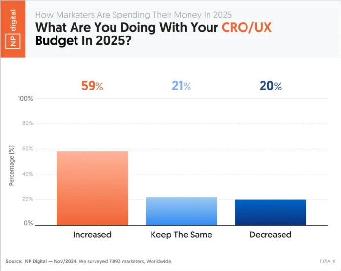
Clear, intuitive design helps users find what they’re looking for and take the next step. That might mean reading more, subscribing, or completing a purchase. It’s also a core part of conversion rate optimization, where even small UX changes can lead to measurable gains. CRO and UX are areas that more and more marketers are devoting increased budgets to.
User experience also plays a role in how search engines evaluate your content. Signals like mobile usability, site structure, and page performance can influence your visibility, even if UX itself isn’t a ranking factor.
When you improve the way people experience your site, you improve nearly every performance metric that matters.
How UX Supports SEO
User experience and SEO share the same goal: helping people find what they need quickly and easily. SEO drives traffic, while UX keeps visitors engaged once they arrive.
Search engines now factor experience quality into rankings. Google’s Core Web Vitals evaluate how fast a page loads, how smoothly it responds, and how stable the layout feels as it renders. When pages perform well, users stay longer and bounce less, which signals quality to search engines.
Mobile usability plays a major role too. With mobile-first indexing, Google often ranks sites based on their mobile experience. A responsive design that works across all devices improves both accessibility and visibility.
Strong UX optimization helps your SEO work harder. The better your experience, the easier it is for users to explore, trust, and convert.
Next, we’ll break down the UX best practices that make those results possible.
UX Best Practices
The following UX best practices will help you design faster, simpler, and more effective experiences that keep users engaged from their first click to conversion.
Know Your Target Audience
Effective UX optimization starts with understanding who your users are and what they expect from your site. When you base design decisions on real data instead of assumptions, you can create experiences that feel natural, relevant, and easy to use.
Collect audience insights through analytics, user surveys, and behavior tracking. Build personas that capture motivations, preferences, and pain points. These details help you personalize the experience, from navigation to recommendations, in ways that feel helpful, not forced.
Personalization is a proven factor in increasing conversions, so it makes a good starting point for your UX improvements:
Thrive Market is a strong example of user understanding in action. The healthy food retailer tailors its shopping experience through an onboarding quiz that asks about dietary needs and personal goals. Shoppers receive customized product recommendations and grocery lists that match their answers, which removes friction and builds trust from the first visit.

When you design around what your audience values most, engagement becomes effortless. The next step is to make that experience as simple as possible.
Keep Things Simple
Simplicity is one of the most powerful UX best practices. Users form an opinion about your site in seconds. Cluttered layouts and confusing navigation create friction. A clean, structured interface helps visitors find what they need quickly and trust what they see.
Research shows that 88 percent of users are less likely to return after a bad experience. Simplicity isn’t just a design preference. It’s how you keep people on your site and build trust with every interaction.
Apple’s website remains one of the clearest examples of simple, effective design. The layout uses generous white space, clean typography, and bold product visuals that highlight what matters most. Each page features short, direct copy and clear calls to action such as “Learn more” or “Buy.” This approach keeps attention focused and makes navigation effortless.
Simple design improves accessibility and reduces cognitive load. It helps users stay oriented and confident as they explore. Once your site feels easy to use, the next step is making sure it performs the same way on every device.
Build Around Mobile
Mobile traffic now dominates the web, and most users expect sites to work perfectly on their phones. If your layout isn’t responsive, you’re losing potential customers before they ever see your content.
Mobile UX design focuses on speed, clarity, and easy navigation. Pages should load fast, text should be readable without zooming, and buttons should be large enough to tap comfortably. A smooth mobile experience keeps users engaged and signals quality to search engines under Google’s mobile-first indexing. It also helps with cart abandonment.
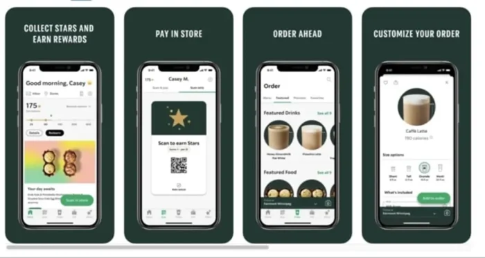
Starbucks offers a strong example of mobile-friendly UX in action. Its responsive design adapts across screens, and the app’s ordering system is simple enough to use one-handed. Customers can browse, order, and pay in seconds, which builds loyalty through convenience.
Mobile UX optimization improves both experience and performance. When users can navigate easily, they stay longer and convert more often. Next, we’ll look at how to guide those users toward the actions that matter most.
Set Goals and Guide Users There
Every great UX design starts with a clear goal. Users should always know what to do next, and every part of your layout should make that path obvious. When visitors understand your purpose, they’re more likely to take action and complete the journey you’ve built for them.
Strong UX optimization is goal-driven. Each page should serve a specific purpose, whether it’s capturing a lead, driving a purchase, or encouraging engagement through smaller actions such as watching a video or subscribing to a newsletter. These soft goals build trust and move users closer to conversion.
Dropbox demonstrates this principle with focus and simplicity. Its homepage centers around a bold, high-contrast “Try Dropbox Free” call to action button that stands out from surrounding content. The message is clear, the design uncluttered, and the action frictionless. This clarity of direction keeps users moving toward sign-up without confusion or distraction.

When your site guides users naturally, you reduce hesitation and increase conversions. The next step is to make sure that experience loads fast enough to keep them there.
Focus on Loading Speed
Speed is one of the simplest ways to improve UX optimization. A slow site frustrates users, hurts engagement, and damages your search visibility.

Fast-loading pages make your entire experience feel smoother and more trustworthy. They also reduce bounce rates and improve rankings because search engines use page performance as a quality signal.
There are practical ways to keep your site fast. Compress images, enable browser caching, and minimize heavy scripts or animations. Consider using a content delivery network (CDN) to distribute resources more efficiently.
When users can access your site instantly, they’re more likely to explore and convert. The next step is making sure that navigation keeps those visitors moving in the right direction.
Use Clear Navigation
Navigation is one of the simplest ways to improve UX. Visitors should be able to find what they need without stopping to think about where to click next. When users can move through your site effortlessly, they stay longer and engage more.
A common rule of thumb is that users should reach any key content within three clicks. While it’s not a strict requirement, the idea still holds: fewer steps mean less frustration and more conversions.
Best Buy demonstrates this principle with effective breadcrumb navigation and well-structured menus. Each category flows naturally into the next, making it easy for shoppers to explore products without getting lost. Clear labels, consistent placement, and visible CTAs reduce confusion and build confidence as users browse.

Good navigation creates momentum. It guides users from curiosity to action and supports the next layer of UX design, establishing a strong visual hierarchy.
Design Hierarchy
Design hierarchy gives structure to your website and helps users focus on what matters most. It’s the principle of using layout, size, color, and placement to show importance and guide attention. When your visual elements follow a clear order, users can navigate your content naturally and confidently.
People don’t read web pages from top to bottom. They scan. Good design aligns with that behavior using visual cues to lead the eye in a predictable flow. Larger fonts, contrasting colors, and prominent placement signal priority and make it easier for visitors to decide what to do next.
Netflix provides a great example of design hierarchy done right. The homepage features bold hero images, clear typography, and obvious CTAs like “Play” and “More Info.” Each element has a specific purpose, guiding users from interest to action without confusion.

Strong hierarchy keeps your design accessible, clear, and easy to use. The next step is to make sure every user can experience it the same way.
Make it Accessible
Accessibility is a core part of UX optimization. Every visitor should be able to navigate, understand, and interact with your site, no matter their abilities or the device they use. When your design works for everyone, you build trust and expand your audience.
Good accessibility starts with simple design choices. Use high-contrast colors for readability, add alt text to images, and make sure every function on your site can be accessed by keyboard. Provide captions for videos and use clear, descriptive link text so screen readers can interpret your content accurately.
Accessibility also includes transparency. Make privacy settings and cookie preferences easy to find and understand. When users know how their data is handled, they feel safer engaging with your content.
Collective Thoughts provides a strong example of accessibility done right. Each article includes an easy-to-find audio version, giving users multiple ways to engage with the same content.

For official standards, review the Web Content Accessibility Guidelines (WCAG). Accessible design benefits every visitor and keeps your site usable across devices, which is especially important for complex actions like forms and checkouts.
Streamline Forms and Checkouts
Checkout friction is one of the biggest UX killers in e-commerce. Every extra click, field, or delay gives users a reason to leave. According to the Baymard Institute, the average cart abandonment rate is nearly 70 percent.
Simple, efficient forms create a faster path to conversion. Ask only for essential information, and make sure labels are clear. Use autofill and progress indicators so users always know where they are in the process. Guest checkout options and flexible payment methods such as PayPal, Apple Pay, and Google Pay remove unnecessary steps that slow people down.
Amazon set the standard for streamlined checkout. Returning users can buy instantly using saved details, skipping the typical multi-step process. That speed and convenience are why the feature became a benchmark for great UX optimization.

When the path to purchase feels effortless, conversion rates rise. The same principle applies to browsing, users should be able to find what they want just as easily.
Use Product Filters and Site Search
Filters and search tools are essential to strong UX optimization. When users can find what they need quickly, they’re more likely to stay, explore, and buy. On large e-commerce sites, well-designed filters reduce decision fatigue and keep the experience organized.
Zappos is a standout example. Its product pages let shoppers filter by size, color, price range, and brand, all from a clean, intuitive sidebar. The site also uses smart search that suggests relevant products as you type, saving time and minimizing frustration. Every interaction feels smooth because the structure matches the way people actually shop.

Good UX best practices make discovery easy. Use predictive search, logical categories, and visual cues like color swatches to help users narrow results faster. When navigation feels effortless, users feel in control, and that control leads to more confident conversions.
The next step is communicating what happens after each click so users always know what to expect.
Test, Test, and Test Again
UX optimization is never finished. Designs that work today can feel outdated or confusing tomorrow. Regular testing keeps your experience aligned with real user behavior instead of assumptions.
Start by using analytics to identify where users drop off or hesitate. Tools like Google Analytics and ContentSquare reveal how people scroll, click, and move through your site. Session recordings and heatmaps show which elements attract attention and which ones get ignored.

A/B testing takes it further. Platforms such as Optimizely or VWO let you compare two versions of a page to see which performs better. Even small adjustments to headlines, layouts, or CTAs can have measurable impact.
The goal is consistent improvement. By testing, analyzing, and iterating regularly, you build a user experience that gets stronger with every insight. Next, we’ll look at how to measure that progress through key UX metrics.
Track Key Metrics for UX Success
Great UX is measurable. Tracking the right data shows whether your optimizations are actually improving the experience. Without clear metrics, you’re just guessing at what works.
Start with the fundamentals. Bounce rate tells you if visitors find your content relevant. Engagement rate shows how long they stay and how deeply they interact. Conversion rate reveals how effectively your UX supports business goals. Together, these numbers tell the story of your site’s performance.
Core Web Vitals are equally important. They measure loading speed, interactivity, and visual stability, the technical foundations of user experience. Improving these signals helps both users and search engines trust your site.
Be sure to monitor these metrics regularly. When you track, analyze, and act on the data, your UX gets sharper and more effective over time. That ongoing improvement is what separates good experiences from great ones.
FAQs
What is user experience?
User experience (UX) is how someone feels when interacting with your website, app, or product. It includes everything from design and navigation to speed and usability. Good UX helps people find what they need quickly and enjoy the process, which builds trust and increases conversions.
What is UX optimization?
UX optimization means improving your site’s design, structure, and performance to make it easier and more enjoyable to use. It focuses on removing friction, improving speed, and guiding users toward clear goals. The result is higher engagement and stronger business results.
What are UX best practices?
UX best practices are proven methods for creating a smooth, intuitive digital experience. They include understanding your audience, simplifying design, using clear navigation, optimizing for mobile, improving accessibility, and testing regularly. These principles make your site more usable and trustworthy.
How do UX best practices impact SEO?
UX best practices directly affect SEO performance. Search engines reward sites that load quickly, work well on mobile, and provide a smooth, intuitive experience. While metrics like time on page or bounce rate aren’t direct ranking factors, strong UX helps users find what they need, stay engaged and complete tasks, which all contribute to better overall performance.
How can I improve website UX?
Start by analyzing how users interact with your site. Simplify your layout, improve page speed, and test your navigation flow. Use clear CTAs and make sure your content is accessible and easy to read.
What tools can I use to test my UX design?
Tools like Google Analytics and ContentSquare help you see where users click, scroll, and drop off. You can also run A/B tests with Optimizely or VWO to compare layouts and features. User feedback platforms such as UserTesting provide direct insights from real visitors.
What is mobile UX design?
Mobile UX design ensures your website works seamlessly on phones and tablets. It includes responsive layouts, readable text, quick load times, and tap-friendly buttons. Strong mobile UX improves accessibility, reduces bounce rates, and helps your site perform better in mobile search results.
Conclusion
Implementing these UX best practices can dramatically improve the user’s journey across your site, increase conversions, and elevate your brand reputation.
Remember, understanding your audience is extremely important. Everything you design should be with your users in mind. Keep things simple, prioritize accessibility, don’t forget about mobile, and never stop testing and refining.
Get started today by examining your site’s user experience and identifying areas for improvement. It may be time to revisit your mobile optimization. Or do your forms need streamlining for a smoother checkout process?
Every change you make can potentially improve your users’ experience and, by extension, your bottom line.