AI Mentions: How to Get LLMs to Mention Your Brand

AI mentions are references to your brand in ChatGPT, Google AI Overviews, etc. Learn why they‘re important.
AI mentions are references to your brand in ChatGPT, Google AI Overviews, etc. Learn why they‘re important.
Would you rather have a beautiful website or a website your customers love?
From a business perspective, you shouldn’t choose either. You should want a high-converting website, instead. And this is where landing pages are so important.
A landing page is a key component in any marketing campaign. Whether you’re running a digital ad, sending an email letter, or posting on social media, you need a webpage that you can send interested visitors to that can help generate leads and conversions.
Many people get caught in the trap of creating designs they like without thinking about what their prospective buyers want and need. Unfortunately, this creates a leaky funnel that’s hard to fix.
But if you want to buck that trend and create landing pages that convert, I’m here to help. In this article, we’ve compiled a list of 20 landing page examples you can gather inspiration from.
We’ll go over each one’s strengths and weaknesses, so you’ll be able to walk away knowing what it takes to create a high-converting landing page for your business.
A landing page is a single webpage designed with a single goal in mind. That goal could be:
Potential leads or customers “land on” the webpage, giving it the name “landing page.” It’s a simple page that dives fully into a single offering with the intent of selling the visitor whatever it’s promoting.
As you scroll through the landing page examples we share below, you might notice that they all appear to follow a similar formula. That’s because you don’t fix what isn’t broken, and the key landing page elements are not broken.
There are five main elements that any high-converting landing page needs to include:
Need some inspiration for your next landing page? Check out these 20 examples that you can get inspiration from.
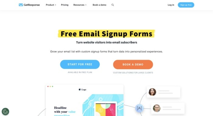
GetResponse is an email marketing platform. This landing page is highlighting a key feature—email signup forms meant to help businesses build their email lists. Powerful headline, check. Eye-catching image, check. List of current clients, check. List of features, check, You get the idea.
It’s quite long, but that just gives the Get Response team more to convince you to create a free account. And there are plenty of CTAs along the way in case you missed the one at the very top of the page.
Three takeaways from GetResponse’s landing page:
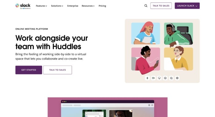
Slack is always on top of its game when it comes to creating some of the best landing pages. They are constantly optimizing for conversions, and that’s the best way to find your winning landing page. This landing page showcases one of its features—voice or video huddles that happen in real time, letting team members essentially call each other to hash something out quickly.
Three takeaways from Slack’s landing page:
This landing page for heatmapping software CrazyEgg showcases a specific feature that the software offers. In this case, it’s the ability to create website pop-ups to increase conversions.
The page leads with a demo link and breakdown of the feature, before you see more detailed information on how it works further down on the page.
Three takeaways from CrazyEgg’s landing page:
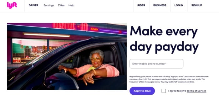
Lyft has been growing in the past years, and its website, landing page, and overall online funnel is a driving force, too. They focus on attracting new drivers that want to control their own life.
Once again, we see a giant, attention-grabbing headline that entices users. Now check out the button “Apply to drive.” It implies that it’s not 100 percent sure you’ll be able to get the position — which makes it even more enticing while also stopping candidates from getting carried away.
Three takeaways from Lyft’s landing page:
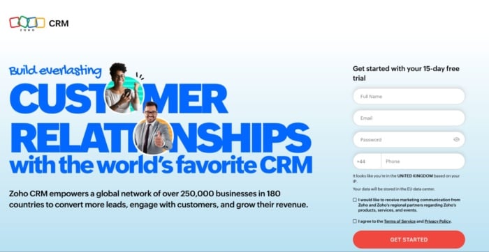
Zoho’s landing page is a great example of a more full-on, but still extremely powerful messaging. They use more text than the average landing page in the industry, but that’s not necessarily bad. It just means users have more information to make a decision. And in a crowded industry like the CRM space, that can be a highly effective thing.
Three takeaways from Zoho’s landing page:
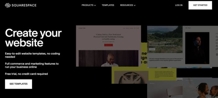
Squarespace is a contender for the shortest landing page ever. Seriously, there’s not much more to it than the screenshot I’ve taken above. But that doesn’t mean it isn’t effective.
Rather than trying to get you to create an account, all Squarespace wants you to do here is look at the templates. I reckon they know that once you see how good the templates are and how easy the platform is to use, you’ll be hooked.
Three takeaways from Squarespace’s landing page:
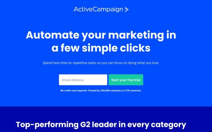
If there’s one thing you can’t fault ActiveCampaign’s landing page for, it’s brevity. They get straight to the point with the key benefit of their platform and encourage you to start a trial by entering your email address. Scroll down further and the rest of the page is similarly pared back, only including key information users need to know.
Three takeaways from ActiveCampaign’s landing page:
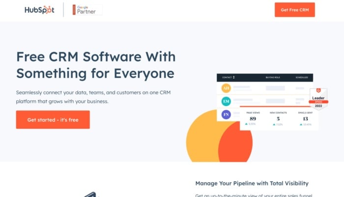
Cost is a big hurdle for any small business looking to purchase a CRM. That’s why HubSpot makes such a big deal of its free offering in this landing page. But just because you get the software for free doesn’t mean it’s limited. That might be your first thought, but HubSpot assuages those fears by showing all of the features you get below.
Three takeaways from HubSpot’s landing page:
Source
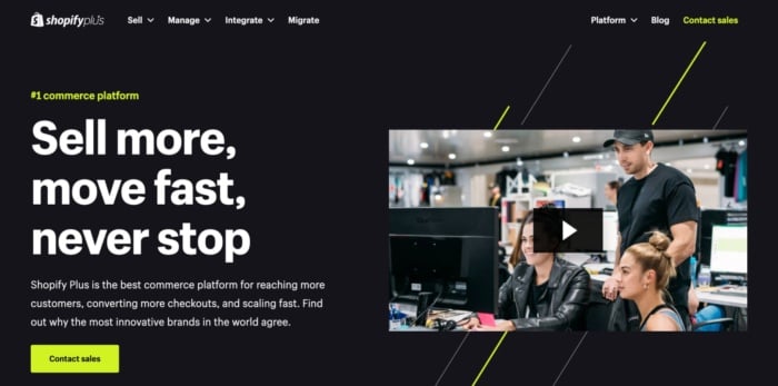
Shopify Plus isn’t designed for bootstrapped e-commerce stores or side hustlers. It’s an enterprise product and that shows in this landing page. It talks directly to big businesses, addresses their specific concerns, and shows them the kind of results they can achieve. Best of all, it’s topped off with a piece of ultra-professional video marketing that’s also designed to appeal to the brand’s target audience.
Three takeaways from Shopify Plus’s landing page:
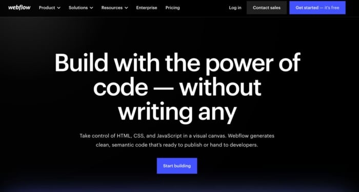
There’s a reason designers aren’t web developers — most don’t know how to code. That doesn’t stop them from designing great-looking websites, but it does mean they need help. Not if they use Webflow, however. Webflow lets designers design and code powerful websites without having to write any themselves. And because the company knows its target audience, everything on the landing page is designed to appeal to designers — from the images to the testimonials to the copy.
Three takeaways from Webflow’s landing page:
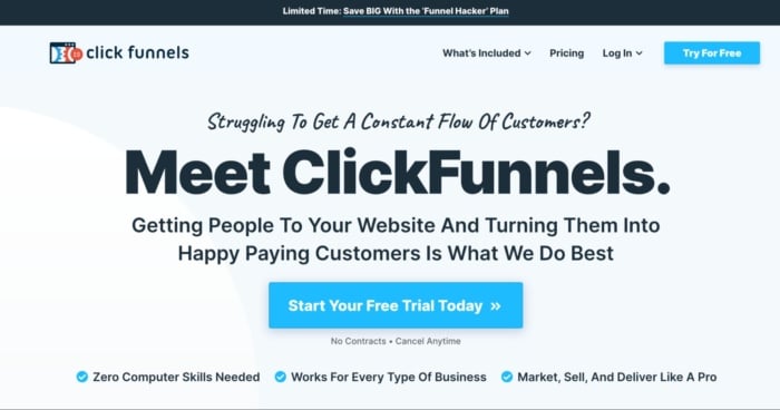
The goal of the ClickFunnels landing page is to get you to start using its software. They know that once they’ve got you on their platform, you are way more likely to start paying. With that in mind, everything on the page is geared at showing how easy it is to get started and what you can accomplish with the software. There are dozens of testimonials of high-profile salespeople who have made serious bank with the software and copy that challenges any preconceived ideas you have. It’s a masterclass in persuasive landing page design.
Three takeaways from ClickFunnels’s landing page:
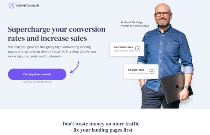
Conversionlab has been using this landing page design for years now. I’ve noticed they split test different button CTAs, like book a call, get a free consult, and many more. Keeping their Founder on the main page of the website builds a long-term relationship many businesses nowadays miss out on. They clearly state their services through their persuasive headline and, even if you’re not ready to book a consultation, a pop-up will appear collecting your email.
Three takeaways from Conversionlab’s landing page:
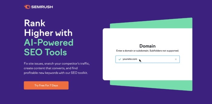
Semrush is an SEO platform. Here’s a landing page example for their tool that showed up as an ad in organic search. The button is bright (and on-brand) and makes it clear what your next step would be. The main headline focuses on the benefit — grow your online visibility — and the third line focuses on another key benefit — you only need one platform. That’s appealing to marketers who are juggling a ton of tools.
Three takeaways from Semrush’s landing page:
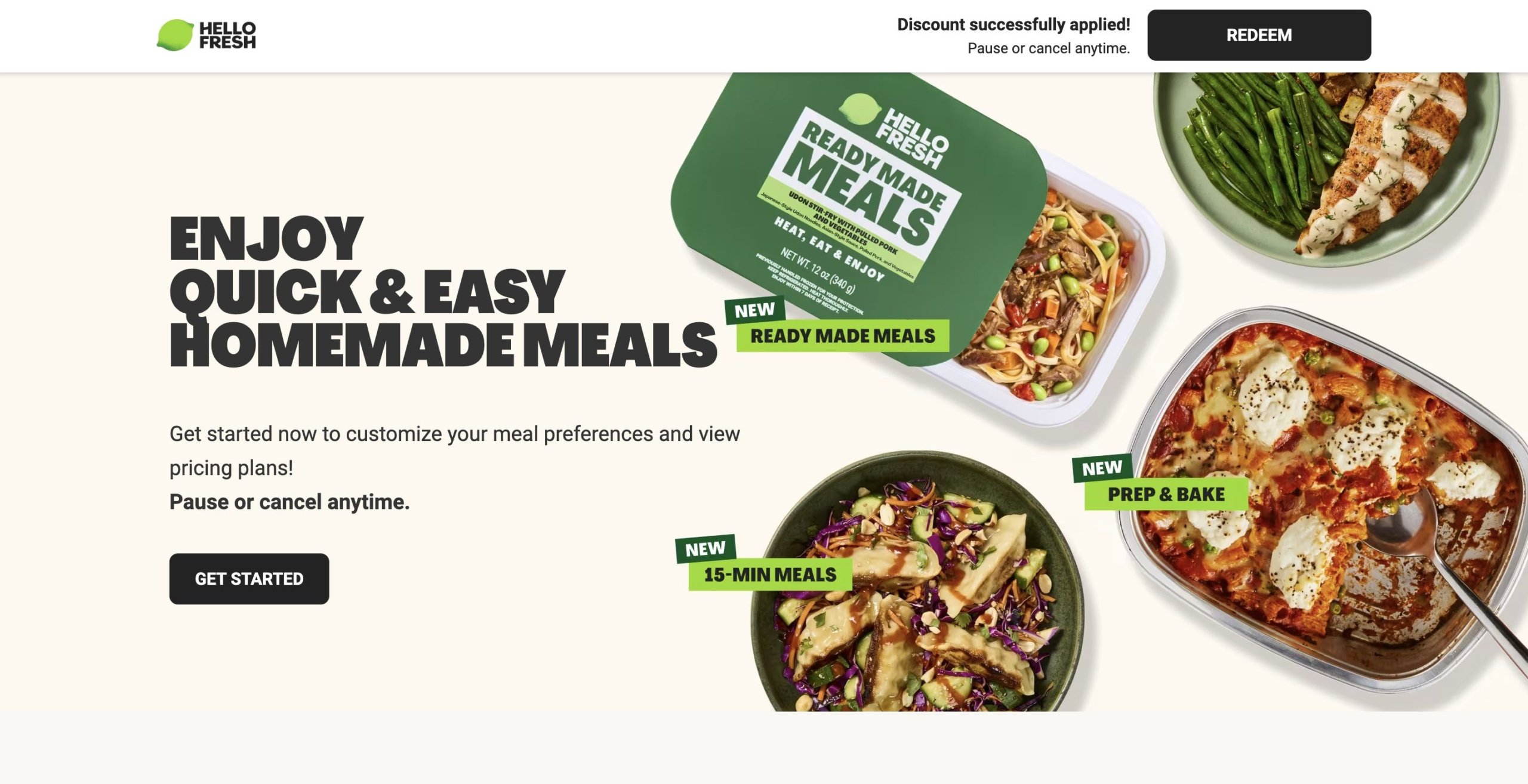
HelloFresh is a meal-kit delivery service, and this landing page is another ad-based page that’s focused entirely on its offering, with no additional navigation.
Like other landing pages, the content is limited. They use a heading, CTA, and images to show how the platform works and some of the user options. However, I suspect that’s on purpose — after all, the premise is relatively simple, it’s more about showing how the service fits into people’s lifestyles.
Three takeaways from HelloFresh’ landing page:
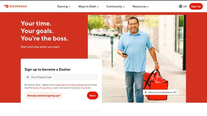
Doordash probably doesn’t have to worry as much about getting customers as it does about recruiting new drivers to meet demand. That’s the goal of this landing page that shows users what they stand to gain from becoming a Dasher. It’s on-brand, carefully lays out the benefits of becoming your own boss, and shows you how much you could earn. The only thing it’s missing is social proof.
Three takeaways from Doordash’s landing page:
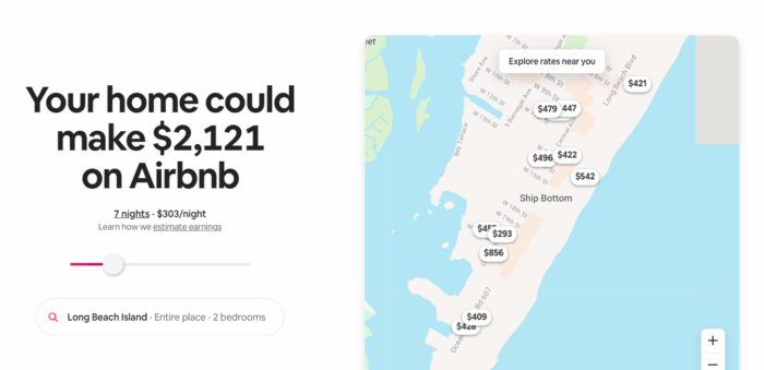
Want to know how much you could rent your property for on Airbnb? That’s exactly what the company’s landing page helps you to understand. This fun and interactive landing page gives users a taste of what they can earn by renting out their property on Airbnb and then shows them how easy the process is.
Three takeaways from Airbnb’s landing page:
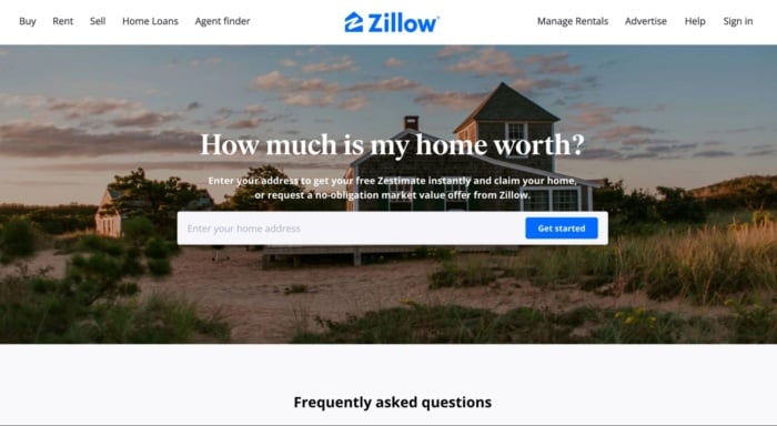
Every homeowner wants to know how much their property is worth. It’s that simple desire that Zillow capitalizes on with this landing page, which aims to generate leads for the company’s mortgage business. It’s short, simple and incredibly alluring for both curious homeowners and buyers looking to understand the potential value of a new home.
Three takeaways from Zillow’s landing page:
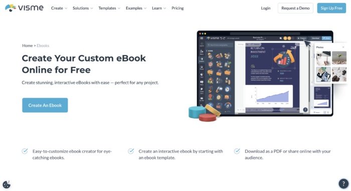
Visme is a graphic design tool that offers a number of templates for different types of business-centric designs, like presentations, infographics, e-books, and the like. This landing page is all about the fact that you can create e-books with the tool, highlighting only e-book templates and other features related to e-book creation.
What I like:
Three takeaways from NP Digital’s landing page:
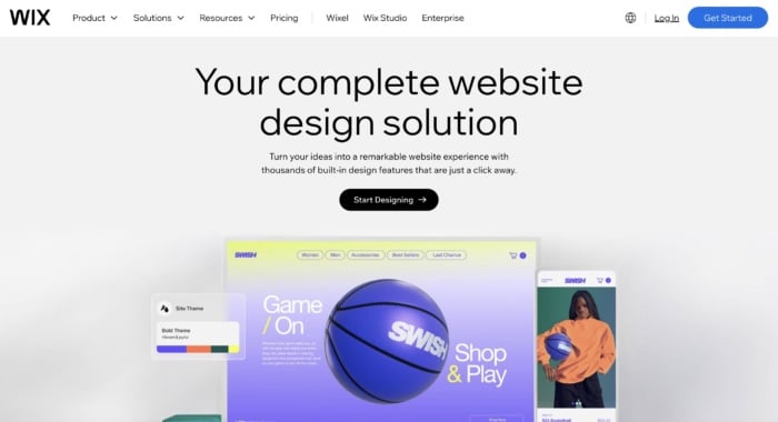
Wix is a website builder, and this landing page goes all in on its website design capabilities. It showcases all features related to getting a new website up and off the ground.
Three takeaways from Wix’s landing page:
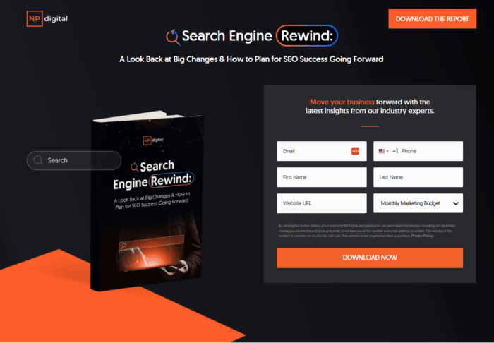
Let’s end with one of the best landing page examples from my digital marketing agency, NP Digital. Unlike some of the other examples in this list, the goal of this landing page isn’t to get people to buy a product or sign up to a service. I want users to download a market research report my team and I created.
As you can see, it’s quite a bit shorter than a normal landing page. That’s because it doesn’t need elements like social proof or loads of images. All I want to get across is a snapshot of what you can read in the report and how you can download it.
Three takeaways from NP Digital’s landing page:
You’ve seen the best of the best. Now you’re ready to create a landing page that drives business growth. These seven tips will help you create the high-converting landing pages you’ve been dreaming of:
In general, a great landing page includes:
You might also include social proof or trust symbols, such as reviews, testimonials, and logos of previous customers.
While there are some consistent elements between all strong landing pages, the exact design will depend on your goals, your business, and your industry.
Let me ask you a couple of questions that will guide you in the right direction.
The most common landing page goals are:
You’ve got to know exactly what offer you want to present on your landing page before creating it.
Building a high-converting landing page is not an overnight effort.
You might find yourself optimizing a non-profitable landing page for months before it starts generating real returns. If you’re not ready for that, then I recommend you quit before you even start.
Yes, you can get lucky and hit a home run on your first try, but don’t count on it.
Be ready for the long game so you catch the long-term gains that are so much sweeter than a short-term spike in traffic.
Before you begin designing your landing page, you need to prepare a solid budget.
You can’t expect everything to go smoothly throughout the process. Problems are going to occur and most times the easiest and fastest way to solve them is to pay someone who is an expert in the field.
That can be a developer, a funnel designer/builder, an ad specialist, or a CRO consultant. Either way, you should be ready to pay someone to do it right so you don’t face the same problems over and over.
In marketing and life, one of the best ways to test the quality of your work is to put it in front of an audience. For landing pages, you can do that by running ads to see if the traffic converts.
If it does, you raise your ad budget and try to scale. If it doesn’t convert at first, then you should let a professional take a look at it.
Even if you already hired someone to build it for you, don’t expect them to help you here. Yes, they could optimize your page, but you’ve got to keep in mind that people have an emotional attachment to their work.
That’s why you need a third party to help you out.
When it comes to optimizing a landing page for conversions, think about hiring an agency.
Big marketing agencies nowadays have had hundreds if not thousands of clients who have been in your exact situation. That’s why hiring a marketing agency to help you increase your conversion is the best bet.
Talking about CRO (conversion rate optimization) there’s no better choice than NP Digital.
I might be biased, but I think it’s the best marketing agency for both SEO and CRO.
If you’re at the stage where you want to optimize your existing landing page but you don’t know exactly how to do it, then book a quick call with a member of my team who can unravel the secret conversion optimization methods your business needs.
A landing page is a specially designed page intended to encourage users to complete a specific task (i.e., convert.) They work by highlighting key points, using social proof or case studies to build trust, and providing a CTA to encourage conversion.
Any business with a website should have a landing page of some sort to encourage users to take an action like booking a demo, calling for a quote, or signing up for an email list, etc.
There are several elements that make a landing page effective. First, a clear and compelling headline that instantly communicates the value proposition is essential. Second, concise and persuasive copy that highlights the benefits of your product or service. Third, it needs a visually appealing design that is easy to navigate and optimized for mobile devices. Fourth, a strong call-to-action that is prominent and directs users to take action. Finally, I recommend trust-building elements such as testimonials or social proof to instill confidence.
I hope these best landing page examples can serve as an inspiration to create a high-converting landing page. To get the most out of your landing page, be sure to:
Finally: always, always optimize your landing pages.
You can NOT be perfect from day one. Every business on this list tests its pages dozens if not hundreds of times before finding the best landing page.
Even then, they still optimize.
If you’re not using AI in marketing, you’re already falling behind. Artificial intelligence (AI) tools are becoming more and more prominent, and many have functions specifically designed to help marketers better promote their products and services.
Throughout this article, we’re going to dive deeper into what AI in marketing looks like, sharing the benefits of taking advantage of AI, how AI can be used in marketing, plus some AI marketing tools to get you started.
Why should you incorporate AI into your marketing strategy? There are so many benefits that these tools can bring to your team—if you use them right.
AI can help marketers speed up processes and spend less time conducting certain tasks manually. According to HubSpot’s State of AI Report, 79% of marketers agree that AI helps them to spend less time on manual tasks, showing just how valuable these new tools can be.
AI can analyze customer data at scale, helping you to gather more insights and understand how to better personalize your content and segment your audience. Better personalization can provide your business with better results from your marketing campaigns.
Because AI can analyze data more effectively than humans can, you can get better insights. For example, AI analysis can help you identify trends earlier, forecast sales and customer behavior more efficiently, and help your marketing team make better decisions.
Incorporating AI tools into your team’s daily processes can save time and resources, resulting in cost savings within your marketing budget. While AI shouldn’t replace core human workers, there are certain tasks that it can take off their plates, letting them focus on things that actually impact your business’s bottom line.
Because AI tools can help your marketing team better understand customers, personalize campaigns, and ship better content, you’ll see a higher return on investment (ROI) as a result. Start using AI within your day-to-day marketing tasks to see how it can help improve your performance.
Because AI is a newer technology, you might not be sure how it works with marketing quite yet. However, there are a number of key use cases that AI can help with.
Let’s look at some real life examples of businesses using AI in ways that market their products or make working with their business feel more appealing.
Spotify is a music streaming service that recently launched its own AI product to help its users have a better listening experience. This AI product is called “DJ,” and it analyzes your top songs and plays music based on your past listening habits.
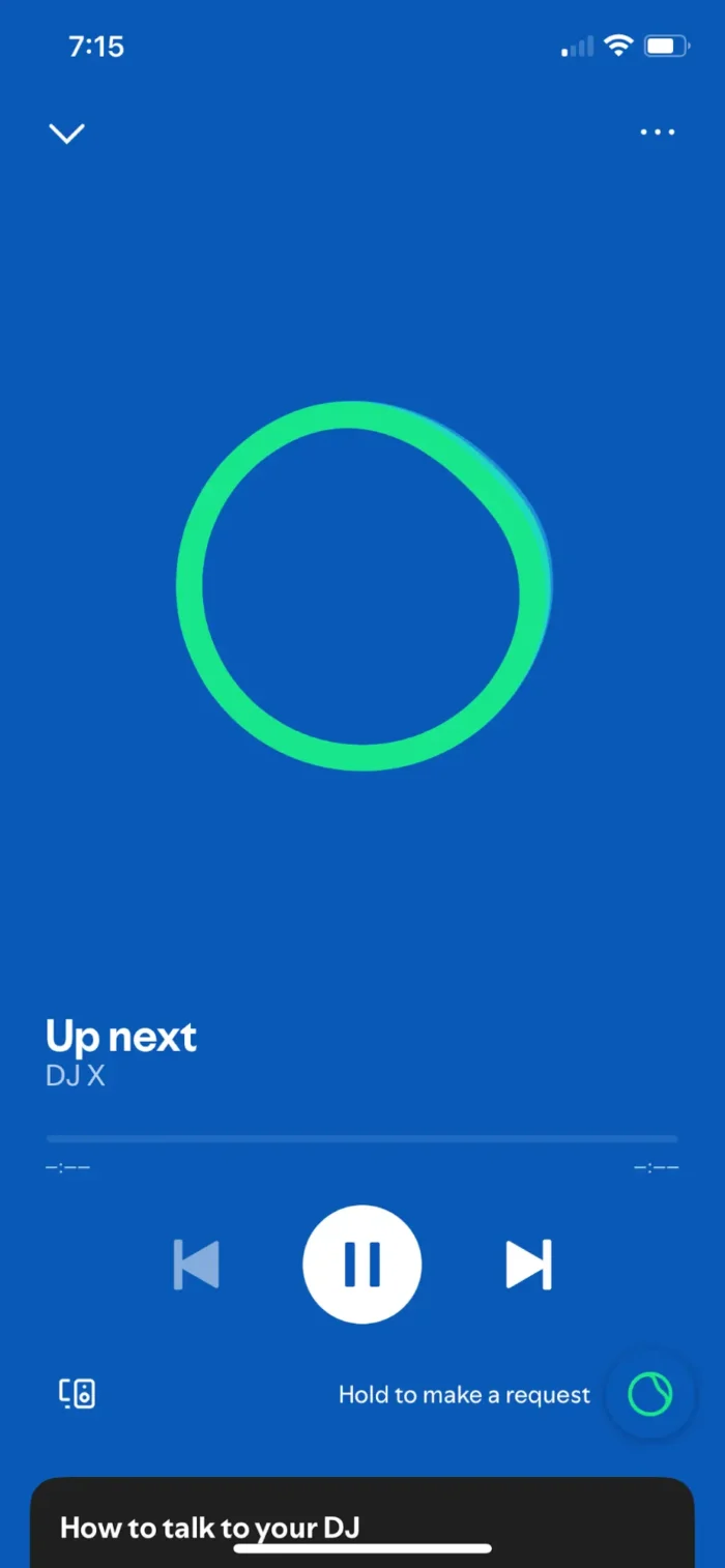
The DJ will play five songs that all come with a similar vibe, then come back onto the “mic” to share your next five songs. If there’s a set of songs that listeners aren’t interested in, they can tap the “DJ” icon to move onto the next set.
It’s a unique experience that really helps to set Spotify apart from other streaming platforms.
Curlsmith is a beauty brand focused on curl care. It has a chatbot widget on its website to help customers find what they’re looking for.
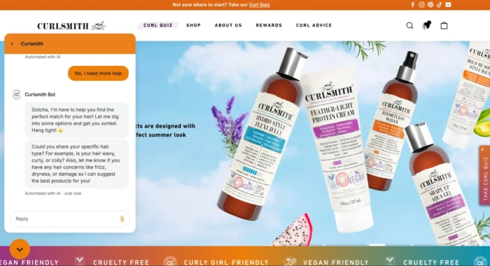
As you can see, the chatbot responses are all “Automated with AI.” Customers can use this chatbot to:
There are programmed responses, but if a user says that they need additional help, there’s a conversational AI chatbot implemented as well that will analyze a user’s response in order to provide them with the best customer service.
Heinz put together a creative ad campaign a couple of years ago and used AI to help them build it. The ad told the story of how the Heinz team typed “ketchup” into an AI image generator, and the output was a ketchup bottle with a logo that looked eerily similar to the Heinz logo.
The campaign essentially said, “even AI knows ketchup is Heinz,” and showcased several other prompts the team ran through the AI image generator, all including the word “ketchup,” and the output they received.
This was a creative way to incorporate AI tools in a marketing campaign that also provided an extremely effective result.
If you want to get started incorporating artificial intelligence into your marketing strategy, you need to find the right tools to use. Below, we introduce you to six different AI marketing tools, each with its own use case.
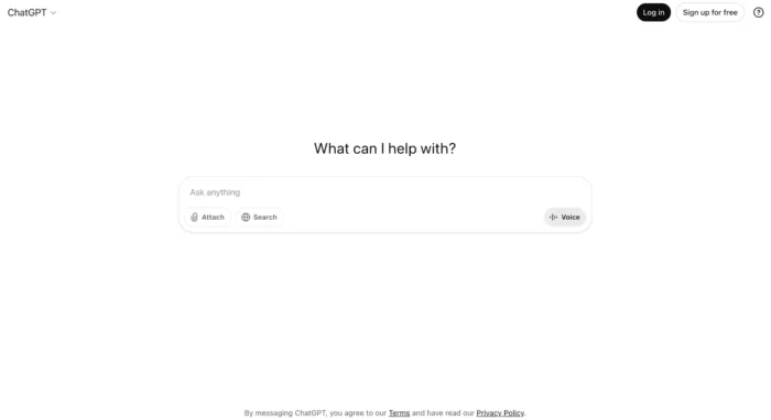
ChatGPT is an AI-powered chatbot that can provide answers to anything you type into the text box. It can help with things like:
But ChatGPT can honestly help with nearly any request you might have for it. You can also upload Excel files and have it analyze historical data, helping you generate predictive analytics, forecast customer behavior, and gather competitive insights, even without tools that are more catered to those capabilities.
If you don’t use any other AI tool, you should at least have a ChatGPT account under your belt.
Pricing: Completely free for limited (but still extensive) use. To get access to more models and more capabilities, premium plans start at $20/month.
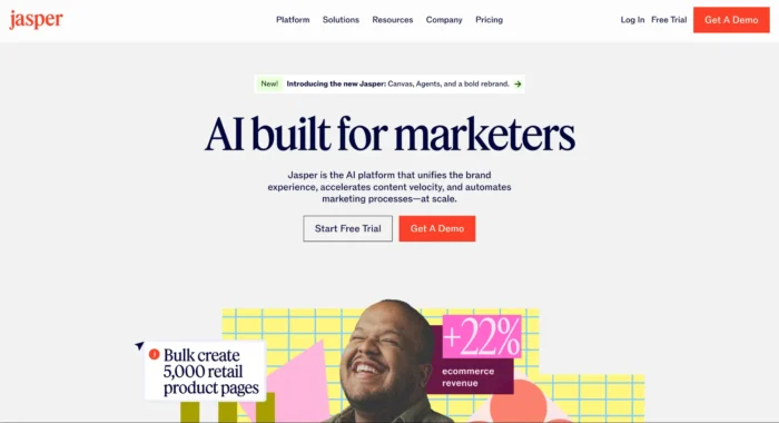
If you’re looking for help with your content generation, Jasper is the perfect tool for you. The tool provides an intuitive workspace that makes it easy to generate content at scale, optimize content so it hits every mark, conduct research to fully flesh out your content, and more.
While Jasper is the ultimate content generation tool for marketers, it also offers AI agent capabilities. AI agents are tools that can operate autonomously, helping marketers get more done in less time.
Pricing: Plans start at $39/month/seat.
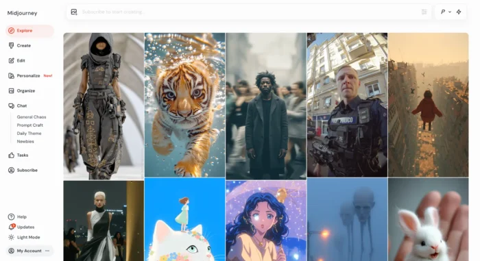
Midjourney is an AI-powered image generation platform. It was originally built through a Discord server (which still remains active), but now can be accessed through an easy-to-use web app. Users can input any text-based description, upload images for reference, and incorporate some of Midjourney’s built-in parameters to create images for any marketing needs.
Generate realistic images, animated images, surreal art, and more. Midjourney is also starting to delve into video generation, which can be a game changer for creating marketing video ads and commercials.
Pricing: Paid plans start at $8/month.
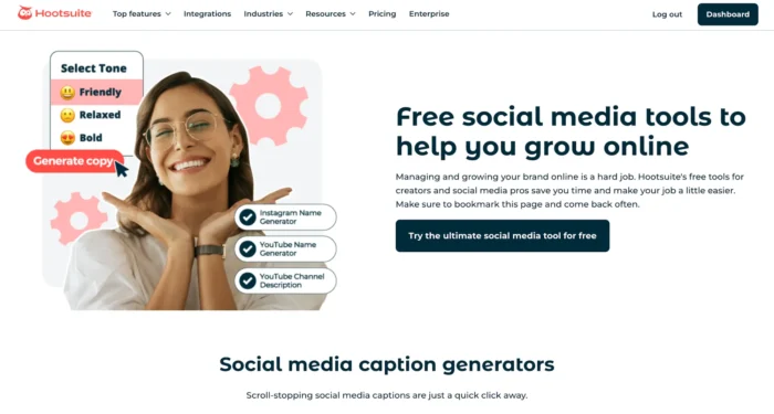
Hootsuite is a social media management platform, but it also offers a number of free AI-powered tools that can help marketers get ideas for their social copy and captions. Some of the available tools include:
Take advantage of these completely free tools to help you brainstorm more ideas and captions for your social media content. These free tools are also their own example of AI in marketing, as they help promote Hootsuite alongside providing free value.
Pricing: The AI-powered generators are completely free to access. Hootsuite’s suite of social media management tools start at $99/user/month.
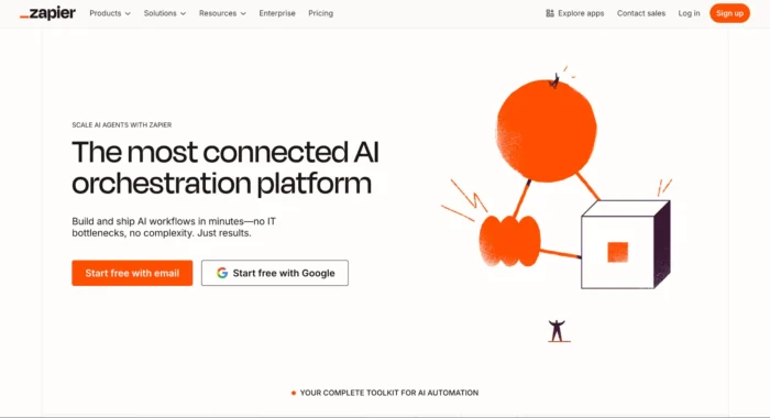
Zapier is an AI-powered marketing automation platform that makes it easy for marketers to set up automated workflows. Zapier works via “zaps” that connect tools together to create an automation that wouldn’t otherwise be possible.
For example, automatically add leads to your CRM, automatically add your new blog posts to your social media content calendar, or automatically add new customers to a spreadsheet for tracking.
These are some basic zaps, though. Zapier also offers a number of extensive workflows that incorporate their AI capabilities, helping marketers to automate more complex tasks as well.
Pricing: Free for up to 100 tasks/month. For more usage, paid plans start at $19.99/month.
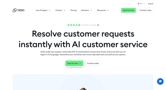
Tidio is a chatbot software that enables businesses to create their own AI-powered chatbots for their customers to interact with. Users can get customer support from your AI bot, chat with your bot about product suggestions, and make appointments all through your Tidio chatbot.
Train the Lyro AI assistant with your business information so they can help customers out, while also escalating more serious concerns or more unique questions directly to a human customer service representative.
Pricing: Plans are flexible based on the number of conversations you expect to have per month. Get access to the tool for free for 50 conversations or less. Plans start at $24.17/month for 100 conversations and go up from there.
Chat bots, a form of artificial intelligence, are a common occurrence on business websites. Other examples within marketing include ad targeting, dynamic pricing, and ChatGPT.
The greatest impact that AI has had on the marketing industry is in the automation of repetitive tasks. This frees up times for digital marketers to focus on larger-scale projects and higher level strategy.
Use AI where it actually helps. Automate tedious tasks like reporting, scheduling, and customer service. Use it to speed up content planning and pull insights from your data faster. Let AI handle repetitive tasks so your team can focus on strategy and creative work.
AI tools, in and of themselves, are nothing to be feared. There is nothing inherently bad about AI or AI tools. However, you do want to review any work that comes out of them to avoid concerns like plagiarism or inaccuracy.
Artificial intelligence (AI) is a key part of marketing these days. You can use the tools to help generate content for your marketing campaigns, analyze results, predict upcoming trends, and so much more. To get even more ideas for how to use AI in your marketing efforts, check out our arsenal of AI tools.
FRP Corporate Finance continues to strengthen its presence in the Welsh market with a series of new hires and staff promotions. The expansion comes as FRP Corporate Finance celebrates its first anniversary of having an on-the-ground presence in Wales, following the acquisition of Cardiff-based Lexington Corporate Finance in July 2024.
Ward Williams has expanded into five UK cities. The Cornwall-based built environment consultancy will now also service clients from hubs in London, Manchester, Cardiff, Winchester and Oxford. Senior partner, James Beckly, explained that the expansion reflects the increasing demand from Ward Williams’ property investment and asset management clients in both the public and private sectors for strategic advice, particularly in response to opportunities around regional devolution, economic development and regeneration, digitalisation and sustainability best practice.
Operations consultancy Argon & Co has welcomed Amanda Khalaf to its UK team. She takes on the role of partner. Bringing 18 years of professional services experience to the firm, Khalaf joins from PwC.
A growing number of UK businesses are identifying Africa as a key strategic growth region – drawn by structural reforms, demographic momentum, and rapid digital transformation across the continent. While half of UK firms polled already operate in the continent, a further third are considering opportunities there.
Big Four firm Deloitte received a public contract worth up to £50 million for a new application, aimed at streamlining admin when accessing government services. Since its launch, the GOV UK app has been criticised for its limited capabilities at launch.
Google clarifies that soft 404 pages consume crawl budget, even when they return a 200 OK status. Here’s how this affects your site.
The post Google: Soft 404s Use Crawl Budget Despite 200 OK Status appeared first on Search Engine Journal.
Do you remember the viral “Little Miss?” meme revival from 2022?
That’s a great example of trendjacking, or inserting your brand into viral online conversations.
It felt like every brand — from global airlines to your local coffee shop — jumped into labeling themselves. Some were hilariously on-point and others…well, not so. For every well-executed moment like a wellness brand that tailored their take to be timely, irreverent, and match their core voice, dozens more missed the mark. And like it or not, audiences can tell.
That’s the fine line with trendjacking. What was once a cheeky social media trick has become a high-stakes play for many modern social media marketers. To stand out and not alienate, brands need more than speed. They need emotional intelligence, audience awareness, and restraint to not jump on every viral moment.
How can you harness what’s trending without sounding tone-deaf or jumping the shark? Let’s break down the basics of effective trendjacking and how you can approach it in a smart way.
Trendjacking is the practice of injecting your brand into a popular or viral conversation to boost visibility, engagement, or relevance. Brands jump on trending topics like memes, social media challenges, or major pop culture moments to join the conversation in ways that are timely and clever.
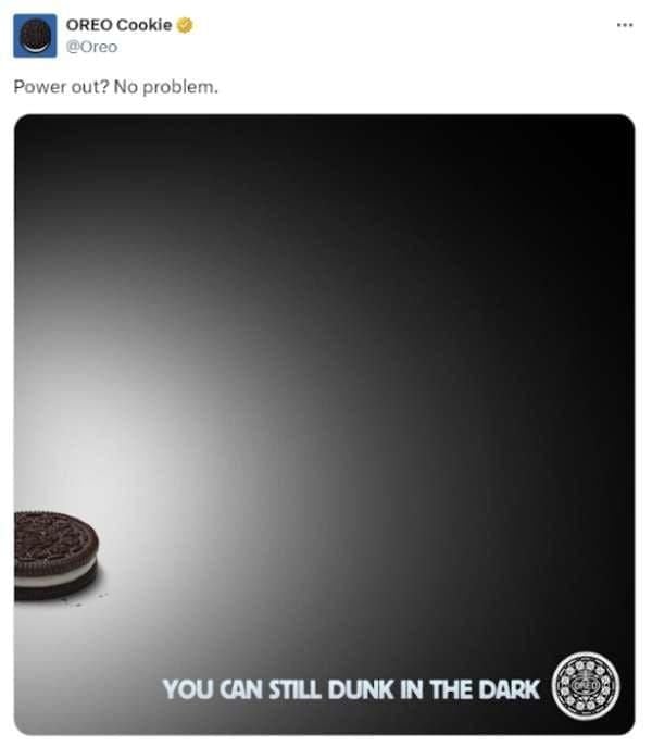
Trendjacking really gained traction during the heyday of Twitter (now X), when brands like Oreo seized viral moments (the “You can still dunk in the dark” tweet during the 2013 Super Bowl blackout) and earned massive engagement for real-time creativity. That post was a signal to marketers that being culturally responsive could pay huge engagement dividends.
Trendjacking isn’t a completely new strategy, though. It has its roots in the older PR strategy of newsjacking. Popularized by David Meerman Scott, newsjacking focused on inserting brands’ perspectives into breaking news stories to get media coverage. Trendjacking is just an evolution of that strategy, tapping into a broader range of online moments.
When you do it well, trendjacking can help your brand show personality, relevance, and humor. But it’s not a strategy without risks, especially if you do it without considering nuance or alignment to your brand’s values.
Let’s say you’re ready to drive into trendjacking. How do you do it right? Like many effective social media strategies, the best trendjacking campaigns start long before a trend even surfaces. Success often hinges on preparation and cultural awareness, but the real secret is the agility to act fast without sacrificing your brand’s integrity.
Trendjacking starts with awareness. The earlier you spot a trend, the better your odds of leading the conversation rather than chasing it.
Start with traditional sources. Social listening tools such as AnswerThePublic, TikTok Creator Search Insights, or Sprout Social can surface what’s gaining traction across different platforms. The latter can help you keep an eye on places like X, Bluesky, TikTok’s trending page, Reddit threads, and even Google Trends to stay ahead of the curve. Using these tools doesn’t just tell you what’s trending. They help you catch the wave before it crests.
Effective trendjacking goes deeper than identifying meme formats or hashtags, though. Ask yourself these questions:
Take, for example, the “Girl Dinner” trend. It wasn’t just a meme. It was a commentary on autonomy, wellness fatigue, and the pushback against curated perfection.
In addition to staying on top of developing trends, think ahead. Certain events almost always spawn viral moments: award shows, the Met Gala, political debates, and major sporting events are excellent fodder for trends. Develop a calendar of these events and build a properly resourced team that can act when the internet lights up.
Before you jump into the trend, assess whether or not it’s right for you. Ask important, hard questions, like “Does this trend actually align with our brand?” and “Will our audience care?” Finally, will it feel authentic or forced?
Many brands falter here. Chasing a trend that’s off-brand does more than fall flat; it risks damaging your credibility. The Duolingo x Scrub Daddy “cursed collab” worked because both brands share a quirky, unfiltered tone. If a serious financial brand tried the same joke? Cue the confused and cringing followers.
Assess risk, too. Some trends carry baggage, like political undercurrents, social controversies, or rapidly shifting sentiment. Your internal team should include diverse perspectives to help flag possible missteps.
Beyond relevance, hopping on the trend should add to your brand’s story. If it doesn’t connect to your values or content pillars, it might be better to skip it. Not every viral moment is worth jumping into. Restraint is often what separates trend-chasers from trend leaders.
Once you’ve vetted a trend, it’s “go time.” Timing is everything in trendjacking. Wait too long, and you’re just adding noise to an already crowded feed.
In practice, your team needs a streamlined workflow to move from idea to pressing the publish button in hours, not days. Empower social managers with decision-making autonomy. Maintain a library of pre-approved assets like brand visuals, fonts, and tone examples so your team can capitalize on trends without needing to create a full-scale design from scratch.
Creating internal “trend kits” or rapid response playbooks can help your team execute quickly and safely. Remember: the most memorable trendjacks feel both spontaneous and strategically on-brand because they are.
Once you’ve identified the right trend and confirmed it makes sense for your brand to participate, the real magic begins: creating content to hit the sweet spot of relevance, creativity, and authenticity. Not every trendjacking post needs to be laugh-out-loud funny or ultra-slick, but it should always bring something fresh and on-brand to the table. Some tried-and-true strategies for creating trendjacking content that resonates include:
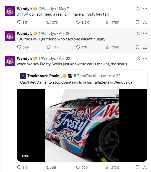
What works on TikTok might not work on LinkedIn, and vice versa. Tailor your content’s tone, format, and visuals to the platform you’re posting on. Wendy’s built their brand on X with snarky one-liners, but the food chain takes a more curated and visual approach on Instagram.
Humor, absurdity, and left-field creativity often fuel viral trends. But you can’t force it. Duolingo’s TikTok presence leans fully into weirdness, but it’s consistent with their edgy, millennial-savvy voice.
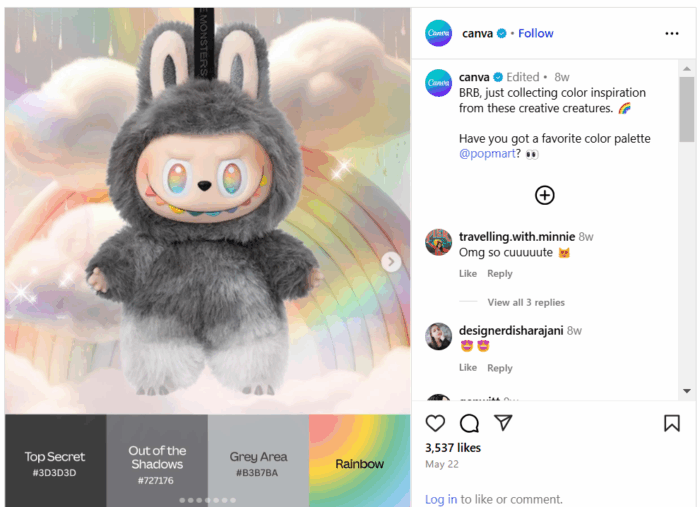
Don’t simply copy-paste a trending meme format. Add your brand’s POV, a clever twist, or insights that enhance the original. For example, Canva recently leveraged the app’s ability to create color schemes with the growing popularity of Labubu toys.
Your audience can smell a cash grab a mile away. If the trend doesn’t align with your values or voice, skip it. If you really feel like you need to participate, subtly nod to the trend without trying to dominate it. Engage, like, or reply to accounts that have posted content in the trend without creating new assets on your own.
Even in a fast-moving trend cycle, visuals (and sound) matter. Low-res graphics or clunky text overlays can kill your momentum. Use templates or pre-approved brand assets to keep things polished under pressure.

Trendjacking is not the time to let the copywriter have the keys to the Canva account.
Trendjacking is a real double-edged sword. When done right, it’s clever, memorable, and engaging. When done wrong, it’s also memorable, but for the wrong reasons; it’s tone-deaf, confusing, or even damaging to your brand. Avoid these common pitfalls.
Some trends are tied to serious or sensitive events, and misjudging the tone can result in intense backlash. That’s what happened to Pepsi in 2017 for their ad that featured Kendall Jenner, which co-opted protest imagery to sell soda (and promptly got called out for trivializing real social movements).
Just because a topic is trending doesn’t mean it’s safe territory. Assign someone on your team to assess social sentiment and cultural context before engaging.
Timing is critical. A trend that peaked two days ago may already feel stale, especially if your post doesn’t add anything new. Joining late makes your brand look like it’s scrambling to stay relevant, not leading the conversation.
To avoid this, consider streamlining your approvals process and having brand-safe assets ready to go.
One of the fastest ways to make a brand look out of touch is to misinterpret the trend altogether. Imagine someone at your company wanted to tweet a meme that referenced “Netflix and chill,” without realizing its NSFW subtext. The internet might notice and not in a good way.
Before trendjacking, do a quick sentiment check. What does this trend actually mean to the people participating in it?
If the trend doesn’t suit your brand voice, values, or audience, don’t force it. It’s painfully obvious when a B2B SaaS brand shoehorns itself into a Gen Z meme format meant for fashion or pop culture. This usually results in low engagement at best and audience cringe at worst.
Brands need a straightforward internal process for evaluating the risk of trendjacking campaigns. Who gets to greenlight? What criteria does the content meet? Building a lightweight risk assessment checklist or review board (creative + legal + DEI leads) can help you act quickly and responsibly.
Even with the best of intentions, things can go sideways fast. That’s why it’s smart to develop a basic crisis response protocol before engaging with fast-moving or culturally sensitive trends. Know who will respond, how quickly, and what steps to take if content sparks backlash.
With your trendjacking content out in the world, it’s time to answer the big question: Did it work?
Start by measuring the basics: likes, shares, reach, and impressions. These top-level metrics help assess immediate visibility and initial audience reaction.
Smart marketers go further, though. The most impactful trendjacking efforts don’t just rack up views. They strengthen brand equity and move the needle on meaningful outcomes. Ask yourself:
Want to level up your campaign? Try aligning your trendjacking posts with keyword-focused content or campaign themes. This gives your SEO strategy a boost, especially in a world where Search Everywhere is the norm (and users can Google the trend and stumble onto your brand).
The art and science of trendjacking will only evolve as the digital landscape shifts. Marketers who want to stay ahead of the curve will need to keep a pulse on what’s trending and how those trends take shape and spread. The future of trendjacking will evolve thanks to things like AI, new platforms, and the rise of “unpolished” realness.
AI is creating massive shifts in real-time marketing as tools like ChatGPT, Midjourney, and Runway help brands generate reactive content faster than ever. From clever captions to custom visuals, the future of trendjacking likely includes AI-enhanced creativity. The big challenge for brands is to remain authentic in the face of automation.
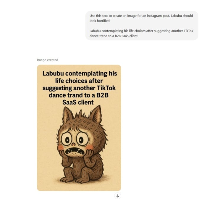
Could ChatGPT help brands jump on the enthusiasm for Labubu without spending the time to go out and source a doll? Possibly.
Instagram, TikTok, and X may reign supreme among platforms, but that won’t always be the case. Bluesky is becoming increasingly popular, and YouTube Shorts has challenged TikTok as a vehicle for short-form video content creation. Expect trendjacking to require more platform-specific fluency, understanding not just the content but the culture of each channel.
Consumers are tired of overproduced content. The next wave of trendjacking will favor brands that show up with honesty, humor, and heart. Even if that means posting something that feels more lo-fi than high-concept. Authenticity isn’t just a “nice to have” anymore. It’s a prerequisite for engagement.
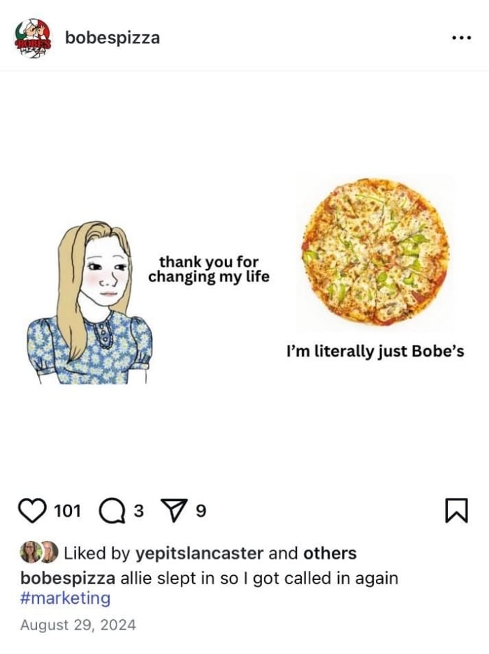
Bobe’s Pizza may be a small Indiana brand, but they lean on authentic content that resonates with their core audience.
The bottom line is that the future of trendjacking isn’t about being fast. It’s about being fast, smart, and real while building systems to let your brand respond with agility and intention.
While both strategies involve jumping into timely conversations, the difference lies in what you’re responding to. Newsjacking is about inserting your brand into breaking news stories — typically through PR or expert commentary — while trendjacking taps into broader online trends, like memes, pop culture moments, or viral challenges. Trendjacking is more social and creative, whereas newsjacking is often more formal and media-facing.
A classic example is Oreo’s “You can still dunk in the dark” tweet during the 2013 Super Bowl blackout. The brand reacted in real time with a witty graphic and caption, and the internet loved it. More recently, brands like Ryanair and Duolingo have gone viral for trendjacking TikTok memes using their unique, offbeat brand voices. The key to successful trendjacking? Speed, creativity, and cultural fluency.
When done well, trendjacking helps brands increase visibility, boost engagement, and connect with audiences in a culturally relevant way. It shows your brand has personality and a pulse. Beyond racking up likes, the real value comes from building brand affinity, sparking conversations, and staying top-of-mind in an increasingly noisy digital space.
Trendjacking is about moving fast and smart. When you do it right, it can drive massive visibility and deepen brand affinity. It takes planning, awareness, and a clear voice to avoid the pitfalls and stand out in the scroll. Whether it’s memes, moments, or movements, show up with purpose.
If you need help crafting an agile social strategy that’s authentic and audience-focused, contact NP Digital to help you lead the conversation, not just follow it.