Do you remember the viral “Little Miss?” meme revival from 2022?

That’s a great example of trendjacking, or inserting your brand into viral online conversations.

It felt like every brand — from global airlines to your local coffee shop — jumped into labeling themselves. Some were hilariously on-point and others…well, not so. For every well-executed moment like a wellness brand that tailored their take to be timely, irreverent, and match their core voice, dozens more missed the mark. And like it or not, audiences can tell.

That’s the fine line with trendjacking. What was once a cheeky social media trick has become a high-stakes play for many modern social media marketers. To stand out and not alienate, brands need more than speed. They need emotional intelligence, audience awareness, and restraint to not jump on every viral moment.

How can you harness what’s trending without sounding tone-deaf or jumping the shark? Let’s break down the basics of effective trendjacking and how you can approach it in a smart way.

Key Takeaways

  • Trendjacking is the practice of inserting your brand into viral conversations in a way that feels timely, relevant, and authentic.
  • Success requires cultural awareness, audience alignment, and speed. Not every trend is right for every brand.
  • Smart brands use social listening tools and planned content workflows to catch trends before they peak.
  • Measuring trendjacking goes beyond likes. Look at sentiment shifts and meaningful engagement.
  • The future of trendjacking will likely be shaped by AI tools, new platforms, and the growing demand for authenticity.

What Is Trendjacking?

Trendjacking is the practice of injecting your brand into a popular or viral conversation to boost visibility, engagement, or relevance. Brands jump on trending topics like memes, social media challenges, or major pop culture moments to join the conversation in ways that are timely and clever.

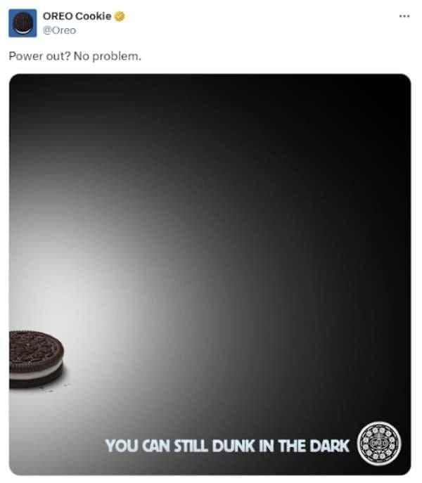
Trendjacking really gained traction during the heyday of Twitter (now X), when brands like Oreo seized viral moments (the “You can still dunk in the dark” tweet during the 2013 Super Bowl blackout) and earned massive engagement for real-time creativity. That post was a signal to marketers that being culturally responsive could pay huge engagement dividends. 

An Oreo Cookie post on Twitter.

Trendjacking isn’t a completely new strategy, though. It has its roots in the older PR strategy of newsjacking. Popularized by David Meerman Scott, newsjacking focused on inserting brands’ perspectives into breaking news stories to get media coverage. Trendjacking is just an evolution of that strategy, tapping into a broader range of online moments. 

When you do it well, trendjacking can help your brand show personality, relevance, and humor. But it’s not a strategy without risks, especially if you do it without considering nuance or alignment to your brand’s values.

How to Pull off an Effective Trendjacking Campaign

Let’s say you’re ready to drive into trendjacking. How do you do it right? Like many effective social media strategies, the best trendjacking campaigns start long before a trend even surfaces. Success often hinges on preparation and cultural awareness, but the real secret is the agility to act fast without sacrificing your brand’s integrity.

Identify Potential Trends

Trendjacking starts with awareness. The earlier you spot a trend, the better your odds of leading the conversation rather than chasing it.

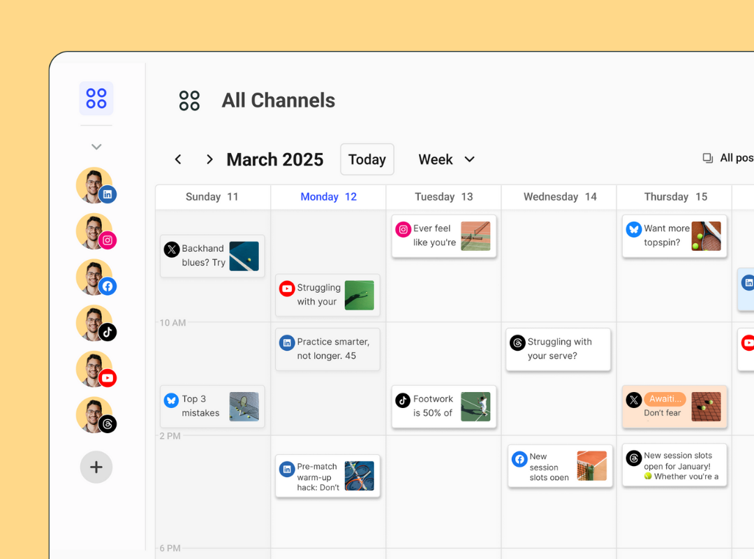
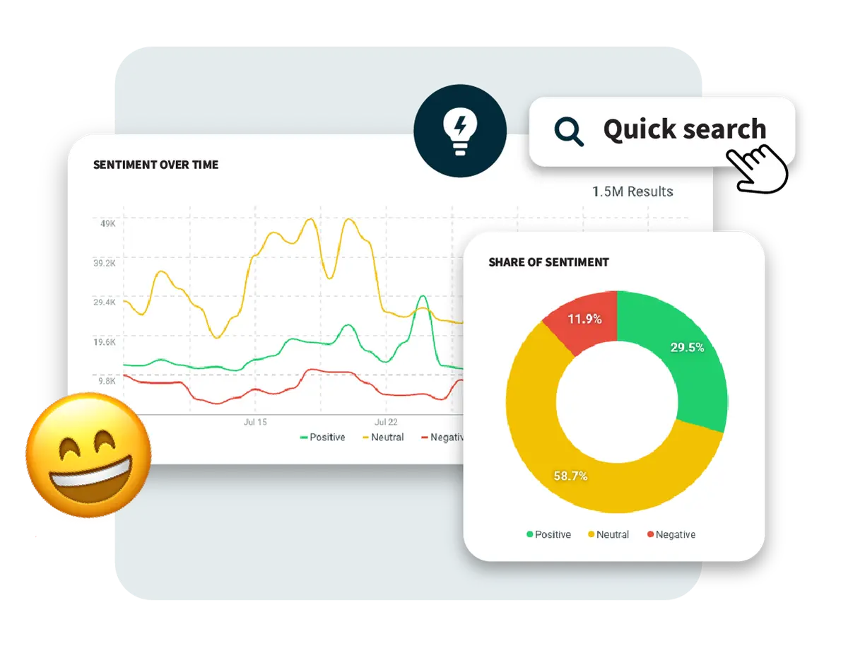
Start with traditional sources. Social listening tools such as AnswerThePublic, TikTok Creator Search Insights, or Sprout Social can surface what’s gaining traction across different platforms. The latter can help you keep an eye on places like X, Bluesky, TikTok’s trending page, Reddit threads, and even Google Trends to stay ahead of the curve. Using these tools doesn’t just tell you what’s trending. They help you catch the wave before it crests.

Effective trendjacking goes deeper than identifying meme formats or hashtags, though. Ask yourself these questions:

  • Why is this trending?
  • What emotion is it tapping into?
  • What cultural shift or behavioral insight is at play?

Take, for example, the “Girl Dinner” trend. It wasn’t just a meme. It was a commentary on autonomy, wellness fatigue, and the pushback against curated perfection.

In addition to staying on top of developing trends, think ahead. Certain events almost always spawn viral moments: award shows, the Met Gala, political debates, and major sporting events are excellent fodder for trends. Develop a calendar of these events and build a properly resourced team that can act when the internet lights up.

Assess the Trend’s Relevance

Before you jump into the trend, assess whether or not it’s right for you. Ask important, hard questions, like “Does this trend actually align with our brand?” and “Will our audience care?” Finally, will it feel authentic or forced?

Many brands falter here. Chasing a trend that’s off-brand does more than fall flat; it risks damaging your credibility. The Duolingo x Scrub Daddy “cursed collab” worked because both brands share a quirky, unfiltered tone. If a serious financial brand tried the same joke? Cue the confused and cringing followers.

Assess risk, too. Some trends carry baggage, like political undercurrents, social controversies, or rapidly shifting sentiment. Your internal team should include diverse perspectives to help flag possible missteps.

Beyond relevance, hopping on the trend should add to your brand’s story. If it doesn’t connect to your values or content pillars, it might be better to skip it. Not every viral moment is worth jumping into. Restraint is often what separates trend-chasers from trend leaders

Produce the Content—Quickly!

Once you’ve vetted a trend, it’s “go time.” Timing is everything in trendjacking. Wait too long, and you’re just adding noise to an already crowded feed.

In practice, your team needs a streamlined workflow to move from idea to pressing the publish button in hours, not days. Empower social managers with decision-making autonomy. Maintain a library of pre-approved assets like brand visuals, fonts, and tone examples so your team can capitalize on trends without needing to create a full-scale design from scratch.

Creating internal “trend kits” or rapid response playbooks can help your team execute quickly and safely. Remember: the most memorable trendjacks feel both spontaneous and strategically on-brand because they are.

Creating Impactful Trendjacking Content

Once you’ve identified the right trend and confirmed it makes sense for your brand to participate, the real magic begins: creating content to hit the sweet spot of relevance, creativity, and authenticity. Not every trendjacking post needs to be laugh-out-loud funny or ultra-slick, but it should always bring something fresh and on-brand to the table. Some tried-and-true strategies for creating trendjacking content that resonates include:

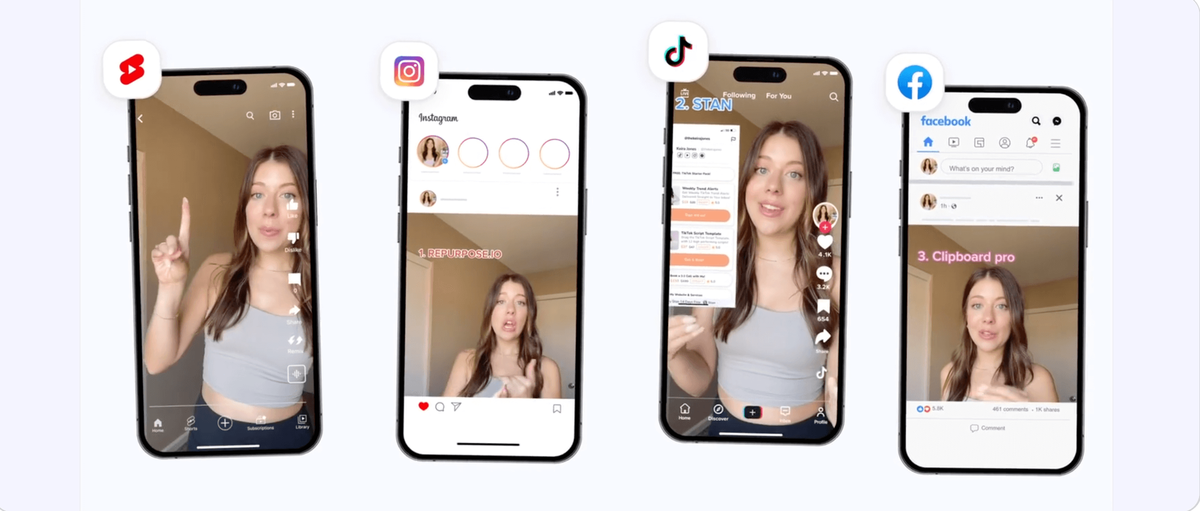
1. Customize by Platform

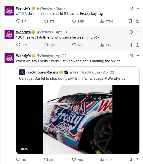
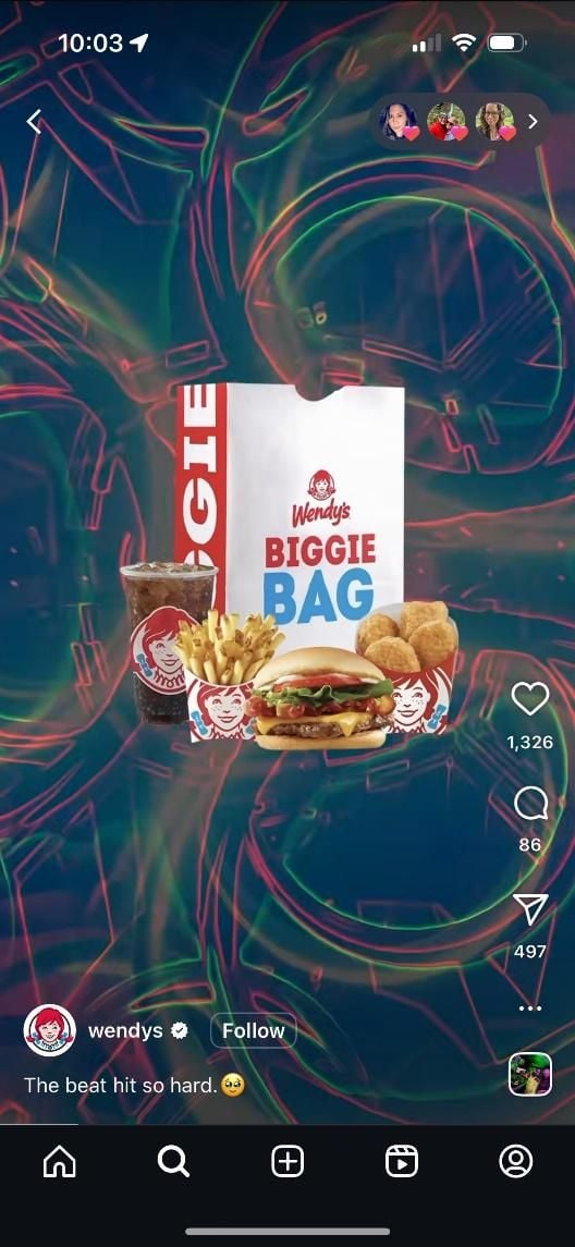
What works on TikTok might not work on LinkedIn, and vice versa. Tailor your content’s tone, format, and visuals to the platform you’re posting on. Wendy’s built their brand on X with snarky one-liners, but the food chain takes a more curated and visual approach on Instagram.

A Wendy's tweet series.
A Wendy's Instagram reel.

2. Embrace the Weird (Strategically)

Humor, absurdity, and left-field creativity often fuel viral trends. But you can’t force it. Duolingo’s TikTok presence leans fully into weirdness, but it’s consistent with their edgy, millennial-savvy voice.

Add Value. Don’t Just Copy

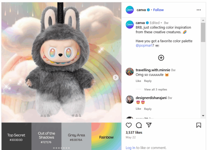
Don’t simply copy-paste a trending meme format. Add your brand’s POV, a clever twist, or insights that enhance the original. For example, Canva recently leveraged the app’s ability to create color schemes with the growing popularity of Labubu toys.

A Canva Labubu ad.

4. Prioritize Authenticity

Your audience can smell a cash grab a mile away. If the trend doesn’t align with your values or voice, skip it. If you really feel like you need to participate, subtly nod to the trend without trying to dominate it. Engage, like, or reply to accounts that have posted content in the trend without creating new assets on your own.

5. Keep the Content High-Quality

Even in a fast-moving trend cycle, visuals (and sound) matter. Low-res graphics or clunky text overlays can kill your momentum. Use templates or pre-approved brand assets to keep things polished under pressure.

r/funny - graphic design is my passion.

Trendjacking is not the time to let the copywriter have the keys to the Canva account.

When Trendjacking Goes Wrong…

Trendjacking is a real double-edged sword. When done right, it’s clever, memorable, and engaging. When done wrong, it’s also memorable, but for the wrong reasons; it’s tone-deaf, confusing, or even damaging to your brand. Avoid these common pitfalls.

Tone-deaf or Insensitive Posting

Some trends are tied to serious or sensitive events, and misjudging the tone can result in intense backlash. That’s what happened to Pepsi in 2017 for their ad that featured Kendall Jenner, which co-opted protest imagery to sell soda (and promptly got called out for trivializing real social movements).

Just because a topic is trending doesn’t mean it’s safe territory. Assign someone on your team to assess social sentiment and cultural context before engaging.

Jumping in Too Late

Timing is critical. A trend that peaked two days ago may already feel stale, especially if your post doesn’t add anything new. Joining late makes your brand look like it’s scrambling to stay relevant, not leading the conversation.

To avoid this, consider streamlining your approvals process and having brand-safe assets ready to go.

Misunderstanding the Trend

One of the fastest ways to make a brand look out of touch is to misinterpret the trend altogether. Imagine someone at your company wanted to tweet a meme that referenced “Netflix and chill,” without realizing its NSFW subtext. The internet might notice and not in a good way.

Before trendjacking, do a quick sentiment check. What does this trend actually mean to the people participating in it?

Forcing the Fit

If the trend doesn’t suit your brand voice, values, or audience, don’t force it. It’s painfully obvious when a B2B SaaS brand shoehorns itself into a Gen Z meme format meant for fashion or pop culture. This usually results in low engagement at best and audience cringe at worst.

Brands need a straightforward internal process for evaluating the risk of trendjacking campaigns. Who gets to greenlight? What criteria does the content meet? Building a lightweight risk assessment checklist or review board (creative + legal + DEI leads) can help you act quickly and responsibly.

Lack of Crisis Planning

Even with the best of intentions, things can go sideways fast. That’s why it’s smart to develop a basic crisis response protocol before engaging with fast-moving or culturally sensitive trends. Know who will respond, how quickly, and what steps to take if content sparks backlash. 

Measuring Success and Finding Learnings for the Future

With your trendjacking content out in the world, it’s time to answer the big question: Did it work?

Start by measuring the basics: likes, shares, reach, and impressions. These top-level metrics help assess immediate visibility and initial audience reaction.

Smart marketers go further, though. The most impactful trendjacking efforts don’t just rack up views. They strengthen brand equity and move the needle on meaningful outcomes. Ask yourself:

  • Was the engagement meaningful? Analyze the sentiment and depth of conversation in your engagement. Did people share it with thoughtful comments or tag their friends, or was the engagement just a flood of indifferent likes?
  • Did it shape perception or sentiment? Use social listening tools to see if brand sentiment improved during and after the campaign. Google Analytics and UTM parameters can help tie social moments back to web traffic and conversion goals.
  • Did it drive real behavior? Track clicks, sign-ups, or sales lifts during and after the campaign. This is another instance where Google Analytics and UTM parameters can help tie those moments back to web traffic and conversion goals.
  • Did it strengthen community? Great trendjacking does more than entertain. It builds a sense of belonging. If the post sparked DMs, follow-up content ideas, or user-generated content (UGC), that’s a sign your audience is invested.

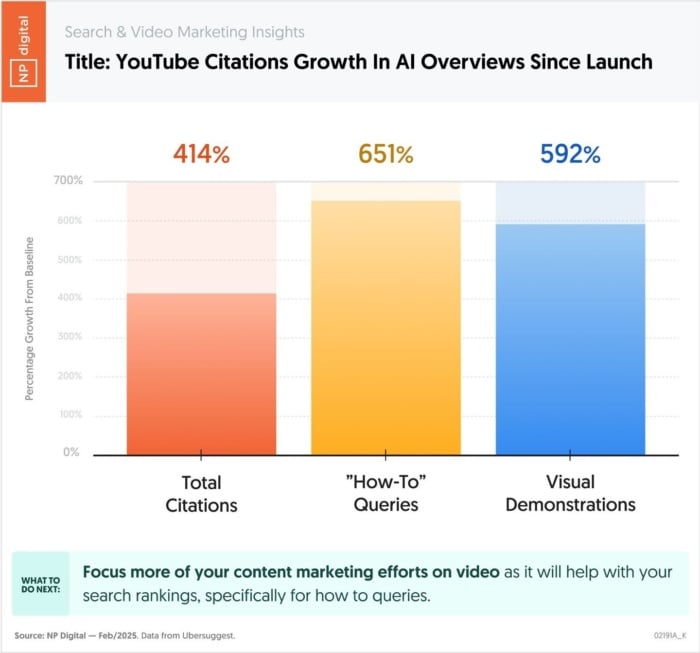
Want to level up your campaign? Try aligning your trendjacking posts with keyword-focused content or campaign themes. This gives your SEO strategy a boost, especially in a world where Search Everywhere is the norm (and users can Google the trend and stumble onto your brand).

Upcoming Trendjacking Trends

The art and science of trendjacking will only evolve as the digital landscape shifts. Marketers who want to stay ahead of the curve will need to keep a pulse on what’s trending and how those trends take shape and spread. The future of trendjacking will evolve thanks to things like AI, new platforms, and the rise of “unpolished” realness.

1. AI-powered Content Creation

AI is creating massive shifts in real-time marketing as tools like ChatGPT, Midjourney, and Runway help brands generate reactive content faster than ever. From clever captions to custom visuals, the future of trendjacking likely includes AI-enhanced creativity. The big challenge for brands is to remain authentic in the face of automation.

A social chatbot interaction creating an Instagram ad for Labubu.

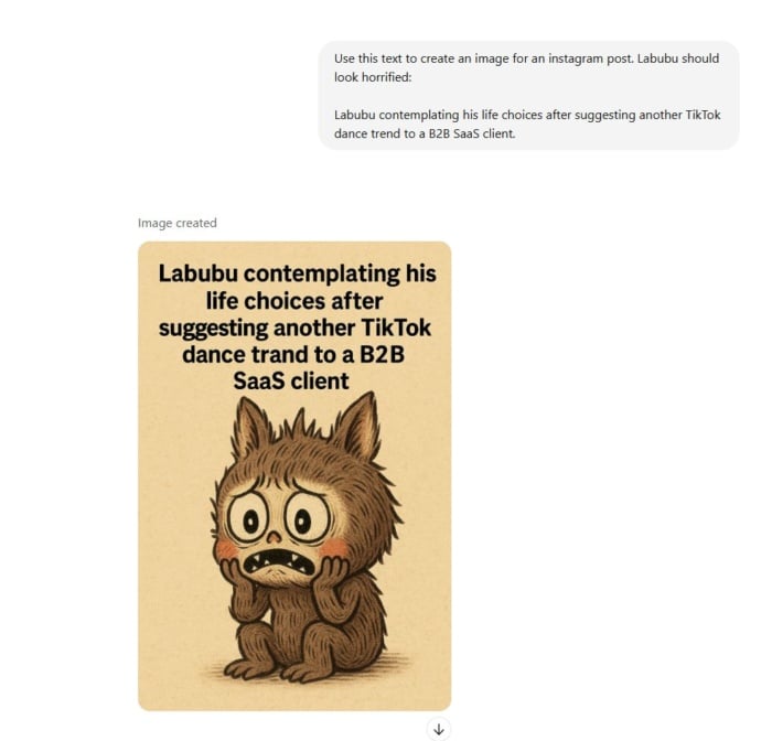
Could ChatGPT help brands jump on the enthusiasm for Labubu without spending the time to go out and source a doll? Possibly.

2. New and Niche Platforms

Instagram, TikTok, and X may reign supreme among platforms, but that won’t always be the case. Bluesky is becoming increasingly popular, and YouTube Shorts has challenged TikTok as a vehicle for short-form video content creation. Expect trendjacking to require more platform-specific fluency, understanding not just the content but the culture of each channel.

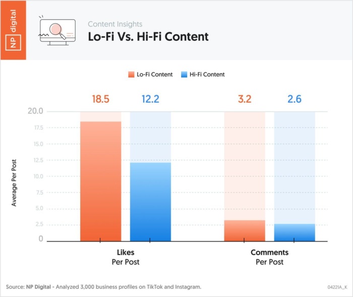
3. The Rise of “Unpolished” Realness

Consumers are tired of overproduced content. The next wave of trendjacking will favor brands that show up with honesty, humor, and heart. Even if that means posting something that feels more lo-fi than high-concept. Authenticity isn’t just a “nice to have” anymore. It’s a prerequisite for engagement.

A bobespizza Instagram ad.

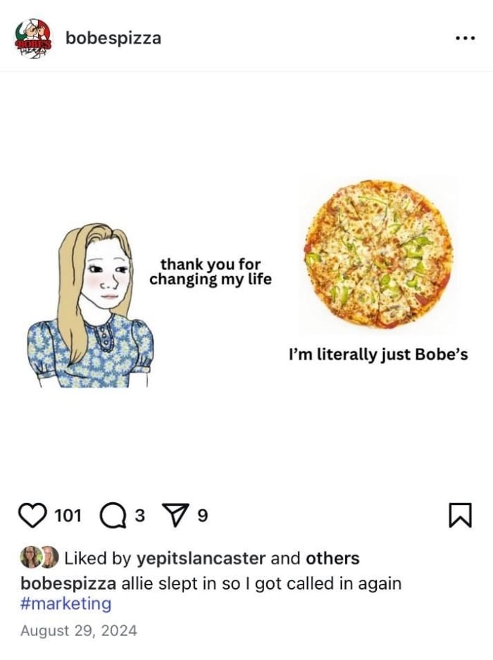
Bobe’s Pizza may be a small Indiana brand, but they lean on authentic content that resonates with their core audience.

The bottom line is that the future of trendjacking isn’t about being fast. It’s about being fast, smart, and real while building systems to let your brand respond with agility and intention.

FAQs

What is the difference between trendjacking and newsjacking?

While both strategies involve jumping into timely conversations, the difference lies in what you’re responding to. Newsjacking is about inserting your brand into breaking news stories — typically through PR or expert commentary — while trendjacking taps into broader online trends, like memes, pop culture moments, or viral challenges. Trendjacking is more social and creative, whereas newsjacking is often more formal and media-facing.

What is an example of trendjacking?

A classic example is Oreo’s “You can still dunk in the dark” tweet during the 2013 Super Bowl blackout. The brand reacted in real time with a witty graphic and caption, and the internet loved it. More recently, brands like Ryanair and Duolingo have gone viral for trendjacking TikTok memes using their unique, offbeat brand voices. The key to successful trendjacking? Speed, creativity, and cultural fluency.

What is the trendjacking strategy?

When done well, trendjacking helps brands increase visibility, boost engagement, and connect with audiences in a culturally relevant way. It shows your brand has personality and a pulse. Beyond racking up likes, the real value comes from building brand affinity, sparking conversations, and staying top-of-mind in an increasingly noisy digital space.

Conclusion

Trendjacking is about moving fast and smart. When you do it right, it can drive massive visibility and deepen brand affinity. It takes planning, awareness, and a clear voice to avoid the pitfalls and stand out in the scroll. Whether it’s memes, moments, or movements, show up with purpose.

If you need help crafting an agile social strategy that’s authentic and audience-focused, contact NP Digital to help you lead the conversation, not just follow it.

​ 

A meta description is a short text that tells the reader what’s on the page before they click. 

You’ve probably heard they’re important for SEO.

But are they really?

That’s what you will learn from the article. I will also share 11 actionable tips on how to write effective meta descriptions and answer a few common questions. 

Key takeaways

  • Meta descriptions don’t affect rankings directly but they can do it indirectly by improving click-through rates and user experience.
  • Google rewrites ≈70% of all meta descriptions, but it still recommends writing quality descriptions. 
  • Good meta descriptions concisely summarize the page, include target keywords, align with search intent, and encourage searcher clicks by showcasing page value. 

What is a Meta Description

Meta description is a short HTML tag that summarizes the page content. 

Here’s what it looks like for my blog:

Neil Patel's meta description.

Readers can’t see meta descriptions on the page without inspecting the code.

But they can see it in the snippet on the search engine results page, below the page URL and title.  

Neil Patel's meta description as it appears in Google.

Its job: to show readers what the page offers and persuade them to click. That’s why people often call it a page’s elevator pitch.  

Are meta descriptions still important for SEO?

The short answer: meta descriptions aren’t very important for SEO. 

Surprised? I bet you aren’t the only one. 

After all, writing meta descriptions has always been one of the core on-page SEO best practices.

Let’s unpack why. 

Meta descriptions aren’t a ranking factor for Google.

However, many SEO believe they improve rankings indirectly.  

This is based on the assumptions that:

  • Compelling meta descriptions improve click-through rates (CTRs).
  • CTRs are a user signal that Google considers when ranking pages. More people clicking on your page signal to Google it satisfies their search intent.
  • Well-written meta descriptions improve the user experience. They show readers what they can find on the page and help them decide if they want to visit on it or not. If they do, they’re less likely to bounce, and bounce rates are a quality signal for Google.

All sounds logical but no recent large-scale studies confirm the positive impact of meta descriptions on CTR or traffic

Experiments conducted by SEOTesting earlier this year indicated that optimizing meta descriptions barely affected traffic and a 2023 case studies by SearchPilot showed that removing them improve CTRs. 

A Linkedin post by Ryan Jones.

Google Rewrites Most Meta Descriptions

One reason why meta description optimization has limited impact is that Google replaces about 70% of them with content directly from the page.

Let me show you an example from one of our recent articles:

As you can see, the meta description tag reads “Discover what GPTBot is, how it works, and what its presence means for your website’s SEO, privacy, and AI data usage policies.”

Meta description code for the Neil Patel article: What is GPTbot?

However, if you search for “GPTBot,” that’s not what you find in the result snippet:

The What is GPTbot meta description as it appears in Google.

The snippet above was taken from the Key Takeaways section.

Key takeways for the What is GPTbot article.

The Verdict: You Should Still Write Meta Descriptions

If Google rewrites most meta descriptions and they don’t move traffic, why bother with them?

First, social media platforms like Facebook still display the original meta description when users share the page. So, by skipping it, you reduce its visibility and shareability. 

The What is GPTbot article as it appears on Facebook.

Secondly, Google itself still recommends it as means of “controlling the snippet.” Essentially, Google may use it in the SERP snippet if it answers the user query better than what Google finds on the page.

Google's guidance on controlling snippets.

So although adding meta descriptions isn’t critical for SEO, still do it. 

Yes, Google often replaces them. But you have a 30% chance that it doesn’t. If you skip the tag, you give up control of the first impression your page makes in SERPs without a fight. 

How to Write a Meta Description: 11 Top Tips.

With the theory out of the way, here are 11 tips for writing meta descriptions that searchers (and Google) will like. 

  1. Stay Under 156 Characters and Front-Load

To ensure readers can see your meta description, don’t go over 156 characters and put the most key info in the first 110 characters. 

Google cuts off the snippet based on pixel length: 960 pixels on desktop and 680 pixels on mobile. That’s roughly 145-155 and 110-130 characters, respectively.

Writing tools, like NeuronWriter below, feature snippet simulators, so you can preview it as you’re crafting your description, so you don’t overflow.

Neuronwriter's snippet simulator.
  1. Check Existing Snippets

Analyzing the snippets for your keyword helps understand what kinds of descriptions Google prefers.

For example, all the meta descriptions for “motorcycle helmet” feature words like collection, range, or selection, kinds of helmets (full face, open face, flip up, etc) and brand names. 

Mimick it when crafting your homepage or category page descriptions. 

A Mega Motorcycle Store meta description.
  1. Satisfy Search Intent

Your meta description must reflect the search intent. Or in other words, it spell out what need it satisfies or problem that it solves. 

For example, the article ranking #1 for ”keto diet’ has a definition of the diet and a brief explanation of how it works because the keyword has informational intent and that’s the kind of information users are after. 

A Healthline meta description.

In contrast, the meta description for the homepage of Next, the UK retailer, aligns with the transactional/navigational intent. Anyone looking for ‘Next’ is likely shopping, so “Shop the latest women’s, men’s and children’s fashion…” nails it. 

A Next Direct meta description.
  1. Highlight the Benefits

To win searchers’ clicks, show them what they will gain.

For a blog post or a guide, state what they will learn. 

Like the meta description for the guide to fitting kitchen worktops, which promises to show the reader how to install it themselves without hiring a professional fitter. 

A B&Q meta description.

For a product page, show potential customers its unique value proposition and how it will change their lives for better. 

Slack’s meta description is a perfect example. It explains what the product does (“is a new way to communicate with your team”) and shows its advantages over alternatives (“faster, better organized and more secure than email”).

Slack's meta description HTML.
  1. Use Active Verbs & Add a Compelling CTA

An effective meta description drives user action through a compelling CTA.

For a blog article, this could be “visit to learn”, for a software product page, “start free trial now”, and for a car, “Book a test drive today,” just like in the Toyota Yaris example. 

The Toyota meta description starts with an imperative “enrich” which is also a common tactic to prompt readers to act. 

A Toyota UK meta description.
  1. Clearly Describe the Page Content

Effective meta descriptions summarize the page content accurately to tell the potential readers what they can find in the article to help them decide if it’s relevant.

That’s what the meta description for the BBC Gardeners’ World Magazine article on how to build a garden pergola does.  It tells them what the article includes (advice, ideas) and how it’s structured (a list). 

A BBC Gardeners World Magazine Meta Description.

Inaccurate or misleading meta descriptions backfire: if the reader expects something else from the page, they bounce. This hurts the page rankings by signaling Google that the page isn’t relevant.  

  1. Include Primary Keywords Naturally

Including target keywords in your meta description is another way to signal relevance and help the meta description stand out.

How so?

Google boldens words and phrases related to user query in the snippet.

For example, when I searched for “climbing shoes,” it returned multiple results with the keyword boldened, including the one from Rock + Run product category page. 

A Rock + Run meta description.

But embed the keywords naturally. 

Keyword stuffing makes no sense because A) meta descriptions aren’t a ranking factor, B) Google considers it a spammy practice will most likely replace such descriptions.

And it will do it for your own benefit because it makes text hard to follow, negatively affecting the user experience, which may harm your brand perception. 

  1. Make Your Meta Descriptions Stand Out

Stand-out meta descriptions catch user attention and stop them from scrolling past.  

You can achieve this with:

  • Eye-catching phrases
  • Sensory descriptions
  • Rhythm and rhyme
  • Alliterations 
  • Witty puns, jokes and idioms (like “make a splash” in the M&S description).
A Marks & Spencer meta description.

Beware of clickbait — sensational wording, contrarian opinions, or half-truths. These might be fine for certain sectors, like celebrity news sites, but won’t cut it in ecommerce or SaaS.  

Likewise, spammy claims like “best in the world” don’t inspire confidence while misleading and overpromising can bite you back: users won’t get what they expect and will bounce. 

  1. Match Your Brand Voice

Whatever the vibe of your home or product pages, match it in the meta descriptions. If you nail, you will improve brand recognition. If you get it wrong, you will undermine visitor trust.

For example, Naked Coffee’s home page tag perfectly mirrors the tone of its site and social media content. 

A Naked Coffee meta description.
  1. Write Unique Descriptions for Every Page 

Google recommends writing unique meta descriptions to differentiate pages. 

An example of Google recommendations for meta descriptions.

Duplicate meta descriptions confuse readers and don’t help them choose the right page.

They also signal that you may not care much about the user experience (read “you’re lazy”).  

You can quickly identify meta description issues like duplicates by running the SEO Audit with Ubersuggest. 

Ubersuggest's SEO audit function.
  1. Be Consistent Across the Website

A consistent meta description format across your website provides a predictable user experience.

Mind you, it doesn’t mean ALL pages across the whole website should follow the same format.

But definitely pages of the same category. For example, all category pages and all product pages within the same category. 

How to Write Meta Descriptions At Scale

For large websites with hundreds or thousands of pages, writing meta descriptions manually isn’t always feasible. 

The solution?

Write them manually for the mission-critical pages, like your homepage, category pages, or top-converting product pages. 

And generate the rest automatically, using:

  • Programmatic SEO: Create content from templates using data from structured databases or spreadsheets. Setting it up requires a certain level of technical expertise but once done, you can generate thousands of meta descriptions within minutes. 
  • AI chatbots: Build a spreadsheet with all your pages, for example, by downloading it from the SEO tool, and prompt ChatGPT, Claude or Gemini to create the descriptions. Make sure to provide all the details, like the desired length and what it should include. The downside is that you still need to import these to your CMS. 
An AI-generated meta description prompt.
  • CMS plugins: Install a plugin like AI for SEO (WordPress) or Metagen (Shopfiy) to generate meta in bulk. You can do it either with AI or by inserting variables, like 

Whatever approach, always review and edit the descriptions manually to avoid embarrassing misfires. 

FAQs

To finish, let’s answer a few frequently asked questions about meta descriptions.

What is a meta description in SEO?

It’s a short summary that shows up under your page title in search results. It doesn’t help you rank directly, but it can boost clicks by telling people what they’ll get if they visit your page. Think of it as your page’s pitch, fast, clear, and built to earn the click.

How to write meta descriptions for SEO?

To write an effective meta description, consider including relevant keywords and phrases that accurately describe the content on your web page.
Additionally, ensure:
Your meta description is unique and compelling.
You use active language.
That you highlight the benefits or solutions visitors can find on your page. 
You include a call-to-action.

Do meta descriptions affect SEO?

While Google doesn’t count meta descriptions as a ranking factor, meta descriptions still play a vital role in your SEO. 
Why? The brief summary you provide in a meta description gives users an idea of what to expect. This entices viewers to engage as they can see that your content meets their needs.
Optimized meta descriptions can also enhance click-through rates.

How long should a meta description be for SEO?

The standard length for meta descriptions is 155 characters, but up to 160 is acceptable.  Don’t forget to check the pixel widths of your meta descriptions to avoid truncated results. For mobile aim for 680 pixels, and for desktop 960 pixels.

Conclusion

Meta descriptions aren’t very important because they aren’t a ranking factor and Google rewrites most of them. 

But if you don’t provide a meta description, you voluntarily surrender control over how users see your page in SERPs. This means missed opportunities to attract users and shape your brand image online. 

That’s why writing meta descriptions is still one of the core SEO best practices. 

​ 

SMS marketing is an effective way to meet your target audience exactly where they are—their smartphones. With short snippets of text messages, SMS marketing can be a great way to engage customers and boost sales.

Throughout this article, we’re going to dive deeper into what a successful SMS marketing strategy looks like, plus some top tips and tools for making it work for your business.

Key Takeaways

  • SMS marketing is a great method for communicating directly and effectively with your audience.
  • With SMS marketing, you’re getting access to a faster, higher engaging, and less saturated form of marketing.
  • To maximize results, be sure to require opt-ins, send short and sweet messages, identify your company with each communication, and optimize your timing.

What Is SMS Marketing?

SMS marketing is a promotional strategy that uses text messaging to communicate with current and potential customers. Due to the nature of texting, SMS marketing tends to focus more on short promotional messages like discounts, sales, product launches, and low stock alerts.

Benefits of SMS Marketing

SMS marketing is a newer strategy so it comes with a lot of benefits that not many companies are taking advantage of yet. If you’re considering creating an SMS marketing strategy, these perks might be just the thing to sway you.

It’s Less Saturated

Of all the types of digital marketing—social media, content, email, etc.—SMS marketing is one of the lesser used tactics. This can give you an edge because customers aren’t inundated with marketing texts the way they are with marketing emails or social media posts.

So if someone in your target audience opts in for SMS communication, you can be sure that they’re probably actually reading your text, and not just sending it to the trash because their inbox is overflowing with messages from brands.

You Have Faster Open Rates

People tend to open text messages they receive faster than new emails. In fact, 90% of people open new texts within the first three minutes. This means you can watch your results come in much more quickly with SMS messages than with emails, getting a sense of how your texts are performing almost instantly.

Get Better Engagement

Not only do you see faster results, but you see better results. Text messages have a 98% open rate, 5x the open rate of marketing emails. Most businesses see an SMS click-through rate between 21-35%, meaning people are also interacting with their texts.

Plus, the opt-out rate is just 1-2%, meaning people tend to stick around with text message marketing more than via other channels.

Create an Omnichannel Strategy

SMS marketing can be a huge part of a successful omnichannel marketing strategy. Let people hear from your business in their preferred channels, and make it easy for them to shop via mobile by sending promotional messages straight to their smartphones.

Personalize Your Communication

Texting is a much more personal form of communication. But more than that, you can make it even more personal by using their name, segmenting people based on their behavior with your business, and bringing a really personalized approach to your strategy.

It’s Cost-Effective

SMS marketing is a cost-effective way to promote your business and its products or services. You just need an SMS marketing platform and some copy—no need for additional visuals or assets, making this a quick and easy strategy to get up and running.

Top SMS Marketing Tips & Best Practices

To make the most out of your SMS marketing strategy, you need to implement some best practices. These tips can boost your results and help your SMS communications perform even better.

Only Send Messages to Customers Who Opt In

Just like with email marketing, you must receive an actual opt-in or consent from a customer to start sending them text message communication. Your business must comply with the Telephone Consumer Protection Act (TCPA) if you or your customers are in the United States, or whatever SMS regulations are available in your audience’s country/ies.

This doesn’t have to be a complicated process. Ask for people to opt into your text message communications the same way you would ask them to sign up to receive your email newsletter.

Take a look at this example from Crate and Barrel’s website to see what we mean:

A Crate and Barrel SMS ad.

Source

Entice People to Opt In

Want to boost your SMS subscribers? Give them an offer they can’t refuse. Many businesses use pop-ups on their website to ask people to opt-in to their email and/or text communications by offering a discount code.

Here’s an example from soda brand Poppi:

A Poppi ad.

Source

A 15% off discount isn’t a bad deal for simply handing over your email address and phone number. And it’s just on the customer’s first order. So you’re likely generating a new customer at the same time you’re getting them to opt into marketing communications. Win-win, right?

Send Short Text Messages

The maximum character count for SMS messages is 160 characters, so your texts need to be short and sweet, conveying your message in just a quick sentence or two. But more than that, people don’t want to open a text message to a wall of content—unless they’re getting the latest gossip from their friends.

Take a page out of beauty brand NaturAll’s book. Each of their marketing texts is straight to the point, letting customers know exactly what they’re promoting, whether it’s a $9.99 sale or a new product:

A NaturAll ad.

Identify Your Company in Your Texts

Not everyone who opts into your SMS messages is going to save your company’s contact information. This means it’s important to identify yourself in each message you send.

Here’s an example from mattress company Casper. The brand includes its company name at the start of every text it sends—a common way for brands to identify themselves right from the jump:

A Casper SMS ad.

Optimize Your Message Timing

Text message timing is a bit more sensitive than email timing. Most people don’t receive email notifications straight to their phone, whereas texts alert them every time. This means you need to ensure you’re sending your text communication during times you won’t be interrupting your customers.

Many regulations even have parameters in place to ensure companies can’t bother consumers during inopportune times. For example, according to the TCPA, companies cannot send text messages between the hours of 9PM and 8AM in their local time zones.

So you need to keep timing in mind so you’re not sending messages during the wrong time frame. But you also want to optimize your timing to improve the chances that your customers will take action after reading your messages.

If you look back at our example from Casper, you can see that the brand sends its text messages at 12:01PM like clockwork. Try to find a time between 10AM and 5-6PM that seems to work for your brand.

Don’t Text Too Often

If you send too many text messages, you’re going to have an extremely high opt-out rate. Analysis from SMS marketing platform Attentive shows that sending more than 10-15 messages per month can make your opt-out rate skyrocket.

This is different from email marketing, where some industries send daily emails. Instead, you want to max out at 1-2 text messages per week, sometimes going as infrequent as 2-4 texts per month.

Send More Than Just Promotional Messages

Many brands use their SMS strategies just to send out discount/sale alerts, product launches, low stock reminders, and more. However, you should expand your strategy and send out more than just promotional messages.

You can use your SMS marketing communications for:

  • Promoting events
  • Sharing details about your loyalty program
  • Sending people to educational content on your website

Look at this example from baby formula brand Enfamil. The company sends out plenty of promotional messages, while balancing out their communication with educational content, too:

An Emfamil SMS ad.

Finish With a Call to Action

What action do you want your text recipients to take? Make it clear by ending your messages with a call to action (CTA). This can be a simple “Shop now,” or “Learn more.”

Take a look at how organic baby brand Snuggle Me adds a call to action at the end of each of its messages, making it easy for the recipient to take the exact desired action:

A Snuggle Me SMS ad.

Ensure Your Website is Mobile-Friendly

If you’re using SMS marketing to send people to your website, they’re almost always going to be clicking to your site using their mobile device. If your website isn’t mobile -friendly, you’re essentially losing customers as soon as they click, making your SMS efforts completely obsolete.

If you’re going to use SMS marketing, your website needs to be mobile friendly so customers can click your links, shop around, and check out all via their mobile devices.

Make it Easy to Opt Out

Just like with email, you don’t want your customers to have to jump through hoops to unsubscribe. They’ll get frustrated if they can’t easily figure out how to opt out from receiving texts from your brand.

Take a look back at our example from Snuggle Me. Every single text ends with “Text stop to stop.” Enfamil ends theirs with “Text STOP to cancel.”

Use a similar strategy to make sure your recipients know exactly what to do if they decide they’re not interested in hearing from your business anymore.

7 Easy-to-Use SMS Marketing Tools

If you want to launch your own SMS marketing strategy, you need the right tool to help. These SMS marketing tools are perfect for creating, sending, and analyzing your text campaigns.

Textedly

The Textedly homepage.

Textedly is a great SMS marketing platform for businesses looking to send out mass marketing messages, as well as have 1:1 conversations with their customers. Send out your marketing texts while also reaching customers directly to send appointment reminders, ask for reviews, and more.

Pricing: Free for your first 50 text messages. Paid plans start at $26/month for up to 600 monthly messages.

Attentive

The Attentive homepage.

Attentive is a great tool for businesses looking to combine their SMS and email strategies as you can send both types of communication using this platform. It also offers RCS messaging, which is a more modern version of messaging that incorporates additional features from platforms like iMessage and WhatsApp.

Pricing: Request a demo to get pricing information.

Twilio

The Twilio homepage.

Twilio is a customer engagement software that makes it possible for businesses to connect with their audience via platforms like SMS messaging, email communication, voice chat, and video. This is a great way for your brand to build an omnichannel experience seamlessly through just a single tool.

Pricing: Pricing varies based on the types of communication you want to send out.

SimpleTexting

The SimpleTexting homepage.

SimpleTexting is an SMS marketing service that lets you send out mass marketing messages or communicate one-on-one with your customers. If you want to offer text message customer service so your audience can reach you directly via their mobile phones, this is the perfect platform to get started with.

Pricing: Plans start at $39/month for 500 messages/month.

Textmagic

TextMagic's homepage.

Textmagic is another platform that makes it easy to send both SMS and email communication from one seamless dashboard. Create interconnected campaigns to promote your business and analyze your results in the Textmagic interface.

Pricing: Plans vary based on your usage. For example, for just 500 texts and 500 emails/month, you’ll pay just $37.50/month. It’ll go up from there, based on how many messages you’re sending so you’re never paying for messages you don’t need.

SlickText

SlickText's hompeage.

SlickText makes it easy to send comprehensive SMS marketing campaigns, letting you put together one-off messages, create automated workflows based on how customers respond to your promotions, and segment out your audience to personalize your messaging.

Pricing: Plans start at $29/month for up to 500 monthly messages.

EZ Texting

EZTexting's homepage.

EZ Texting is another great SMS marketing platform that enables brands to send mass marketing messages, hold one-on-one conversations, create text automations, and more. With EZ Texting, you can even get access to AI tools that help you compose texts so your brainstorming and content creation process is jumpstarted for you.

Pricing: Plans start at $20/month for up to 500 contacts.

FAQs

What is SMS marketing?

SMS, or short messaging services, refers to using text messages to communicate with leads or customers. Brands can share promotions, news, shipping updates, and more.

Does SMS marketing annoy customers?

If you don’t use them correctly, SMS marketing can definitely backfire and annoy your customers. Make sure to ask permission, make it easy for consumers to opt-out, and only send specific or time-sensitive messages — such as a sale.

Is SMS marketing expensive?

No, it’s often much cheaper than other types of marketing like paid ads because each message usually only costs a few cents each to send.

Why should I use SMS marketing?

SMS marketing is cost-effective, easy to deploy, and incredibly effective because messages are delivered directly to users’ phones.

Is SMS marketing effective?

Yes, when it’s done right. People open texts faster than emails, and they’re way more likely to read them. SMS has higher engagement, lower competition, and quicker results. If your list is opted-in and your timing’s smart, SMS can drive real revenue.

Get Started With SMS Marketing

SMS marketing is a key strategy for communicating with your customers in a quick and easy way. Share sales, discounts, launches, educational content, and more in a digestible format that your audience will receive almost instantly. If you want to implement even more great ways to reach your audience, I’ve also created a full guide to email marketing you won’t want to miss.

​ 

If you don’t know how much it costs to acquire a customer, you’re flying blind. And if you do know, but you’re paying too much, you’re in trouble.

The simple fact is, scaling a business without understanding your customer acquisition cost (CAC) is like trying to fill a leaky bucket.

This post will break down what CAC is, how to calculate it the right way, and how to reduce CAC without killing your growth.

Key Takeaways

  • Customer acquisition cost should account for so much more than ad spend. When you’re only tracking ad spend, you’re missing the bigger picture of what it truly costs to win a customer.
  • A healthy CAC marketing strategy balances cost efficiency with long-term value. Alongside CAC, you should also consider LTV and payback period. These combined will tell you more about your success than CAC alone.
  • An increasing CAC isn’t always a bad sign. Use this time to evaluate your funnel, but also consider that this increased cost may contribute to increased value. 
  • You don’t need to kill growth to reduce CAC. Start with what’s already working: optimize your website, lean into organic, and automatic where possible. 
  • Your happiest customers are your best way of reducing CAC. Invest in keeping them because their LTV will not only reduce your CAC but it may bring in additional leads.

What is Customer Acquisition Cost (CAC)?

Customer acquisition cost (CAC) refers to the total expense incurred in acquiring a new customer. 

Here’s the basic formula:

CAC = (Total Sales and Marketing Costs) / Number of New Customers Acquired

Sounds simple, but here’s where most people mess it up: they only include ad spend. 

You also need to include expenses such as:

  • Ad spend
  • Content creation (blog writers, video editors)
  • Marketing tools and software
  • Team salaries
  • Free trials, discounts, onboarding costs
  • Sales commissions and tools
  • Sales travel and events

Example: You spend $25,000 and land 500 customers. That’s a CAC of $50. 

Why CAC Matters More Than You Think

If you don’t have a handle on your CAC, you’re probably wasting money. Even worse? You might think you’re profitable when you’re not.

It’s not just about how much you spend, but whether you’re spending it efficiently.

The straight CAC calculation above isn’t the only one that matters, though. You should also consider the following metrics as part of your overall marketing strategy:

  • Lifetime Value (LTV) to Customer Acquisition Cost (CAC) ratio: You want at least a 3:1. That means for every $1 you spend, you make $3.
  • CAC payback period: How long until you break even on a customer? The shorter, the better.
  • Channel-specific CAC: Know your per-channel numbers. SEO CAC might be $20, but paid social CAC could be $100. 

What’s a Good CAC? A Look at Industry Benchmarks

A “good” CAC depends heavily on your industry, pricing model, and the length of time your customers stay. But having ballpark figures can help you understand how your acquisition costs stack up. 

Here’s what CAC looks like across industries: 

  • Startups (Seed to Series C): $400 to $900, depending on vertical and funding stage
  • Ecommerce: $86 average, with ranges between $45 to $150 depending on AOV and product type
  • B2B:
    • Legal: $1,245
    • IT/Managed Services: $1,180
    • SaaS: $702
    • Financial Services: $1,067

More important than how you compare to others in your industry is how you compare to yourself. 

A low CAC doesn’t always mean you’re doing great, but one that is steadily decreasing while other metrics grow or remain steady (like revenue, orders, etc) is a step in the right direction.

How to Calculate Your Real CAC

You can’t fix what you can’t measure. And most businesses underestimate their CAC because they forget to include the full picture.

Here’s what you need to add up:

  • Ad spend (across all channels)
  • Content creation and creatives (even for organic content)
  • Marketing and sales tools
  • Team salaries (and commissions) and benefits
  • Discounts and returns
  • Agency fees or freelancers
  • Any customer onboarding or support costs

Example: If the above costs $80,000 and you receive 1,000 new customers, your CAC is $80.

A graphic showing how CAC works.

Now, what if you have a subscription model?

In subscription-based businesses like SaaS, CAC should be spread over the average customer lifetime. For example, if your CAC is $300 and your average customer stays for 15 months, you’re paying $20 per month for each customer.

This helps align acquisition costs with the recurring revenue they generate and gives you a clearer view of profitability over time. 

Top Mistakes That Drive CAC Through the Roof

Here’s what I see killing CAC marketing strategy time and time again:

  1. Ignoring team and tool costs: Your tools and salaries count.
  2. Living off paid ads: Paid channels get expensive fast. Branch out into organic marketing.
  3. Chasing volume over quality: If customers churn fast, your CAC increases.
  4. No attribution strategy: Without solid tracking, you over-invest in what looks good but doesn’t convert.
  5. Short-term promotions: They boost conversions but often attract low-LTV customers.

Fix these, and your CAC will drop. Fast.

Multi-Touch Attribution for Smarter CAC Tracking

While I mentioned attribution strategy above, it deserves its own section. Why? The attribution model you use can make or break your CAC tracking. 

Modern buyers interact with multiple touchpoints before making a purchase. If you rely on first-click or last-click attribution, you’re missing out on valuable information.

That’s why multi-touch attribution is the best approach.

With multi-touch attribution, you distribute credit across every interaction. 

For example, imagine a customer who first clicked on a Google ad, then read your blog, and finally converted via an email promo.

With first-touch, you’re giving all the credit to Google, which can result in costly increases to your ad budget. With last-touch, you’re giving all the credit to email, which can result in a failure to support other avenues (like your blog). 

Multi-touch attribution enables you to assign a portion of the CAC to each of those channels, providing a clearer understanding of what’s truly effective.

Here’s how it helps reduce CAC:

  • Allocating spend intelligently. See which touchpoints drive conversions (so you can invest more) and which are merely noise (so you can reduce spend).
  • Forecasting smarter. Use historical multi-touch data to estimate the true cost of new customer acquisition.
  • Aligning teams. When sales and marketing see that both of their teams contributed to a conversion, it improves alignment and resource sharing.

Multi-touch attribution makes for more accurate CAC, which makes for smarter decisions.

How to Lower Customer Acquisition Cost Without Killing Growth

Let’s talk solutions. Here’s how to lower your CAC and still scale like a champ.

Dial in Your Website and Funnel

Your website is your best salesperson, so make sure it’s optimized to convert.

Consider the following changes that can have a big impact:

  • A/B test headlines, calls to action, images, and offers
  • Improve site speed
  • Remove friction from the checkout or sign-up flow
  • Minimize form fields and unnecessary steps

Also consider incorporating referrals and similar customer acquisition strategies into your funnel.

Dropbox is a notable example of this, achieving a 3,900% growth rate in just 15 months. 

Their “give and get storage” model rewarded current users and their invitees with 500MB each of additional storage. Referral links were integrated directly into onboarding, and the system provided transparent tracking so users saw their progress.

This virtually zero marketing cost strategy made this campaign all the more successful and led to decreased CAC while driving explosive growth.

Go Big on Organic

If you focus only on paid channels, you could be unnecessarily bloating your CAC. Organic marketing can naturally decrease CAC by driving more customers will significantly less cost than paid channels.

How?

  • Create SEO-driven blog content that solves your customers’ problems
  • Repurpose blog content into videos and short-form social posts
  • Stay active on platforms where your audience actually hangs out
  • Lean into user-generated content (UGC) and word-of-mouth marketing

Don’t forget email, too. Automated drip campaigns keep leads warm and buyers engaged long after the first click.

Retention as an Acquisition Strategy

Keeping customers is often more cost-effective than acquiring new ones.

Take Glossier as an example. In a 2018 interview, the founder stated that repeat purchasers drove over 50% of revenue. That, combined with their customer-led growth strategy, has turned Glossier into the cosmetic powerhouse it is today.

If you want to lower your CAC by nurturing existing relationships, focus on:

  • Onboarding experience: Drive early wins and product adoption with an exemplary onboarding experience.
  • Referral programs: Reward your customers for sharing your product/service and generating warm leads.
  • Loyalty perks: Identify which loyalty perks your customers appreciate (such as discount codes or free products) and use them to encourage repeat business.

Remember, happy customers are your best marketers. This retention approach won’t only lower CAC, but it will also boost LTV.

Get Smart With Paid Ads

Organic marketing is important, but paid ads aren’t the enemy. A bad ad strategy is, though. Here’s how to tighten up your strategy for improved CAC: 

  • Refine targeting and use lookalike audiences built from high-value customers
  • Optimize for return on ad spend (ROAS), not just impressions
  • Test lower-lost platforms (like Pinterested and Reddit)
  • A/B test your campaigns, including headlines and creative

The greatest tip of all: be ruthless with underperforming campaigns. Pause, tweak, or cut them fast so your ad campaign doesn’t quickly devolve into a money pit.

Automate and Streamline

How much time and money are you spending on manual processes? Automate as much as you can to lower CAC and reduce friction. 

Here’s how:

  • Automate onboarding emails and customer education series
  • Use AI to personalize offers and predict behavior
  • Align sales and marketing teams with shared CRM workflows

Efficiency means a lower CAC. It’s that simple.

Tools to Help You Track and Optimize CAC

You don’t have to do this alone. There are various tools available to support your CAC optimization journey.

Monitor User Journeys: GA4

A Google Analytics landing page.

GA4 helps you understand exactly how users move through your site.

From first click to conversion, you can identify drop-off points and optimize touchpoints that matter most.

Track Attribution: Northbeam

Northbeam.io home page

Northbeam provides multi-touch attribution, showing which channels and campaigns drive conversions.

No more guessing which ad gets the credit.

Make Smarter SEO Decisions: Ubersuggest

Ubersuggest home page

Lowering your CAC starts with attracting the right traffic. That’s where Ubersuggest comes in.

Ubersuggest can help you identify high-intent, low-competition keywords your ideal customers are already searching for. By targeting those terms, you can drive more organic traffic without paying for every click.

With Ubersuggest, you can spend less time on acquisition and get more qualified leads in the door.

Automate CRM: HubSpot

HubSpot CRM landing page

HubSpot streamlines customer management with automated workflows, lead nurturing, and pipeline tracking. 

Automate Email Sequences: Klaviyo

Klaviyo home page

Klaviyo makes email marketing smarter with data-driven automations that respond to customer behavior. These keep engagement high and CAC low.

Visualize Customer Drop-Off: Crazy Egg

Crazy Egg homepage

Crazy Egg shows you where users click, scroll, and drop off on your site. Use heatmaps and session recordings to quickly resolve friction. 

FAQs

What is customer acquisition cost?

CAC is the cost of convincing a potential customer to buy a product or service. It includes everything you do to attract a new customer, like your advertising, the staff you employ, and your tools.

How do I calculate customer acquisition cost?

Take your total expenses spent on acquiring customers over a specific time and divide it by the number of customers you gained in that same time.

How do you lower customer acquisition cost?

Start by fixing your funnel. If your site’s clunky or confusing, you’re paying to lose people. Then, build out organic channels like SEO, email, and referrals, which scale without burning cash. Use multi-touch attribution to track what’s actually working, and cut what’s not. Automate where it saves time, and keep your best customers happy so they’ll do your marketing for you.

Conclusion

Customer acquisition cost is a reflection of how well your business turns effort into growth. 

If it’s too high, don’t panic. Instead, get curious.

Where’s the waste? Where’s the friction? Start small: optimize your funnel, test organic channels, and automate what you can. 

The goal isn’t to spend less, but to spend smarter. So measure often, adjust quickly, and remember that your best customers often bring the next ones with them.

​ 

The 21 Best Social Media Marketing Tools to Try in 2025

While it’s entirely possible to have a strong social media marketing strategy without a stack of tools, the right ones can make your life a lot easier.

Social media marketing tools can help you create content, schedule posts, engage with your audience, analyze performance, study competitors, keep up with trends, search influencers … phew! I could go on.

Whether you’re flying solo or working with a team, having a few good tools in your toolbox can save time and help you focus on what really matters: creating great content and connecting with your audience.

The challenge isn’t just stitching these tools together (though that’s no easy feat either!): it’s figuring out which ones are worth your time and budget.

In this article, we’ve rounded up 21 of the best social media marketing tools for various use cases to save you the trouble of researching.

Some of the tools on this list will help you do multiple tasks, while others are more specialized. Whatever your strategy is, you can mix-and-match tools from this list to bring your social media marketing plan to life.

Let’s get into it.

Jump to a tool:

  • Buffer: Best for creators and small business owners
  • Hootsuite: Best for combining social media management with social listening
  • Sprout Social: Best for combining social media management with influencer marketing
  • Verlynk: Best for combining social media management with social media monitoring
  • Madgicx: Best for creating Meta ads
  • Kitchn: Best for managing a social media advertising strategy
  • Keyhole: Best for market research
  • Siftsy: Best for analyzing comments on your posts
  • Socialinsider: Best for a deep dive into your performance analytics
  • Mention: Best for social listening
  • YouScan: Best for image monitoring
  • SparkToro: Best for audience insights
  • Manychat: Best for DM automation
  • Modash: Best for finding influencers
  • Short.io: Best for shortening your URLs
  • Repurpose.io: Best for repurposing your short-form videos
  • Quuu: Best for content curation
  • Canva: Best for editing your images
  • CapCut: Best for editing your videos
  • Rival IQ: Best for competitive analysis
  • Supermeme.ai: Best for turning text into memes

1. Buffer

Best social media marketing tool for creators and small business owners

The 21 Best Social Media Marketing Tools to Try in 2025

Free plan/trial available: Yes. Free forever for up to 3 channels. All paid plans also have a 14-day free trial.

Price: Paid plans begin at $6/month/channel.

Buffer is a social media management tool that can make many tasks on your to-do list easier. Some of my favorite core features:

As you can probably guess, Buffer alone is powerful and can take many tasks off your plate. However, the great part about Buffer is that it is both powerful and easy to use (one of the rarest combinations in the world of social media marketing tools, in my opinion).

Buffer’s also quick to add all the above functionalities for new social media platforms (hi there, Threads and Bluesky) at whip speed. This means that Buffer can evolve as your strategy shifts — a big plus when you don’t want the headache of adding another social media marketing tool for a new platform.

Creators and social media managers often struggle with posting consistently because they have a lot to do besides social media management. This is why Buffer has habit-building features like streaks to keep you motivated. The tool also makes it easy to store ideas using the create space (my favorite feature), because inspiration can strike anywhere, anytime.

🚀 Sign up for Buffer’s free-forever plan

2. Hootsuite

Best social media marketing tool for combining social media management with social listening 

The 21 Best Social Media Marketing Tools to Try in 2025
Source

Free plan/trial available: No free plans. All paid plans have a 30-day free trial.

Price: Pricing starts at €149/user/month for five social media channels

Like Buffer, Hootsuite is a social media management platform. This means you can use it to publish posts on multiple platforms, track performance, and respond to comments. But what makes it stand out is its social listening features.

Since acquiring Talkwalker, Hootsuite has emerged as a top contender in the social media listening tools market. You can:

  • Track brand mentions and stay on top of trends
  • Never miss a piece of user-generated content
  • Understand brand sentiment

The tool’s trademarked Blue Silk AI also condenses heaps of data and findings into a digestible format. And Hootsuite goes beyond social media platforms to also find what people are saying about your brand on other websites, forums, and podcasts.

Beyond social listening, Hootsuite is more suitable for large and complex teams. It has numerous advanced features — so learning to use the tool is a complex process.

Its price might also be a dealbreaker for many people. It might be a better idea to pair a dedicated social listening tool with an affordable social media management platform if Hootsuite’s cost is out of your budget.

3. Sprout Social

Best social media marketing tool for combining social media management with influencer marketing

The 21 Best Social Media Marketing Tools to Try in 2025
Source

Free plan/trial available: No free plan available. All paid plans have a 30-day free trial.

Price: Pricing starts at $199/seat/month, including five social media accounts. All plans require annual billing.

Sprout Social is another all-in-one social media tool. It can help you manage your overall social media presence, helping you do tasks like:

  • Publish posts across many social media channels
  • Respond to comments and queries coming in via social media networks
  • Understand your social media performance and pinpoint what’s working (and what’s not)

Apart from these features, Sprout Social also offers a great influencer marketing tool, where you can find authentic and relevant creators using topic search. Let’s say you want to find influencers who post about sustainable makeup products. You can input that phrase on Sprout Social’s influencer marketing tool directly and discover creators who post on that subject.

Then, you can analyze a creator’s profile to ensure they match your brand values and requirements. You can even manage your influencer marketing campaigns right inside the tool (in addition to your other social media campaigns).

If you’re a social media marketer also managing influencer marketing for your company, Sprout Social can be a godsend — you can manage all your efforts in one software instead of scraping multiple tools together.

What can hold you back is the cost. Sprout Social’s influencer marketing tool comes at an additional cost (separate from the price of its social media marketing software). A silver lining: If you don’t like Sprout Social as a social media tool, you can still use it as your influencer marketing software and pay for it separately.

4. Verlynk

Best social media management tool for combining social media management with social media monitoring

The 21 Best Social Media Marketing Tools to Try in 2025
Source

Free plan/trial available: Free plan allows you to connect up to 3 social media accounts (but not X). You can schedule up to 10 social media posts per channel at a time. All paid plans have a 14-day free trial.

Price: Pricing starts at $9.99/month for 10 social media channels.

Verlynk can assist you with a range of tasks. It can be your:

  • social media scheduling tool
  • engagement tool
  • monitoring tool
  • analytics tool

But what makes Verlynk stand out is its unified social media inbox feature. You can respond to conversations across your social channels in one place — this includes DMs, comments, and mentions.

I love that you can also filter your inbox based on social media channels, audience sentiment, message type, timeline, and conversation status. If you use social media for customer service, you can even create canned responses for frequently asked questions.

And what if you use social media platforms to generate leads? In Verlynk, you can set up real-time alerts to ensure you never miss a message and reply promptly.

Verlynk is ideal for a creator or social media marketer who relies heavily on social media to run their business — whether that’s to generate leads or provide customer support.

That said, Verlynk doesn’t suffice as a social media monitoring tool if you get a large number of mentions, messages, or comments across multiple networks. In that case, you’d be better off pairing a social media tool with a dedicated monitoring software.

Looking to listen? Here’s a list of the best social media monitoring tools

5. Madgicx

Best social media marketing tool for creating Meta ads

The 21 Best Social Media Marketing Tools to Try in 2025
Source

Free plan/trial available: No free plan. All paid plans have a seven day free trial.

Price: Pricing starts at $72/month and increases with your monthly ad spend.

If you practice social media advertising on Facebook or Instagram, Madgicx can help you run, manage, and optimize your paid strategy.

What about the Meta ads manager? The Madgicx dashboard is far more user-friendly and offers additional features. It goes beyond basic analytics and even allows you to create ads using AI. You can even scroll through the ad library and save ads you like within your industry for future inspiration.

My favorite feature is the AI marketer, which analyzes your ads and suggests areas for improvement. This feature can come in handy — especially if you’re a beginner or looking to experiment.

Lastly, Madgcix has an add-on one click report tool that allows you to monitor ads not just on Meta, but also on Google Ads, TikTok, Google Analytics, Shopify, and Klaviyo — all in a single dashboard. It costs $29/month (early bird price).

6. Kitchn

Best social media management tool for managing a social media advertising strategy

The 21 Best Social Media Marketing Tools to Try in 2025
Source

Free plan/trial available: No free plans. All paid plans have a seven day free trial.

Price: Pricing starts at $209/month for one seat and one ad account.

Kitchn is another tool to manage your advertising efforts seamlessly. While Madgicx is focused on improving your ad strategy, Kitchn’s main purpose is making it more efficient.

It has lots of features like bulk upload, direct cloud integrations, and auto-mapping your ads across various placements that help you execute your advertising strategy faster.

You can also mix and match various creatives to experiment and quickly edit multiple ads at once. The best part is all these features aren’t hard to use — there’s little to no learning curve to the tool.

I also love Kitchn’s quality assurance features, which identify dead links and ad errors, ensuring your ads run as they should.

Kitchn can help you manage ads on Meta, Snapchat, Pinterest, and TikTok. The only drawback is that its cost isn’t beginner-friendly. But if you have a comprehensive paid social strategy across multiple platforms, Kitchn will prove to be worth the investment.

7. Keyhole

Best social media management tool for market research

The 21 Best Social Media Marketing Tools to Try in 2025
Source

Free plan/trial available: Not publicly available.

Price: Not publicly available.

Keyhole is a top-tier social media analytics tool to understand your target audience better. You can conduct an in-depth competitor analysis, analyze trends, and even do product research.

Its audience demographics can also help you uncover deep insights about your potential customers — the keywords they use, the products they need, and the marketing that resonates with them.

If you’re working in a time-sensitive industry (like the news), Keyhole’s real-time data can help you identify how the sentiment about a particular topic is evolving by the minute.

But you can’t manage social media marketing using Keyhole alone. You need to pair it with a management tool that allows you to build a social media calendar and engage with your followers.

8. Siftsy

Best social media marketing tool for analyzing comments on your posts

The 21 Best Social Media Marketing Tools to Try in 2025
Source

Free plan/trial available: Not publicly available.

Price: Not publicly available.

Siftsy is a qualitative social media analytics tool to help you analyze the comments under your social media posts. This tool can come in handy for various use cases. For instance:

  • When your audience’s opinions on something
  • When you’re teasing the launch of a new product
  • When you want to analyze the comments under an influencer’s post.

You can simply paste the URL of your post on Siftsy or upload a CSV file if you want to analyze multiple posts in bulk. The tool works with most of the popular social channels — namely, Instagram, LinkedIn, TikTok, and YouTube.

9. Socialinsider

Best social media marketing tool for a dive deep into your performance analytics

The 21 Best Social Media Marketing Tools to Try in 2025
Source

Free plan/trial available: No free plans. All paid plans have a 14-day free trial.

Price: Plans start at $99/month for 20 social media accounts.

Socialinsider is a dedicated social media analytics tool. You can do a competitor analysis and get post-by-post metrics.

However, my favorite feature is the content analysis — the tool helps you understand which of your content pillars are performing best across social media apps. You can even conduct a content pillar analysis of your competitors in the higher-tier plans.

These insights can help you immensely in your content creation process — you can understand which topics resonate the most with your target audience and double down on them.

The tool also has an AI summary of your social media metrics, so you don’t have to do the work of analyzing your raw data (if you’re not a numbers person like me, nothing sounds better) and get strategic insights about how you should evolve your social media marketing efforts.

But since Socialinsider is a dedicated analytics software, you’ll either need to manually post and engage with your followers or use another tool to accomplish those tasks.

10. Mention

Best social media marketing tool for social listening

The 21 Best Social Media Marketing Tools to Try in 2025
Source

Free plan/trial available: No free plans. All paid plans have a 14-day free trial.

Price: Plans start at $49/month for 5,000 mentions, one user, and two basic alerts.

Mention can help you manage your entire social media marketing strategy — schedule posts, collaborate with your team, and track analytics. But social media listening is what gives it an edge.

The software analyzes your brand mentions from over one billion sources ( 🤯) daily. You can analyze the sentiment behind each mention and uncover tags dating back up to two years. Mention’s AI tool can also summarize the mentions for you.

You can also set up alerts for specific queries to stay ahead of the loop and monitor conversations about specific topics in your industry.

If you work as a team, Mention also lets you assign specific mentions to your team members. For example, someone from customer support can handle a product query while someone inquiring about your items can go to sales.

The only con is that Mention is not easy to use, and its social media management features aren’t the best compared to other apps on this list. For effective social media marketing, you’ll likely need to pair it with another tool.

11. YouScan

Best social media marketing tool for image monitoring

The 21 Best Social Media Marketing Tools to Try in 2025
Source

Free plan/trial available: No free plan or trial available.

Price: Plans start at $299/month, billed annually.

YouScan’s standout tool is its image recognition. Sure, social media monitoring tools can help you spot brand mentions, but can they spot your logo in images across the web? YouScan can!

Sounds like a small thing, but imagine being able to find your product on the shelf of a famous creator or kickstarting influencer partnerships with people who already use your product. It’s also excellent to spot counterfeits.

The catch? Its price. YouScan is more suitable for established enterprises or agencies that need a dedicated listening tool. 

12. SparkToro

Best social media marketing tool for audience insights

The 21 Best Social Media Marketing Tools to Try in 2025
Source

Free plan/trial available: Free plan available for five searches per month.

Price: Paid plans begin at $50/month.

SparkToro is not a traditional social media marketing tool. It’s technically an audience research tool that you can use to learn more about your potential customers.

You can learn which newsletters your target audience reads, what podcasts they listen to, which influencers they trust, keywords they use on Google, and even which subreddits they follow. It’s the best way to do a crash course on your audience.

You might not be able to justify investing in SparkToro solely for social media marketing, but its use cases are beneficial across all areas of marketing, growth, and sales.

13. Manychat

Best social media marketing tool for DM automation

The 21 Best Social Media Marketing Tools to Try in 2025
Source

Free plan/trial available: Free for up to 1,000 contacts.

Price: Paid plans start at $15/month.

Manychat is a social media automation tool. Do you ever spot those “comment [keyword] for [value]” call-to-action on your favorite creators’ captions? Manychat helps you automate that. Everyone who comments gets the resource you intend to provide.

If you generate leads through your social media marketing, Manychat is the best way to stay available 24/7. It’s also an excellent tool to start a conversation with your followers on DMs.

But Manychat isn’t a social media engagement tool, so it won’t be able to help you beyond the initial automation.

However, if you’re a small business running your business on DMs, Manychat can help set up complex workflows that aid in warming up potential customers and answering their questions.

14. Modash

Best social media marketing tool for finding influencers

The 21 Best Social Media Marketing Tools to Try in 2025
Source

Free plan/trial available: No free plans. All paid plans have a 14-day free trial.

Price: Plans start at $299/month.

Modash is an influencer management tool that helps you find, outreach to, manage, and report on your creator marketing efforts. It lists every influencer across Instagram, YouTube, and TikTok with over 1,000 followers.

My favorite feature is the vetting tool — you can not only see a creator’s audience details, but also their popular and sponsored social media posts. The tool also provides benchmarks for standard metrics, such as engagement rates, so you don’t have to guess whether a creator is above or below average.

Due to its price, Modash is only a suitable option when you’re running multiple influencer campaigns and have a comprehensive creator marketing strategy.

15. Short.io

Best social media marketing tool for shortening your URLs

The 21 Best Social Media Marketing Tools to Try in 2025
Source

Free plan/trial available: Free for up to five custom domains and 1,000 branded links.

Price: Paid plans start at $5/month.

Short.io is a URL shortener that helps you create branded and free links. Its detailed statistics also help you understand how your URLs are performing — like your top links, locations where your link is being clicked, which browsers your audience uses, etc.

You can also use a UTM link to understand where your website visitors are coming from. In the paid plans, you can also redirect users based on their location, automatically expire old links, and use password-protected links.

16. Repurpose.io

Best social media marketing tool for repurposing your short-form videos

The 21 Best Social Media Marketing Tools to Try in 2025
Source

Free plan/trial available: No free plan. All paid plans have a 14-day free trial.

Price: Paid plans begin at $35/month.

Content repurposing is an ongoing task for every creator and social media marketer. You want to get the most out of every piece you create, but doing so over and over again can get cumbersome. Enter: Repurpose.io.

You can integrate your social media accounts into the tool and crosspost on multiple platforms. The software will automatically resize and optimize your videos to fit each channel perfectly.

17. Quuu

Best social media marketing tool for content curation

The 21 Best Social Media Marketing Tools to Try in 2025
Source

Free plan/trial available: No free plan. The paid plan has a seven-day free trial.

Price: The paid plan costs $19.79/month per social media profile.

Quuu is an AI social media assistant that helps you with your content creation process. You can ask it to create posts based on the articles you’ve read, and it will generate a draft that you can then infuse with your own voice.

Quuu does its best to understand your brand voice and produce publish-ready posts, but the best way to use content creation tools is to get a rough draft, not the entire social media post. And with Quuu, the thinking behind a piece of content also has to be yours.

The software also serves as a social media scheduling tool, allowing you to schedule posts directly using Quuu.

📚

18. Canva

Best social media marketing tool for editing your images

The 21 Best Social Media Marketing Tools to Try in 2025
Source

Free plan/trial available: Free plan available.

Price: Paid plans begin at $15/month for one person.

Canva needs no introduction. There’s no wonder why it has become a staple in almost every social media strategy — it’s the easiest tool to create beautiful images from scratch.

Even if you aren’t a graphic designer, you can quickly learn how to use it and build templates for your brand’s images, collaborate with your team, and even schedule social media posts.

I love that the tool now has image specs for most social media platforms, so you don’t have to spend time resizing anything. The free templates are also invaluable for building upon an existing image, rather than creating one from scratch.

19. CapCut

Best social media marketing tool for editing your videos

The 21 Best Social Media Marketing Tools to Try in 2025
Source

Free plan/trial available: Free plan available. Pro plan has a seven day free trial.

Price: Pro plan costs £21.99/month.

CapCut is a video editing software and a pretty awesome one at that. It’s best for TikTok (ByteDance owns both apps), but that doesn’t mean you can’t use it to edit videos for other platforms.

The best part is that CapCut’s most notable features are free, and the tool is easy to use. You can choose from a variety of fonts, transitions, stickers, and more. The latest? AI video generation. You can even cut your long videos into snackable social media clips (post from YouTube to TikTok in a jiffy!).

20. Rival IQ

Best social media marketing for competitive analysis

The 21 Best Social Media Marketing Tools to Try in 2025
Source

Free plan/trial available: No free plans. All paid plans have a 14-day free trial.

Price: Paid plans begin at $239/month.

Rival IQ is an analytics tool excelling in competitive analysis. You can benchmark your engagement, follower growth, and other metrics against your competitors to check how you’re performing compared to your industry.

The tool also summarizes the key takeaways from the analysis and lets you know when a competitor has likely boosted a post to improve its performance. All of this data can help you refine your social media marketing plan and understand how your strategy compares to your peers.

Because of Rival IQ’s cost, I’d say it’s best for businesses who have a comprehensive competitive analysis strategy.

21. Supermeme.ai

Best social media marketing tool for turning text into memes

The 21 Best Social Media Marketing Tools to Try in 2025
Source

Free plan/trial available: No free plan. Free trial for 10 credits.

Price: Paid plans start at $9.99/month.

Does social media marketing require memes? Of course not. But does it make it a lot more fun? 100%. Supermeme is a meme generator — you type the text and it generates the meme.

It features an elite meme database to provide context for your texts, and it’s watermark-free. If you want, you can even brand your memes without using another image editor. Plus, the memes are available in 110+ languages. Color me amused.

How many tools do you need?

There’s no right answer to how many social media marketing tools you need. It depends on your social media strategy, team size, and goals.

That said, my parting advice would be to avoid beginning with too many tools at once. It can be heavy on the pocket and the mind (more tools can be overwhelming). Instead, start with an all-in-one tool and layer specialized tools as and when you think you need them to be more efficient.

For example, with Buffer, you can get started quickly. It can help you schedule posts, interact with your audience, store ideas, and get in the groove of social media management. Once you’re in the flow, you can always add more specialized tools if and when you need them.

Sign up for Buffer for free 💸 .

More tools we love

​ 

Have you ever noticed a blog post that used to drive tons of traffic to your site suddenly isn’t performing like it used to?

Maybe it ranked on the first page of Google for a few months and brought in steady leads, and then…poof! Nothing. The traffic just disappeared, and you’re left wondering what happened.

If that sounds familiar, you’re dealing with content decay. Trust me, you’re not alone. Content decay happens when once-successful content loses its search rankings, traffic, and effectiveness over time. It’s frustrating, especially when you put so much work into creating it in the first place.

The good news is content decay isn’t an automatic death sentence for your copy. Let’s dive into what content decay actually is, how to spot it before it becomes a bigger problem, and how to fix it so your content can start performing again. Because let’s be honest: nobody has time to constantly recreate content from scratch when a little maintenance can bring it back to life.

Key Takeaways

  • Content decay is about declining user interest, not just old content. When user behavior shifts or new competitors emerge, previously successful content can lose rankings and traffic even if it’s still technically accurate. 
  • Monitor your content regularly using free and paid SEO tools. Google Search Console, Ubersuggest, and SEMrush can help you identify declining traffic and rankings before content decay becomes a bigger problem. 
  • You have multiple strategies to fix declining content. Quick wins include adding videos, tables of contents, and FAQ schema, while more comprehensive approaches involve expanding, consolidating, or pruning your existing content. 
  • Fixing content decay is more cost-effective than starting from scratch. Since your declining content already proved it could rank and drive traffic, strategic updates often deliver better ROI than creating entirely new content. 
  • Early detection is crucial for successful content recovery. Set up regular monitoring and alerts so you can address content decay before your rankings completely disappear from search results.

What is content decay?

Let’s get specific about what we’re dealing with here. Content decay is a gradual decline in your content’s performance over time. We’re talking about drops in organic traffic, search rankings, engagement rates, and conversions. It’s not just a bad month or a seasonal dip; it’s a consistent downward trend that shows you’re losing your grip on your audience.

But here’s the important part: content decay isn’t just about your content getting “old.” It’s actually a symptom of declining user interest, a much bigger issue. Think about it this way. When you first published that blog post, it hit all the right notes for E-E-A-T. It was timely, relevant, and answered questions people actively searched for. But as time goes on, user behavior changes, new competitors enter the space, and search algorithms evolve. Suddenly, once valuable content starts to feel stale or outdated.

Content decay happens because your audience’s needs and interests are constantly shifting. What they cared about six months ago might not be what they focus on today. They’ve moved on to more advanced topics, or perhaps new trends have emerged that make your content feel less relevant.

Ultimately, when users stop engaging with your content — by clicking away quickly, not sharing it, or not converting — search engines take notice and start pushing it down in the rankings.

How declining user interest happens

User interest decline isn’t a new concept. Think about how search queries for digital cameras completely plummeted after the iPhone was released. People didn’t suddenly stop taking photos. Instead, their interest shifted to a better solution that combined their phone and camera needs.

The same thing happens with your content. There are several reasons why user interest might drop over time. Sometimes people lose interest in a topic altogether (like how fewer people search for “how to burn CDs” these days). Other times, Google introduces new navigation features or rich results that answer users’ questions directly in the search results, leading to zero-click searches. A big disruptor in the search space, AI Overviews and now AI Mode, reduce the clicks necessary to get answers.

While personalizing content can be a great way to reach your audience, it can sometimes work against you. It might only rank for certain demographics or geographic areas now, limiting your reach. Algorithm updates can change what Google thinks is relevant, and increased competition means more players fight for the same audience attention. Even seasonality plays a role; your summer suncare content won’t get much love in December.

But fear not. The key in recognizing content decay often reflects broader shifts in user behavior rather than problems with the content itself. That’s why updating content strategically can bring it back to life.

How to recognize content decay when it happens

A tricky thing about content decay is that it can sneak up on you. One day, your content is performing well. The next thing you know, it’s barely getting traffic. There are some warning signs you can see before the decay completely tanks performance.

First, take a hard look at whether the content is outdated or irrelevant. This is especially true if you write about timely topics or include survey data. Content age does matter. A blog post from 2019 about “social media trends” will feel pretty stale by now, for example. If your content references old statistics, outdated tools, or strategies that aren’t effective anymore, users will bounce quickly.

Next, do some competitive research. Is your competitor’s content simply better than yours? Maybe they’ve updated posts with fresh data, better formatting, or a deeper dive into the topic. If you’re still writing short blog posts while your competitors have published 2,000-word comprehensive guides with videos and infographics, it can be a big red flag.

Take a minute to check for other URLs on your site covering the same topics. Content decay can sometimes happen because you’ve accidentally created competing pages that cannibalize each other’s traffic. 

The most obvious signs of content decay are performance metrics: declining organic traffic, higher bounce rates, lower time on page, and fewer conversions. Pay attention to how this content performs during algorithm updates or new feature rollouts. If your traffic drops significantly after an update, your content might no longer align with what Google considers valuable or relevant. Or, in the case of AI Mode, it might no longer meet the benchmarks that Google uses to serve that information up to customers as part of zero-click search. In cases like this, it can make sense to approach the user’s search priorities from a Search Everywhere perspective.

A graphic showing causes of content decay.

Use SEO tools to find decayed content

You can look for signs of content decay on your own, but SEO tools make it much easier to identify. Trying to track this information down in spreadsheets gets overwhelming, especially if you have a lot of content.

Google Search Console is a typical option for many people because it’s free and pretty robust. Checking the Performance report and filtering by specific pages or queries can show you consistent traffic declines over the past six months to a year. You can also look for the “Average position” column to see if rankings have dropped for key terms. If a page used to rank in spots 1-5 and now sits at position 15, it’s content decay in action.

Ubersuggest is another great tool for tracking content decay. The Site Audit feature can identify pages with declining organic traffic, and the Keyword Tracking tool can monitor how your target keywords perform over time. You can even set up alerts to notify you when rankings drop significantly.

Finally, there’s SEMRush. This platform takes it a step further with a Position Tracking tool that allows you to see exactly how your rankings change over time. The “Cannibalization” report is especially helpful when identifying multiple pages on your site that compete for the same keywords, a common cause of content decay.

The key to this is setting up regular monitoring to catch content decay as early as possible. Content repurposing becomes much easier when declining content is identified before it completely disappears from search results.

Content decay solutions

Now, for the good news: content decay isn’t permanent. Once you’ve identified which pieces of content are declining, you have several strategies to bring them back to life. The beauty of fixing content decay is that you’re working with content that already had some success, not starting from scratch. The key is choosing the right approach based on what’s caused the decay in the first place.

Embed a video

Adding a relevant video to your existing content can help boost engagement and time on page, two factors that often signal to Google that your content is valuable. A quick explainer video or a detailed walkthrough can help your content feel fresh and current. You can post these videos elsewhere (like YouTube or TikTok) for additional “Search Everywhere” relevance.

Optimize content for SEO

Sometimes, content decay happens because SEO best practices have evolved since you first published. Update your title tags, meta descriptions, headers, and internal linking structure to align with current SEO standards. You might also need to adjust keyword density or improve the content’s semantic relevance.

Add FAQ Schema markup

FAQ schema can help your content appear in rich snippets and AI Overviews, which gives you more real estate in search results. If your content answers common questions, adding this markup can help it regain visibility and attract more clicks.

Add a table of contents

Another organizational element that can help improve your content (and user experience)? A table of contents. This helps make your content more scannable, which is especially important for longer pieces that might experience high bounce rates.

Prune content

Sometimes, less is more. If sections of your content are outdated or no longer relevant, removing them can actually improve performance. Focus on keeping the most valuable, accurate information.

Re-promote

Your declining content might just need a visibility boost. Share it again on social media, include it in email newsletters, or mention it with internal links in newer blog posts to drive fresh traffic and engagement signals.

Add expertise

Enhance your content’s authority by adding expert quotes, case studies, or more detailed analysis. If your content feels surface-level compared to your competitors, deeper expertise can help it regain rankings.

Expand

Pruning is a great way to refresh content, but sometimes you may need to add something to improve it. If user intent has shifted toward more comprehensive coverage, you should expand content to better match what searchers want. That might look like turning a 1,000-word post into a 2,500-word guide.

Consolidate

If multiple pages compete for the same keywords, you could consolidate them into one stronger piece to eliminate cannibalization and concentrate ranking power. Updating content strategically often delivers better ROI than creating brand new content from scratch.

What is content decay?

Content decay is when a blog post or page that used to get solid traffic and rankings slowly starts losing visibility over time. Along with age, it happens when user interest shifts, competitors publish stronger content, or Google updates its algorithm. The result? Less traffic, fewer conversions, and lost opportunities. The fix: update, expand, or optimize the content to bring it back to life instead of letting it fade away.

Conclusion

Content decay isn’t the end of your hard work. By understanding it’s about declining user interest rather than aging content, you can strategically bring your best-performing pieces back to life.

The key to catching decay early is to regularly monitor it with the tools you have to work with, like GSC, Ubersuggest, and SEMRush. Once you know what’s in decline, you have options to remedy it: quick wins like videos and adding tables of content to comprehensive expansion or consolidation.

Fixing content decay is more cost-effective than creating brand-new content, especially when you know these pieces can succeed. They just need strategic updates.

Feeling overwhelmed by the process of identifying and fixing content decay? Don’t tackle it alone. Reach out to NP Digital for expert guidance on content strategy or check out an Ubersuggest demo to see how our tools can streamline your content decay monitoring and help prioritize which pieces need love first.

​ 

How the YouTube Algorithm Works (Data-Backed Answer)

Some YouTube videos gain millions of views, while others struggle to find an audience. The reason often comes down to the algorithm. YouTube’s algorithm isn’t guesswork—it’s a sophisticated system predicting what viewers will most likely watch and enjoy.

Whether you’re a marketer, content creator, or business owner, understanding how the YouTube algorithm works can help you grow your channel and reach more viewers. In this article, we’ll break down how the YouTube algorithm works in 2025 and share strategies to help you succeed.

Key Takeaways

  • The YouTube algorithm in focuses on understanding individual viewers through their behavior, preferences, and watch history.
  • YouTube serves videos in three main ways. The homepage shows videos based on viewer history, suggested videos appear alongside a video being watched, and search results combine relevance and viewer preferences.
  • Metrics like watch time, click-through rates (CTR), likes, comments, and shares are key factors in determining a video’s visibility.
  • Including YouTube Shorts, live streams, and playlists in your strategy can help you connect with wider audiences.
  • Regular uploads and active audience engagement signal to the algorithm that your channel offers value.
  • Features like polls, Q&A sessions, and multilingual subtitles increase engagement and appeal to diverse audiences.
  • Algorithm optimization has seven components: create a click-worthy title, add detail to your description, design an attractive thumbnail, increase watch duration, encourage action after the video, maintain engagement with video series and playlists, and improve content using analytics over the long term.

What Is the YouTube Algorithm?

The YouTube algorithm is a recommendation system that serves videos to users based on their histories and (if they’re actively searching) search queries. The algorithm evaluates over 80 billion signals, according to the official YouTube blog. 

The algorithm matters because YouTube is a powerful organic channel. Understanding how to increase the reach of your videos can increase revenue significantly.  

In fact, research conducted by my team at NP Digital found it’s the top organic social channel, outperforming sales from all other platforms by a large margin. 

A graphic that shows how many conversions organic social really drives.

YouTube provides recommendations in four main areas:

  • Homepage: Features videos based on viewer history and content performance.
  • Suggested videos: Highlights related content next to the video being watched.
  • Search results: Combines relevance and viewer preferences to rank results.
  • Shorts: Shows short-form videos in the shorts feed based on user history. 

Let’s look at each of these in detail. 

Recommended Videos: A Whopping 70% of All Views

Recommended videos appear on the homepage and alongside videos on “watch pages,” on-screen at the end of videos, and in the suggested videos sidebar.

Recommended videos on YouTube.

YouTube’s recommendation algorithm drives 70% of views, according to a study by the Institute of Strategic Dialogue

A mixture of personalization factors—based on the user’s history—and individual video performance signals are used to make recommendations. 

Search Results: The Web’s Sixth Biggest Search Engine

Results page videos are served in response to YouTube search bar queries. The algorithm uses a mix of relevance (in relation to the search phrase) and personalization to rank videos. 

Search results for Digital Marketing Tips.

Despite accounting for only 30% of views, the number of searches on YouTube is still high enough to make it the sixth largest search engine on the web. My research found that YouTube has 3.3 billion searches every day. 

Daily searches per platform.

Shorts: Casual Scrolling

The “shorts algorithm” serves videos based on user history, in a similar way to the homepage and watch page suggestions. However, videos are viewed in a scrolling format, typically on mobile. 

A YouTube short.

My team and I looked at the engagement levels of different types of content and found that shorts account for 31.3% of all social media content engagement, beating every other category. Shorts are excellent for building your audience, and I publish them regularly on my channel. 

Content that generates the most engagement.

Trending: What’s Hot In Your Country

The “Trending” tab in YouTube displays videos that are going viral and generating high viewing figures. According to the YouTube Help Center, “Trending isn’t personalized and displays the same list of trending videos to all viewers in the same country.”

The Trending YouTube tab.

The YouTube Algorithm’s Evolution

The YouTube algorithm has evolved significantly over the years. Early versions rewarded videos based on view counts alone, encouraging clickbait tactics. In 2012, the focus shifted to watch time, prioritizing videos that kept viewers engaged for more extended periods.

In 2025, AI-driven personalization will play a central role. The algorithm analyzes viewer behavior to recommend videos that align with individual preferences. Metrics like watch time, click-through rates (CTR), and satisfaction surveys have a major impact on video ranking.

Short-form videos, like YouTube Shorts, are now a major factor in discoverability. They grab attention quickly, making them effective for engaging new viewers. Creators who include Shorts in their strategy often see significant growth in views and subscribers.

The evolution of the algorithm shows that success on YouTube depends on adaptability. Content that engages viewers across formats and metrics is more likely to gain visibility.

How the Algorithm Works: A Complete Overview

So, how does the algorithm work? 

Let’s look at official and reputable third-party sources to piece together an understanding of what YouTube looks at to recommend and rank videos.

Official YouTube Documentation: Personalization and Performance

YouTube has stated that it uses a comparison system on its official blog: 

“…we start with the knowledge that everyone has unique viewing habits. Our system then compares your viewing habits with those that are similar to you and uses that information to suggest other content you may want to watch.” 

YouTube has also explicitly said that it measures user activity

“Our algorithm doesn’t pay attention to videos, it pays attention to viewers. So, rather than trying to make videos that’ll make an algorithm happy, focus on making videos that make your viewers happy.”

In addition, a paper published in 2016 titled Deep Neural Networks for YouTube Recommendations explained that the YouTube recommendation model works in two stages. Although it has evolved since the paper was published, there’s a strong likelihood that the underlying ideas have remained the same. 

First, the algorithm goes through a “corpus” of millions of videos to retrieve a subset of videos that match the user’s preferences based on their history. Second, it evaluates multiple video and user factors to rank these candidates, returning what it determines to be the best-fit recommendations. 

A Discussion Between YouTube Insiders: No One “Number”

In early 2025, YouTube Creator Liaison Rene Ritchie and Todd Beaupré, who leads the Growth and Discovery team, discussed the YouTube algorithm in depth. 

Rene Ritchie asked, “We often hear from creators, ‘What’s the one number? Is it click-through rates? Is it watch time?” How do creators optimize for all of these factors?”

Beaupré answered by saying, “One thing to understand is there’s no single answer to that question, as much as creators would love to have one. But the reality is that we’ve enabled the system to learn that different factors have different importance in different contexts.” 

He also added, “While we do look at how long people watch videos, it’s only one of the factors we consider…we introduced this concept of satisfaction…where we’re trying to understand not just viewers’ behavior but also how they feel.” 

The key point is that YouTube considers a wide range of context-dependent factors. But the emphasis is on user “satisfaction.” Factors like relevance, watch time, and engagement all fit neatly into this category. 

7 Key YouTube Algorithm Signals

A mix of official documentation and third-party testing highlights seven key areas that YouTube looks at in order to evaluate what Todd Beaupré calls “satisfaction.”

Here’s a working roundup of YouTube algorithm signals:

  • Content characteristics: The algorithm uses metadata, such as titles, descriptions, and transcripts, to determine a video’s relevance to a viewer’s query. Optimized metadata increases a video’s chances of being recommended.
  • Watch time: Longer viewing sessions suggest valuable content. While there is significant variance across topics, my team and I found that 3.06 minutes is the average watch time on YouTube, and this is a good benchmark to keep in mind for longer videos. 
A graphic showing average watch time for long-form videos by platform.
  • Click-through rate (CTR): This is the percentage of impressions that turn into clicks.  Attractive titles and thumbnails draw more clicks and indicate relevance. 
  • Likes, comments, and shares: Viewer interactions show the content’s relevance and appeal. Videos with strong engagement are more likely to be promoted.
  • Viewer behavior: Content is prioritized based on individual viewing history, likes, and repeated interactions. It also considers patterns among viewers with similar interests to recommend content.
  • Relevance: Research by the Pew Research Center found that 32% of adults in the US use YouTube to stay up to date with current events, making it one of the web’s most popular news platforms. Because of this, the relevance of news-related content is likely a strong ranking factor. 
  • Handling misinformation: Channels with authority and consistent, trustworthy content are favored. The algorithm also flags and limits the reach of misleading videos, so aligning with YouTube’s policies is critical. According to YouTube, consumption of “borderline content” recommended by the algorithm is lower than 1%. This is content that doesn’t violate YouTube’s terms of service but comes close.  

How to Improve Your Organic Reach: 7-Step Framework

Improving organic reach on YouTube is about focusing on three factors: engagement, relevance, and viewer satisfaction. 

A graphic showing how to improve organic reach on YouTube.

Creating useful, attention-grabbing content should be your priority. However, there are also powerful tweaks that can give your rankings an extra lift.

1. Pick a Catchy Title

YouTube looks at your video’s title to understand what it’s about. A well-crafted title makes it more likely that you’ll be recommended to users and appear in search results for relevant queries. 

Here’s how to nail your video titles:

  1. Pick a primary high-volume keyword: Enter the core topic of your video into the YouTube search bar to generate specific keyword variations and pick one of these for your title. You can also run potential keywords through a tool like Ubersuggest, as there is significant overlap between Google and YouTube search term volumes. 
Results for Social Media Marketing.
  1. Describe a clear benefit: A catchy title isn’t just for telling the algorithm what your video is about. It’s also for building interest and driving clicks. Articulate a clear, precise outcome or benefit, as I have done with “social media mastery” in my video below. “How to” titles also work very well on YouTube. 
Results for Social Media Marketing 2025.
  1. Don’t get too hung up on tags: There’s no harm in adding tags in the Show more section of the Details page of the upload window. However, don’t worry too much about these as their value is limited. Three or four keywords that describe your video will do the job.

2. Optimize Your Description

Descriptions do more than summarize your video—they help the algorithm understand and categorize your content.

Here’s how to create a killer description:

  • Focus on the first two lines: These appear in search results. Start with an engaging preview that highlights what viewers will learn.
  • Provide details: Outline key takeaways and include timestamps for longer videos. Use bullets in your description to make it easy for readers to skim. 
  • Add calls to action (CTAs) where appropriate: Direct viewers to related videos or encourage them to subscribe when it’s appropriate to do so. 

Here’s an example of a helpful description from one of my videos. It’s comprehensive—giving plenty of info to YouTube—and pulls readers in with a clear description of what they’ll learn. 

An example YT video description.

3. Create a Captivating Thumbnail

Your thumbnail is an invaluable opportunity to stop scrollers, restate the benefits of watching your video, and encourage clicks. And if you’re not a natural designer, AI tools can fill the gap.

Here’s how to create thumbnails that get noticed: 

  • Reiterate the benefit in a different way: Use the thumbnail as an opportunity to reiterate the main promise or learning of your video in a slightly different way to attract viewers that may not have found your title compelling. 
  • Include a picture of your face: Research shows that we’re drawn to content that includes human faces.
  • Keep your design professional (without breaking the bank): Platforms like Canva and Adobe Express, which now have AI features, create professional-looking thumbnails that grab attention.
  • Split Testing: Test different thumbnails across your videos to see which combinations perform best.

You can see a selection of thumbnails for my videos below. In all cases I include my ugly mug—ahem, beautiful visage—and reiterate the main promise of the video in a slightly different way to the title. 

Neil Patel thumbnails.

4. Aim for Longer Watch Durations

The algorithm rewards content that keeps viewers watching from start to finish. Strong video storytelling holds those eyeballs and boosts watch time.

Here are my four top tips for improving average watch duration:

  • Start strong: Hook your audience in the first 10 seconds with a clear and engaging statement.
  • Match expectations: Align your video content with what the title and thumbnail promise. 
  • Add chapters: Divide longer videos into sections with timestamps so viewers can skip to the parts they’re most interested in. 
  • Modify your strategy based on feedback: Analyze audience retention graphs in YouTube Studio to see where viewers drop off and refine your content strategy accordingly, removing sections that might be seen as boring or not useful. 

I hit all these criteria in my video “I’ve Closed $100M+ in Sales, Here’s How to Sell Anything to Anyone.” It opens strong, provides exactly what it promises (with practical examples), includes chapters, and cuts all nonessential fluff. 

Oh, and don’t be afraid of creating lo-fi (or low-fidelity) videos if your audience is already engaging with content that’s more casual. This content isn’t overly polished and is designed to communicate authenticity. My research found that it tends to outperform high-fidelity content. 

Lo-fi vs Hi-fi content.

5. Don’t Skip the Conclusion

How you end your videos matters. A good conclusion keeps viewers engaged and encourages them to either subscribe, watch another video, or visit a landing page. 

Add all of the following to your conclusions:

  • End screens: Add an end screen with a CTA and a link to your landing page or subscribe button. 
  • Verbal calls to action (CTAs): Suggest specific videos or playlists that viewers can watch next.
  • Add cards: Reference related content from your channel and use clickable cards to drive traffic to it.

Here’s an example of a video from Russell Brunson with an end screen that includes a CTA, a card of a related video, and links to his channel page (the picture of his face) and his commercial website. 

A Clickfunnels YouTube endscreen.

6. Create Series and Playlists

Serial content keeps viewers engaged for longer and increases session time as they watch the whole series, which the algorithm values. Creating binge-worthy videos also encourages viewers to subscribe to your channel.

There are two ways to offer serial content:

  • Playlists: Group related videos into playlists that autoplay. This keeps viewers watching without needing to search for the next video.
  • Episodic, well-labeled series: Structure your content in a way that builds anticipation, such as a step-by-step tutorial or a multi-part series that is clearly labeled—“Part One,” “Video One,” etc. 

When signing off from videos in a series, don’t underestimate cliffhanger endings. A teaser for what’s coming next can make all the difference in keeping viewers watching. 

Here’s an example from my SEO Unlocked course on SEO fundamentals, with a link at the end of the video to part two. 

A video from Neil Patel's SEO Unlocked course.

7. Monitor Analytics to Find Opportunities

YouTube Studio offers tools to analyze your performance, refine your strategy, and align content with audience preferences.

Here are the key metrics to track in YouTube analytics:

  • Audience retention: Identify drop-off points and adjust your content to keep viewers engaged.
  • Click-through rate (CTR): Measure how well your titles and thumbnails attract clicks.
  • Engagement metrics: Look at likes, comments, and shares to understand what resonates.
  • Demographics and traffic sources: Learn about your audience and adjust to appeal to core groups. 
YouTube video analytics.

Bonus Tip: Make the Most of YouTube Shorts

As we’ve mentioned before, YouTube Shorts are a powerful way to reach new audiences and promote your main content. Their quick, engaging format is perfect for grabbing attention. But they work slightly differently from long-form videos. 

Follow these best practices for maximizing the reach of your shorts:

  • Focus on one idea: Keep it simple and clear. Shorts are most effective when they focus on a single concept.
  • Use captions: Many viewers watch without sound, so captions help convey your message.
  • Repurpose content: Highlight key moments from your long-form videos to attract new viewers.

Here’s an example from my YouTube channel. In under a minute, it delivers a quick lesson on social media engagement.

Adapting to Trends in 2025

Staying competitive on YouTube in 2025 requires keeping up with audience expectations and platform trends. Interactive content and a focus on sustainability and inclusivity shape how creators connect with viewers.

Interactive Content

Interactive features like polls, Q&A sessions, and community posts help you connect with your audience on a deeper level. These tools encourage participation, making viewers feel more connected to your content. This engagement also signals to the algorithm that your videos resonate with your audience.

Here’s an example of how Marvel used a poll:

Source: Clipchamp

A poll from Marvel's YouTube channel.

This simple and easy addition makes the video more engaging and can even spark future conversations and video ideas.

Live streams are another way to build engagement. Use live chats to answer questions or collect feedback directly from viewers. These real-time interactions create a sense of community and keep your audience coming back for more.

Sustainability and Inclusivity

Audiences are increasingly drawn to creators who reflect their values. Content incorporating sustainable practices, like reducing waste during production, can appeal to eco-conscious viewers. Inclusivity is equally important. Multilingual subtitles, diverse representation, and accessible formats help you reach a broader audience while improving viewer satisfaction.

Focusing on these areas can strengthen your brand and improve your chances of gaining visibility on the platform.

Is AI Changing the Way the Algorithm Works?

I believe that the future looks bright for YouTube creators in the age of AI. 

The algorithm has evolved significantly over the years. Early versions rewarded videos based on view counts alone, encouraging clickbait tactics. In 2012, the focus shifted to watch time, prioritizing videos that kept viewers engaged for more extended periods.

In 2025 and beyond, AI algorithms will continue to focus on relevance, watch time, click-through rates (CTR), and satisfaction. My view is that it will get better and better at measuring these signals, which means that high-quality content is the best path to success. 

In addition, my team and I have found that AI engines often cite YouTube videos, with a 414% uptick in citations in AI overviews since launch. This points towards continued growth in the consumption of YouTube videos as AI search becomes more pervasive. 

A graphic on YouTube Citations Growth in AI overviews since launch.

FAQs

How does the YouTube algorithm work?

The YouTube algorithm matches videos to viewers based on relevance, engagement, and personal preferences. It analyzes metadata, watch time, and viewer behavior to recommend content that keeps audiences engaged.

What is the YouTube algorithm?

The YouTube algorithm is powered by artificial intelligence (AI) and machine learning (ML) to determine which videos to recommend to users. It evaluates individual preferences, engagement metrics, and channel authority to prioritize content.

What 4 things does the algorithm prioritize on YouTube?

Watch Time: Videos with longer viewing durations and those contributing to session watch time perform better.

Engagement: Likes, comments, and shares improve visibility.

Relevance: Titles, tags, and descriptions matched to user queries.Viewer History: Recommendations based on past watch and search behavior.

Conclusion

Mastering the YouTube algorithm is about creating engaging content that connects with your audience. The algorithm prioritizes watch time, relevance, and engagement, so aligning your videos with these factors is critical.

Focus on building quality content that addresses viewer needs, optimizing it with strong YouTube SEO practices. Use features like interactive tools, live streams, and Shorts to connect with your audience and expand your reach. Embracing sustainable and inclusive practices can also strengthen your brand and attract diverse viewers. Whether you’re improving your video marketing strategy or experimenting with new formats, staying focused on your audience will keep your channel growing.

​ 

20 Landing Page Examples to Learn From

Would you rather have a beautiful website or a website your customers love?

From a business perspective, you shouldn’t choose either. You should want a high-converting website, instead. And this is where landing pages are so important.

A landing page is a key component in any marketing campaign. Whether you’re running a digital ad, sending an email letter, or posting on social media, you need a webpage that you can send interested visitors to that can help generate leads and conversions.

Many people get caught in the trap of creating designs they like without thinking about what their prospective buyers want and need. Unfortunately, this creates a leaky funnel that’s hard to fix.

But if you want to buck that trend and create landing pages that convert, I’m here to help. In this article, we’ve compiled a list of 20 landing page examples you can gather inspiration from.

We’ll go over each one’s strengths and weaknesses, so you’ll be able to walk away knowing what it takes to create a high-converting landing page for your business.

Key Takeaways

  • A landing page is a webpage created with a singular purpose—to generate a conversion, whether that’s a lead, sale, subscription, etc.
  • There are five main elements that every successful landing page should have—a bold headline, consistent copy, social proof, one singular offer, and a call to action.
  • Looking at landing page examples can be a great way to gather inspiration before you start building out your own landing pages.

What Is a Landing Page?

A landing page is a single webpage designed with a single goal in mind. That goal could be:

  • Selling a product
  • Signing customers up for a service
  • Promoting a product feature
  • Sharing an e-book, report, or white paper
  • Increasing newsletter subscribers

Potential leads or customers “land on” the webpage, giving it the name “landing page.” It’s a simple page that dives fully into a single offering with the intent of selling the visitor whatever it’s promoting.

5 Elements of an Effective Landing Page

As you scroll through the landing page examples we share below, you might notice that they all appear to follow a similar formula. That’s because you don’t fix what isn’t broken, and the key landing page elements are not broken.

There are five main elements that any high-converting landing page needs to include:

  • Bold value proposition at the top of the page. The top of the landing page should clearly state what it’s promoting and why the webpage visitor needs it.
  • Messaging consistent from the ad or post that led to the landing page. Upon clicking to your landing page, viewers should see a consistency in messaging from the ad or social media post that initially led them there. That messaging should clearly communicate what the page is promoting, giving further information than the bold heading at the top.
  • Social proof, case studies, reviews, testimonials. Social proof is where people tend to lean towards choices that they’ve seen others make, which is why reviews and testimonials can make such a big impact. Include this type of social proof on your landing page to convince people to take action.
  • One single, hyper-focused offer. You should be focusing your landing page on one single topic or offer, whether you’re promoting a single software feature, a single service, or a single lead magnet.
  • A clear call to action. What do you want people who visit your landing page to do? Use that as your call to action. Make it clear, bold, bright, and easy to click.

20 Amazing Landing Page Examples

Need some inspiration for your next landing page? Check out these 20 examples that you can get inspiration from.

1. GetResponse

A GetResponse landing page.

Source

GetResponse is an email marketing platform. This landing page is highlighting a key feature—email signup forms meant to help businesses build their email lists. Powerful headline, check. Eye-catching image, check. List of current clients, check. List of features, check, You get the idea.

It’s quite long, but that just gives the Get Response team more to convince you to create a free account. And there are plenty of CTAs along the way in case you missed the one at the very top of the page.

Three takeaways from GetResponse’s landing page:

  • Highlight your copy to make it even more impactful. GetResponse highlights important words and phrases throughout the landing page, drawing your attention to them and making their copy pop.
  • Use social proof. The landing page includes a slideable widget filled with customer testimonials that mention this specific feature and how well it works.
  • Use multiple CTAs. Because GetResponse’s landing page is so long, they scatter it with CTAs at the end of every section.

2. Slack

Slack landing page example.

Source

Slack is always on top of its game when it comes to creating some of the best landing pages. They are constantly optimizing for conversions, and that’s the best way to find your winning landing page. This landing page showcases one of its features—voice or video huddles that happen in real time, letting team members essentially call each other to hash something out quickly.

Three takeaways from Slack’s landing page:

  • Keep your navigation bar bare. Slack only includes the most important elements in the navigation bar on this landing page: letting current user login and prospective users talk to sales.
  • Show the difference between free and premium. If you have a popular free version, use your landing page as a chance to show what users are missing out on by not upgrading.
  • Take advantage of multimedia. The page includes looping animated videos that showcase each of the main features, letting interested users see them in action before signing up.

3. CrazyEgg

Intercom landing page example.

Source

This landing page for heatmapping software CrazyEgg showcases a specific feature that the software offers. In this case, it’s the ability to create website pop-ups to increase conversions.

The page leads with a demo link and breakdown of the feature, before you see more detailed information on how it works further down on the page.

Three takeaways from CrazyEgg’s landing page:

  • Provide basic instructions. The landing page includes a basic step-by-step for how users can set up pop-ups using the CrazyEgg tool, showing just how quick and easy it is and further selling them on the software.
  • Show versatility in applications. The use cases section shows how a variety of different industries can benefit from using this tool.
  • Use trust badges. CrazyEgg’s landing page is dotted with trust badges from the likes of G2 and Capterra, adding instant credibility to their offering.

4. Lyft

Lyft landing page example.

Source

Lyft has been growing in the past years, and its website, landing page, and overall online funnel is a driving force, too. They focus on attracting new drivers that want to control their own life.

Once again, we see a giant, attention-grabbing headline that entices users. Now check out the button “Apply to drive.” It implies that it’s not 100 percent sure you’ll be able to get the position — which makes it even more enticing while also stopping candidates from getting carried away.

Three takeaways from Lyft’s landing page:

  • Make a point with your images. I’d bet Lyft wants to attract female drivers, which is exactly why they’ve chosen the feature image on the landing page.
  • Customize data requests. Most landing pages ask for an email. But because Lyft is an app, it asks for your phone number instead.
  • Link off to learn more. You don’t want to overwhelm users with information on a landing page, that’s why linking to other pages (as Lyft has done) can be a useful strategy.

5. Zoho

Zoho landing page example.

Source

Zoho’s landing page is a great example of a more full-on, but still extremely powerful messaging. They use more text than the average landing page in the industry, but that’s not necessarily bad. It just means users have more information to make a decision. And in a crowded industry like the CRM space, that can be a highly effective thing.

Three takeaways from Zoho’s landing page:

  • Give your users a why. Don’t let users guess how your software stands out. Show them exactly why they should use your software.
  • Show how you compare. Comparison tables are a highly effective way to stand out in a crowded marketplace.
  • Talk price. If price is a USP for your brand, then mention it. Zoho shows how much users can save by using them instead of a competitor like Salesforce.

6. Squarespace

Squarespace landing page example.

Source

Squarespace is a contender for the shortest landing page ever. Seriously, there’s not much more to it than the screenshot I’ve taken above. But that doesn’t mean it isn’t effective.

Rather than trying to get you to create an account, all Squarespace wants you to do here is look at the templates. I reckon they know that once you see how good the templates are and how easy the platform is to use, you’ll be hooked.

Three takeaways from Squarespace’s landing page:

  • Short can be sweet. You don’t have to have a massive landing page to convince users to take action. A couple of enticing benefits may be all you need.
  • You don’t need much color. Everyone knows color can be used to convey emotion to users. But it’s not essential. And because it’s not on-brand for Squarespace, it’s not used.
  • The rule of three. Three is a magic number in marketing and Squarespace uses it to get across their core USPs.

7. ActiveCampaign

Active campaign landing page example.

Source

If there’s one thing you can’t fault ActiveCampaign’s landing page for, it’s brevity. They get straight to the point with the key benefit of their platform and encourage you to start a trial by entering your email address. Scroll down further and the rest of the page is similarly pared back, only including key information users need to know.

Three takeaways from ActiveCampaign’s landing page:

  • You don’t need fancy graphics. There are no eye-catching images above the fold and only two in total.
  • Lean on an authority. Are you highly rated by a trusted authority like G2? If so you can do what Active Campaign has done by showcasing all of your badges.
  • Show how your platform works. Images are great, but showing how to use your platform can make a huge difference in your conversion rate.

8. HubSpot

Hubspot landing page example.

Source

Cost is a big hurdle for any small business looking to purchase a CRM. That’s why HubSpot makes such a big deal of its free offering in this landing page. But just because you get the software for free doesn’t mean it’s limited. That might be your first thought, but HubSpot assuages those fears by showing all of the features you get below.

Three takeaways from HubSpot’s landing page:

  • Get your point across fast. The first three words users read on this landing page will be exactly what they are looking for: free CRM software. They don’t need to know much more to get started.
  • Reiterate your USP in your CTA. You can use your CTA to back up your headline by tacking on a short message or reason to take action as HubSpot has done here.
  • Use white space. HubSpot’s landing page isn’t too busy or crowded. There’s loads of white space, which makes it super easy to read.

9. Shopify Plus

Shopify plus landing page example.

Source

Shopify Plus isn’t designed for bootstrapped e-commerce stores or side hustlers. It’s an enterprise product and that shows in this landing page. It talks directly to big businesses, addresses their specific concerns, and shows them the kind of results they can achieve. Best of all, it’s topped off with a piece of ultra-professional video marketing that’s also designed to appeal to the brand’s target audience.

Three takeaways from Shopify Plus’s landing page:

  • Tailor your CTA. Enterprise customers aren’t going to make a purchase straight away. That’s why Shpoify encourages them to contact their sales team rather than book a demo.
  • Use statistics. The landing page gives hard data about how much better stores can perform by using Shopify Plus. This is much more powerful than a throwaway comment.
  • Speak to your customer’s values. Shopify devotes a large chunk to talking about the performance of their platform — something enterprise companies care about deeply.

10. Webflow

Webflow landing page example.

Source

There’s a reason designers aren’t web developers — most don’t know how to code. That doesn’t stop them from designing great-looking websites, but it does mean they need help. Not if they use Webflow, however. Webflow lets designers design and code powerful websites without having to write any themselves. And because the company knows its target audience, everything on the landing page is designed to appeal to designers — from the images to the testimonials to the copy.

Three takeaways from Webflow’s landing page:

  • Tailor your landing page to your target audience. This landing page won’t appeal to anyone who can’t design. But that’s the point. Those people won’t use Webflow, designers will.
  • Double down on social proof. Webflow understands the power of social proof, which is why they highlight their existing customers multiple times on the page.
  • Show, don’t tell. Webflow ends the landing page by showing designers exactly the kind of sites they can create with the platform.

11. ClickFunnels

Click funnels landing page example.

Source

The goal of the ClickFunnels landing page is to get you to start using its software. They know that once they’ve got you on their platform, you are way more likely to start paying. With that in mind, everything on the page is geared at showing how easy it is to get started and what you can accomplish with the software. There are dozens of testimonials of high-profile salespeople who have made serious bank with the software and copy that challenges any preconceived ideas you have. It’s a masterclass in persuasive landing page design.

Three takeaways from ClickFunnels’s landing page:

  • Let your customers sell for you. Testimonials are so powerful. If you have them from the right people (the kind your prospective customers want to emulate) then they’ll do most of the hard work for you.
  • Attack objections early. ClickFunnels does a great job of overcoming common objections (like you need to have good computer skills or your business isn’t a good fit) above the fold.
  • Use CTAs liberally. There is a CTA banner after every section on this page, giving users every opportunity to convert.

12. Conversionlab

Conversionlab landing page example.

Source

Conversionlab has been using this landing page design for years now. I’ve noticed they split test different button CTAs, like book a call, get a free consult, and many more. Keeping their Founder on the main page of the website builds a long-term relationship many businesses nowadays miss out on. They clearly state their services through their persuasive headline and, even if you’re not ready to book a consultation, a pop-up will appear collecting your email.

Three takeaways from Conversionlab’s landing page:

  • Put your team front and center. You can build instant relatability with users by putting your team members on your landing page.
  • Don’t be afraid to give it all away. Conversion Lab’s landing page explains in detail what it’s like to work with them, so every prospect knows exactly what to expect.
  • Try twice to convert. Following up with an email (collected via pop-up) is a great way to ensure that a high percentage of prospects that land on your website will end up booking a call with you.

13. Semrush (404)

SEMrush landing page example.

Source

Semrush is an SEO platform. Here’s a landing page example for their tool that showed up as an ad in organic search. The button is bright (and on-brand) and makes it clear what your next step would be. The main headline focuses on the benefit — grow your online visibility — and the third line focuses on another key benefit — you only need one platform. That’s appealing to marketers who are juggling a ton of tools.

Three takeaways from Semrush’s landing page:

  • Know your audience. The landing page’s CTA focuses on a known pain point of digital marketers: that they have to juggle dozens of different tools.
  • Roll out the big guns for testimonials. Semrush lists some of their biggest customers prominently on the homepage. If these massive companies use the platform, surely you should, too?
  • Use variety with your CTA buttons. Each of the CTA buttons lead to the signup form, but the copy is different in each one, ensuring they hit the pain point that will get someone to click, no matter where they’re at on the page.

14. HelloFresh

Source

HelloFresh is a meal-kit delivery service, and this landing page is another ad-based page that’s focused entirely on its offering, with no additional navigation.

Like other landing pages, the content is limited. They use a heading, CTA, and images to show how the platform works and some of the user options. However, I suspect that’s on purpose — after all, the premise is relatively simple, it’s more about showing how the service fits into people’s lifestyles.

Three takeaways from HelloFresh’ landing page:

  • Strategic discounts make a difference. The page is offering a discount, but it’s automatically applied the second someone clicks on the page, creating an enticing offering that requires no additional effort on the customer’s side—they just have to click “Redeem” or “Get Started.”
  • Use high-quality visuals. HelloFresh prides itself on high-quality, fresh ingredients, and the images here present these front-and-center.
  • Strategic link placement. The carousel at the bottom is neatly aligned with different dietary needs and preferences, helping move users down the sales funnel.

15. Doordash

Door Dash landing page example.

Source

Doordash probably doesn’t have to worry as much about getting customers as it does about recruiting new drivers to meet demand. That’s the goal of this landing page that shows users what they stand to gain from becoming a Dasher. It’s on-brand, carefully lays out the benefits of becoming your own boss, and shows you how much you could earn. The only thing it’s missing is social proof.

Three takeaways from Doordash’s landing page:

  • Put the user front and center. Everything on this landing page, from the copy to the images revolves around the user. It’s about what they can achieve and speak directly to them.
  • Pre-qualify users on your landing page. Doordash clearly lists the requirements drivers have to meet, meaning they’ll need to spend less time vetting candidates in the future.
  • Don’t rule out the impact of social proof. The lack of testimonials from current Dashers really lets this page down. The experience of current drivers is probably high on a prospective driver’s checklist.

16. Airbnb

AirBNB landing page example.

Source

Want to know how much you could rent your property for on Airbnb? That’s exactly what the company’s landing page helps you to understand. This fun and interactive landing page gives users a taste of what they can earn by renting out their property on Airbnb and then shows them how easy the process is.

Three takeaways from Airbnb’s landing page:

  • Dynamic pages can work a dream. As soon as you land on Airbnb’s landing page it automatically changes the content depending on your location. That creates a highly personalized and interactive experience that’s more likely to convert users.
  • CTAs don’t have to take center stage. The CTA to create an Airbnb account is tucked away in the right-hand corner of the page. But that doesn’t make it any less prominent or visible.
  • Make it interactive. Users can play with the slider bar to see how much they could earn by renting out their property for longer. The more you slide, the bigger the number gets, and the more tempting it is to create an account.

17. Zillow

Zillow landing page example.

Source

Every homeowner wants to know how much their property is worth. It’s that simple desire that Zillow capitalizes on with this landing page, which aims to generate leads for the company’s mortgage business. It’s short, simple and incredibly alluring for both curious homeowners and buyers looking to understand the potential value of a new home.

Three takeaways from Zillow’s landing page:

  • Eye-catching imagery can play a big role. The biggest element on Zillow’s landing page isn’t the CTA, but the image behind it. It’s doing a lot of legwork creating an aspirational feel to the page.
  • Clearly contrast copy and images. There’s a danger that the overlay copy on the background image could get lost. But Zillow does a great job of ensuring the contrast is clear and the copy is readable.
  • Give users more information, but only if they want it. There’s a tendency for the best landing pages to overwhelm users with information. Zillow avoids this by providing FAQs that only appear if users click on them.

18. Visme

Visme landing page example.

Source

Visme is a graphic design tool that offers a number of templates for different types of business-centric designs, like presentations, infographics, e-books, and the like. This landing page is all about the fact that you can create e-books with the tool, highlighting only e-book templates and other features related to e-book creation.

What I like:

Three takeaways from NP Digital’s landing page:

  • Brand consistency matters. All of the copy and images are related to this singular type of design. This page is perfect for ebook-related ads but also a great SEO play as well.
  • Showcasing different product. The examples section does a great job showing off the variety of different e-books that this product can make.
  • CTAs after key features. The page design here places the CTA button after all the different breakdowns of major features, meaning that the user can buy as soon as they see the feature that matters most to them..

19. Wix

Source

Wix is a website builder, and this landing page goes all in on its website design capabilities. It showcases all features related to getting a new website up and off the ground.

Three takeaways from Wix’s landing page:

  • Don’t neglect the visual factor. As you scroll, you’re met with colorful blocks that each highlight its own feature, making this a visually appealing landing page that keeps users engaged the entire time.
    Show your work. The examples section here does a great job of showing the full breadth of sites that Wix can help build.
  • Use FAQs (when it makes sense). FAQs can be very useful for helping go into greater detail about a product without clogging up the page experience. They are great for SEO, too!

20. NP Digital

NP Digital landing page example.

Source

Let’s end with one of the best landing page examples from my digital marketing agency, NP Digital. Unlike some of the other examples in this list, the goal of this landing page isn’t to get people to buy a product or sign up to a service. I want users to download a market research report my team and I created.

As you can see, it’s quite a bit shorter than a normal landing page. That’s because it doesn’t need elements like social proof or loads of images. All I want to get across is a snapshot of what you can read in the report and how you can download it.

Three takeaways from NP Digital’s landing page:

  • Don’t let users enter fake information. I email the document to the address you provide in the form. That means you have to enter your correct email address to get the document and I don’t have to waste time scrubbing fake emails from my database.
  • Sometimes you can ask for more information. Your opt-in form doesn’t have to be tiny in order to convert. Because I’m giving away a lot of information for free, I can ask for more information in return.
  • Long landing pages don’t necessarily make the best landing pages. If you don’t want users to waste time scrolling, don’t make them. Only give them the information they need to convert.

7 Tips for Creating Killer Landing Pages

You’ve seen the best of the best. Now you’re ready to create a landing page that drives business growth. These seven tips will help you create the high-converting landing pages you’ve been dreaming of:

  1. Include clear calls to action. Your call to action should be specifically tied to your goal and should be supported by everything else on your page, from the headline and body copy to the images and overall layout. Avoid bland CTAs like “Submit” that don’t explain the next steps.
  2. Keep your landing page forms simple. Only require users to provide the minimum amount of information they need, usually just their name and email. Asking for too much information early on decreases the chances a user will complete the action you want them to take.
  3. Ensure your copy is clear and concise. The best landing page copy should be clear, easy to read, and make a specific point. Use bullet points, headings, and bold font to make content easier to read. Every single sentence and word on your landing page should serve a purpose, and that purpose should be to support your call to action. If it doesn’t do that, cut it.
  4. Include vital information above the fold. That includes a benefit-focused headline and a CTA. Hopefully, at least a small percentage of your visitors will be ready to buy as soon as they arrive on your landing page.
  5. Ensure your landing pages look the same as your campaign ads. If your page is tied to an email or PPC campaign, make sure the landing page echoes the look and feel of the ad or email. The easiest way to do this is to carry over fonts, images, and colors from your campaign to your landing page. This is especially important for paid ads, as it can increase your quality score.
  6. A/B test your landing page. A/B testing means running two different landing pages and changing just one element to see which performs best. For example, you might use two different images and see which one drives the most conversions.
  7. Use fewer images and a large font. Visual clutter detracts from the message and CTAs. Larger font sizes are also a good idea to keep visitors’ eyes focused on what matters and reduce eye strain. Just don’t go overboard and put everything in a headline-size font — no one wants to be yelled at.

In general, a great landing page includes:

  • A strong heading that includes your main keyword
  • A subheading that clarifies the heading
  • Copy that explains the offer
  • An image, video, or illustration that supports the offer
  • A form or CTA button where the user can convert

You might also include social proof or trust symbols, such as reviews, testimonials, and logos of previous customers.

Building Out Your Next Landing Page

While there are some consistent elements between all strong landing pages, the exact design will depend on your goals, your business, and your industry.

Let me ask you a couple of questions that will guide you in the right direction.

What do you want to accomplish with your landing page?

The most common landing page goals are:

  • Getting people to opt-in in exchange for free value on a subject.
  • Selling a low-ticket product like a book or a mini-course.
  • Promoting a free trial offer for a monthly service or software.

You’ve got to know exactly what offer you want to present on your landing page before creating it.

Are you committed to this project or are you just trying out an offer?

Building a high-converting landing page is not an overnight effort.

You might find yourself optimizing a non-profitable landing page for months before it starts generating real returns. If you’re not ready for that, then I recommend you quit before you even start.

Yes, you can get lucky and hit a home run on your first try, but don’t count on it.

Be ready for the long game so you catch the long-term gains that are so much sweeter than a short-term spike in traffic.

What’s your budget?

Before you begin designing your landing page, you need to prepare a solid budget.

You can’t expect everything to go smoothly throughout the process. Problems are going to occur and most times the easiest and fastest way to solve them is to pay someone who is an expert in the field.

That can be a developer, a funnel designer/builder, an ad specialist, or a CRO consultant. Either way, you should be ready to pay someone to do it right so you don’t face the same problems over and over.

In marketing and life, one of the best ways to test the quality of your work is to put it in front of an audience. For landing pages, you can do that by running ads to see if the traffic converts.

If it does, you raise your ad budget and try to scale. If it doesn’t convert at first, then you should let a professional take a look at it.

Even if you already hired someone to build it for you, don’t expect them to help you here. Yes, they could optimize your page, but you’ve got to keep in mind that people have an emotional attachment to their work.

That’s why you need a third party to help you out.

When it comes to optimizing a landing page for conversions, think about hiring an agency.

Big marketing agencies nowadays have had hundreds if not thousands of clients who have been in your exact situation. That’s why hiring a marketing agency to help you increase your conversion is the best bet.

Talking about CRO (conversion rate optimization) there’s no better choice than NP Digital.

I might be biased, but I think it’s the best marketing agency for both SEO and CRO.

If you’re at the stage where you want to optimize your existing landing page but you don’t know exactly how to do it, then book a quick call with a member of my team who can unravel the secret conversion optimization methods your business needs.

Frequently Asked Questions

What is a landing page?

A landing page is a specially designed page intended to encourage users to complete a specific task (i.e., convert.) They work by highlighting key points, using social proof or case studies to build trust, and providing a CTA to encourage conversion.

Who needs a landing page?

Any business with a website should have a landing page of some sort to encourage users to take an action like booking a demo, calling for a quote, or signing up for an email list, etc.

What makes a good landing page?

There are several elements that make a landing page effective. First, a clear and compelling headline that instantly communicates the value proposition is essential. Second, concise and persuasive copy that highlights the benefits of your product or service. Third, it needs a visually appealing design that is easy to navigate and optimized for mobile devices. Fourth, a strong call-to-action that is prominent and directs users to take action. Finally, I recommend trust-building elements such as testimonials or social proof to instill confidence.

Conclusion

I hope these best landing page examples can serve as an inspiration to create a high-converting landing page. To get the most out of your landing page, be sure to:

  • Find what your best customers struggle the most with and then solve this problem with a short and punchy headline.
  • Use credibility and videos if possible.
  • Know your goals — Is it to get their email or phone number? Have them call? Start a free/paid trial or something else?
  • Use clear and easy-to-follow calls to action.

Finally: always, always optimize your landing pages.

You can NOT be perfect from day one. Every business on this list tests its pages dozens if not hundreds of times before finding the best landing page.

Even then, they still optimize.

​