Training programs are often judged by their immediate results, completion rates, survey scores, or early performance shifts. But the true impact of learning isn’t always visible in the first year. It builds over time, as skills are reinforced, knowledge deepens, and business needs evolve.
To fully understand the value of learning investments, organizations need a long-term view, one that tracks progress over several years and connects training programs directly to business outcomes.
This article outlines a strategic framework for measuring training investment returns across a five-year period. By taking a longer view, companies can better align learning objectives with business goals, refine programs over time, and clearly demonstrate lasting impact.
Building Comprehensive L&D Measurement Frameworks Beyond Year One
Many organizations assess training programs within the first year, focusing on immediate results, course completions, learner satisfaction, or short-term productivity shifts. While these metrics offer early insights, they don’t tell the full story of how training shapes long-term employee performance or business success.
To fully realize the value of a training investment, companies need measurement frameworks designed to track progress well beyond the first year. Long-term frameworks provide a clearer picture of how learning evolves, compounds, and ultimately supports business growth.
Laying the Groundwork for Long-Term Impact
Effective training programs start with well-defined learning objectives that align closely with business goals. These objectives serve as the foundation for long-term measurement, ensuring that every learning initiative contributes to strategic outcomes.
A robust framework should also include checkpoints to track progress over time. Common milestones may include:
Skill application: Are employees applying new knowledge in their daily work?
Performance shifts: How has employee productivity or quality improved?
Operational metrics: Are there measurable changes in efficiency or output?
Retention and engagement: Are employees staying longer and remaining engaged?
Instructional designers play a central role in this process. By partnering with subject matter experts and leveraging instructional design best practices, they help build custom eLearning solutions and content development plans that keep learners engaged, and ensure that learning stays connected to organizational needs.
Why Year One Metrics Aren’t Enough
Short-term data points, like course feedback or initial quiz results, offer limited value on their own. They show whether a training course was well received, but not whether it leads to lasting change.
Long-term frameworks go deeper, measuring how training programs affect employee behavior, business performance, and other critical outcomes over several years.
By expanding the scope of measurement beyond the first year, companies gain the ability to refine training programs, improve learning processes, and better calculate training ROI over time.
Key Performance Indicators That Predict Long-Term Business Success
When it comes to measuring training investment, the right metrics are essential. Many organizations track surface-level indicators such as course completions or participation rates. While these numbers are easy to gather, they rarely reveal the deeper impact of training programs on long-term business performance.
To capture meaningful results, companies must focus on key performance indicators (KPIs) that reflect both employee growth and business outcomes. These KPIs serve as leading indicators of whether training investments are driving sustained progress.
Here are some of the most valuable long-term KPIs to track:
Employee Performance Metrics: Changes in productivity, error rates, or quality of work following training programs.
Retention and Promotion Rates: Increases in internal promotions and reductions in turnover, particularly among high-potential employees.
Revenue Growth: Sales performance improvements linked to customer-facing training initiatives.
Customer Satisfaction: Higher Net Promoter Scores (NPS) or customer feedback scores after customer service or product training.
Operational Efficiency: Reduction in time-to-competency for new hires or improved process adherence.
Innovation and Problem Solving: Growth in employee-submitted ideas or process improvements.
Training ROI: Financial returns measured by comparing training costs to performance outcomes over time.
By focusing on KPIs like these, organizations can shift the conversation from simply completing a training course to driving measurable, long-term business value.
Creating Baseline Metrics and Tracking Methodologies
Before measuring training investment returns, every organization needs one critical element: a baseline. Without it, there’s no meaningful way to assess progress or calculate training ROI over time.
Baseline metrics capture the starting point for employee performance, operational outcomes, and other key factors before a training program begins. These numbers provide a clear benchmark against which future results can be compared.
Establishing Effective Baselines
Baseline data should align closely with the learning objectives of the training course and the company’s broader business goals. This ensures that both the training content and the measurement process stay focused on what truly matters.
Key areas for baseline measurement include:
Current Skill Levels: Assess employee competencies in specific areas tied to the training programs.
Productivity Metrics: Measure current output, efficiency, or project completion rates.
Employee Engagement: Use surveys or engagement scores to capture initial sentiment.
Customer-Related Outcomes: Track existing customer satisfaction or retention rates.
Operational Costs: Document current costs tied to inefficiencies or errors that training is designed to reduce.
Collecting this data before training allows for clear, objective comparisons later, making it easier to demonstrate progress and justify the training budget.
Tracking Progress Over Time
Once a baseline is in place, organizations can begin tracking outcomes consistently across months and years. A strong tracking methodology includes:
Defined Intervals: Regular check-ins at set points, such as six months, one year, and annually thereafter.
Consistent Tools: Use the same assessment tools, surveys, or performance metrics at each interval to maintain accuracy.
Integrated Technology: Leverage learning management systems (LMS) and data dashboards to automate collection and reporting.
Qualitative Feedback: Supplement numbers with input from employees, managers, and other stakeholders to understand the full learning process.
The Compounding Effect of Strategic Training Investments
One of the most overlooked aspects of measuring training investment returns is the compounding effect. Just like financial investments, the value of learning programs often grows over time, especially when training is tied to business goals and reinforced through continuous learning opportunities.
Short-term training efforts may boost knowledge temporarily, but long-term, strategic training programs build skills that continue to generate returns, both in employee performance and operational outcomes.
How Training Compounds Over Time
When a company invests in well-designed training programs, the benefits accumulate across several dimensions:
Knowledge Retention: Repeated exposure to key concepts through refresher courses or on-the-job application leads to deeper understanding and long-term retention.
Skill Development: As employees continue to apply new skills, they become more proficient, which enhances productivity and reduces costly errors.
Cultural Shifts: Over time, learning programs can help reshape organizational culture, encouraging collaboration, innovation, and continuous improvement.
Operational Efficiencies: Improved processes often emerge after sustained training efforts, leading to long-term cost savings.
Organizations that focus on sustained learning, not just one-time events, are more likely to achieve higher returns and long-lasting impact. By recognizing and measuring these longer-term effects, companies can better justify their training budgets, and make smarter decisions about future learning initiatives.
Case Study: Fortune 500 Company’s 5-Year L&D Transformation and $2.3M ROI
Measuring training investment returns is always more powerful when supported by real-world results. One of our Fortune 500 clients in the hospitality industry is a clear example of how a long-term learning and development strategy can drive significant business impact, not only improving employee performance but also delivering lasting cost savings and operational value.
The Challenge: Costly, Inefficient Onboarding
When this client came to us, they were struggling with an outdated, instructor-led onboarding program. While well-intentioned, their approach was difficult to scale, expensive to deliver, and inconsistent across locations.
They faced several challenges, including:
Rising training costs due to travel and instructor fees
Inconsistent learning experiences from one location to another
Longer time-to-competency for new employees
Limited ability to measure knowledge retention
They needed a solution that would simplify onboarding, reduce expenses, and improve learning outcomes across their global workforce.
Our Solution: Custom eLearning Development for Scalable Results
We partnered with their team to reimagine their onboarding program through custom eLearning development.
Our instructional design consultants collaborated closely with their subject matter experts to align learning objectives with business goals. Together, we designed a fully digital onboarding program that replaced classroom sessions with an interactive, mobile-friendly experience accessible to employees worldwide.
We focused on creating:
Engaging eLearning solutions tailored to their workforce
Targeted content development addressing specific onboarding needs
Built-in assessment tools to measure learning outcomes throughout the process
This approach allowed the company to streamline training delivery, improve consistency, and engage learners at every step.
The Results: $2.3 Million in Savings and Long-Term Business Impact
Over five years, the impact of this transformation was clear. The company achieved $2.3 million in cost savings by eliminating instructor-led training expenses. Employees reached competency faster, boosting productivity, while the onboarding process became standardized across all locations. Engagement and satisfaction improved, supported by integrated assessments and flexible, self-paced delivery that allowed employees to learn on their own schedule.
Working with Instructional Design Consultants to Establish Measurement Systems
At Clarity Consultants, we understand that measuring training investment requires more than short-term tracking. Our approach focuses on building systems that deliver long-term clarity, tying every learning initiative to meaningful business outcomes.
Here’s how we guide organizations through the process:
1. Align Learning Objectives with Business Goals
We begin by working closely with your leadership team and subject matter experts to align every training course with your business priorities. This ensures that learning objectives are focused, actionable, and tied to measurable outcomes from the start.
2. Build Measurement into Custom eLearning Development
Our instructional design consultants incorporate measurement strategies directly into the learning process. We design custom eLearning solutions with built-in assessments, checkpoints, and progress tracking, making it easy to evaluate learner performance over time.
3. Recommend Tracking Tools and Systems
We advise on selecting the right technologies for consistent, long-term tracking, whether that’s a learning management system (LMS), analytics dashboard, or specialized reporting tools. These systems simplify data collection and allow you to monitor both short-term progress and long-term trends.
4. Provide Ongoing Program Reviews
Our work doesn’t stop at implementation. We stay involved by conducting regular program reviews. This helps you analyze results, refine content, and adjust your learning strategies to improve training ROI over multiple years.
5. Focus on Lasting Business Impact
Ultimately, our goal is to help you measure and maximize the long-term value of your training investment. We ensure every system we help build stays aligned with your evolving business needs.
Tools and Templates for Long-Term Impact Assessment
At Clarity Consultants, we believe that every organization should have practical tools to simplify long-term measurement. That’s why we provide resources that help clients track training investment returns clearly and consistently over time.
Here are some of the tools and templates we often recommend and help implement:
1. KPI Mapping Templates
We create templates that help you map learning objectives directly to key performance indicators (KPIs). These tools ensure that every training course is connected to measurable business goals right from the start.
2. Baseline Assessment Worksheets
Our baseline worksheets allow you to capture critical pre-training data, covering areas like employee performance, productivity, and engagement. These worksheets serve as a clear reference point for future comparisons.
3. Progress Tracking Dashboards
We help set up customizable dashboards, often within your existing learning management system, to track learner progress, course completion rates, and skill acquisition over time. These dashboards make it easy to visualize trends at a glance.
4. ROI Calculation Models
To help you calculate training ROI, we provide straightforward models that compare training costs to business outcomes over time. These models simplify the process of estimating returns on investment from year to year.
5. Feedback and Evaluation Forms
Our customizable feedback forms allow you to gather learner input and qualitative data after each training program. These insights complement quantitative metrics and provide a fuller picture of the learning process.
With these tools and templates, we empower our clients to track long-term results, refine their programs, and demonstrate clear business impact from their learning investments, year after year.
Conclusion
Measuring training investment returns over five years isn’t just about tracking numbers, it’s about ensuring every learning program delivers long-term business value. With the right strategy, the right tools, and the right partners, organizations can confidently connect learning initiatives to lasting results.
At Clarity Consultants, we specialize in building custom learning solutions and long-term measurement systems that align with your goals. Whether you’re launching a new training program or refining an existing one, we’re here to help you assess impact, maximize ROI, and achieve better business outcomes, now and in the years ahead.
Ready to take the next step in measuring your learning investments? Contact us today to start building a smarter, more impactful training strategy.
In just a few years, TikTok has gone from a viral app for teens to a cultural and commercial powerhouse, shaping everything from fashion trends and music charts to how people shop and search.
And as someone who has been creating and consuming since before it was merged with Musical.ly, I know how valuable TikTok can be for both brands and creators.
Now that the platform is maturing, TikTok’s need-to-know numbers have shifted dramatically.
So in this roundup, we’ve pulled together the essential TikTok statistics you need to know in 2025 — whether you’re building a brand, planning your next campaign, or just trying to keep up with what’s actually working on the platform.
TikTok user demographics show a young and growing audience
TikTok’s early growth may have cooled off, but it’s still gaining new users around the world, especially in regions where mobile-first platforms thrive. And while it’s no longer just for teens, TikTok remains the go-to app for younger users looking to explore, connect, and share what they love.
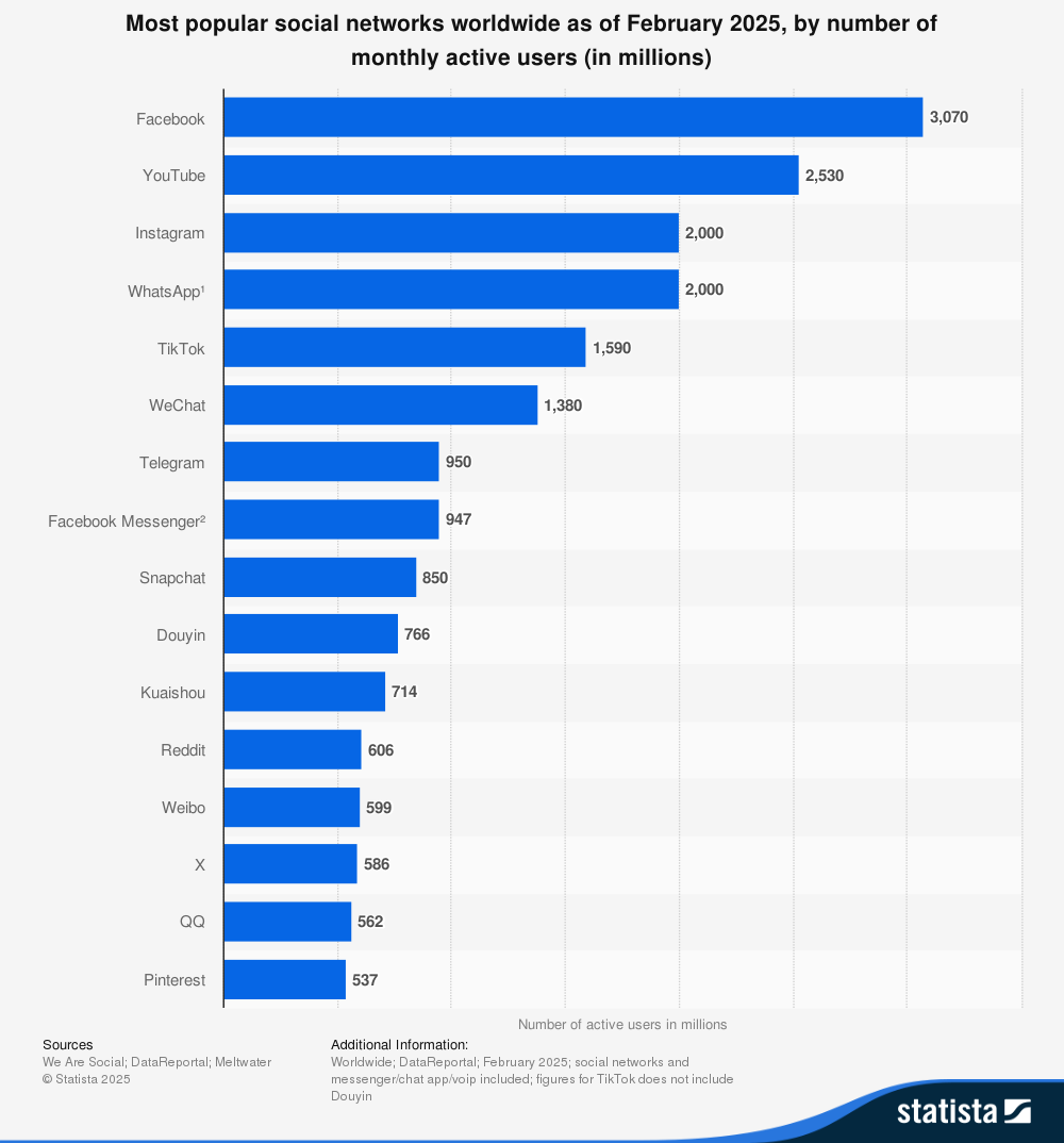
TikTok has 1.59 billion monthly active users
TikTok’s monthly active user base hit 1.59 billion globally in early 2025, solidifying its place as one of the top social platforms in the world, right up there with Instagram and YouTube. It is expected to reach 1.9 billion users in 2029.
That growth is even more impressive when you remember how new TikTok still is. It started as a video app targeted towards Gen Z, but it’s quickly grown into a platform where all kinds of people — creators, brands, and communities alike — show up, connect, and build real momentum.
TikTok’s global audience leans slightly male
💡
Note: The data we have access to, only included binary gender options (male and female). No additional gender identities were captured or reported.
As of February 2025, 55.7% of TikTok users are male, while 44.3% are female. This is a helpful detail to keep in mind, especially if you’re tailoring content for a specific group or noticing differences in what’s landing with your audience.
Nearly 70% of TikTok’s user base is under 35
TikTok is still very much a youth-driven platform, and there’s no debate about it. Nearly 7 in 10 users globally are between 18 and 34 years old. The largest individual segments are men aged 25–34 (20.7%) and 18–24 (16.6%), followed closely by women aged 25–34 (14.6%) and 18–24 (14.1%).
That peek into the average user explains a lot about TikTok’s culture: fast, playful, full of in-jokes and trends that come and go overnight. From trending sounds to niche memes, TikTok moves at the speed of its youngest users — and that’s a big part of why it’s so influential.
More Gen Zers turn to TikTok for discovery than Instagram
Instagram may still top the list of the most-used social media platforms among Gen Z, but TikTok has become their top destination for discovery. Whether they’re looking for a new product, a niche community, or a breaking news update, Gen Z relies more on TikTok than any other app.
In fact, 77% of Gen Z say they use TikTok to discover new products, and 63% use it to keep up with the news, both higher than any other platform.
That habit of using TikTok to find things — not just scroll — is what makes the platform so powerful for creators and businesses alike.
The United States has the most TikTok users
As of February 2025, the U.S. leads worldwide in TikTok usage, with 135.79 million users. That’s nearly one in two American adults using the app regularly. Following close behind are Indonesia (107.7 million) and Brazil (91.75 million), showing just how global TikTok’s reach has become.
While the U.S. continues to dominate in total users, many of TikTok’s most engaged communities are emerging from countries in Asia, the Middle East, and Latin America — a signal that the most influential TikTok communities aren’t just in the U.S., they’re everywhere.
💡
It’s also essential to place the current state of TikTok in relation to the U.S. government into the context of the data we see here — much of it may change once an agreement has been reached. Learn more here.
The UAE and Malaysia are among the countries with the highest TikTok adoption rate
In places where phones are the primary way people access the internet, TikTok is as much a part of daily life as calling or texting.
And its popularity isn’t just high — in some countries, it’s off the charts. In Saudi Arabia (133.7%), the UAE (118.5%), and Malaysia (108.7%), TikTok’s user numbers surpass 100% of the adult population. This accounts for users with multiple accounts and high adoption across age groups.
Other countries also show striking adoption rates:
Vietnam: 94.5%
Thailand: 91.5%
Chile: 88.7%
Mexico: 87.7%
Indonesia: 82.5%
And in the U.S., TikTok reaches 120.5 million people — roughly 50.6% of the adult population.
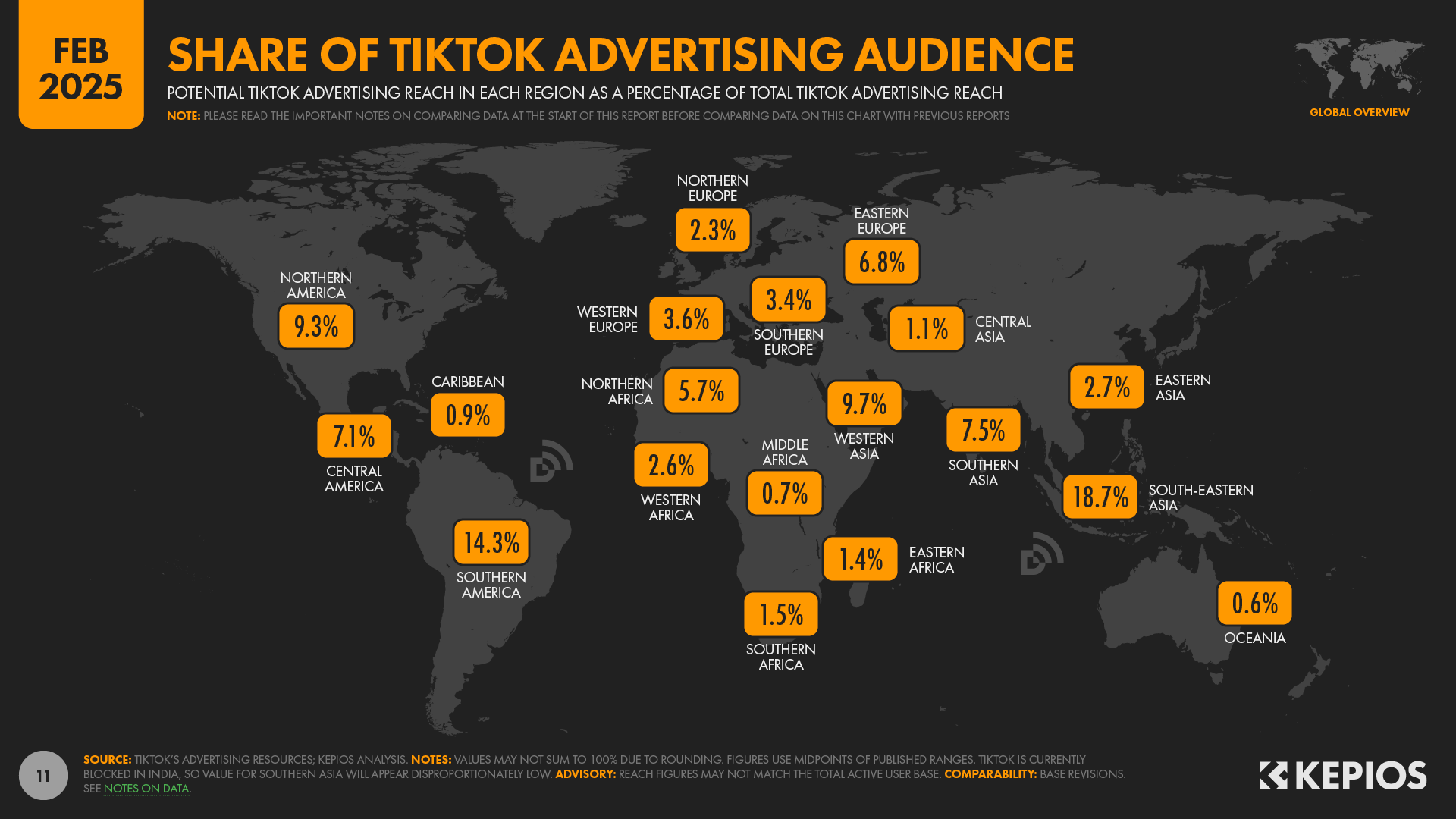
South-Eastern Asia is the region with the highest number of users
TikTok’s global footprint looks different depending on where you zoom in. As of early 2025, South-Eastern Asia had the largest share of TikTok’s advertising audience, with 298 million users — that’s 18.7% of the worldwide total.
Here’s how other world regions compare in terms of active users:
Southern America: 228 million (14.3%)
Western Asia: 154 million (9.7%)
Northern America: 149 million (9.3%)
Southern Asia: 119 million (7.5%)
Central America: 114 million (7.1%)
Eastern Europe: 109 million (6.8%)
Northern Africa: 90.9 million (5.7%)
Western Europe: 57.5 million (3.6%)
Southern Europe: 54.3 million (3.4%)
Eastern Asia: 42.6 million (2.7%)
Western Africa: 41.5 million (2.6%)
Northern Europe: 37.2 million (2.3%)
Eastern Africa: 21.9 million (1.4%)
Southern Africa: 23.4 million (1.5%)
Central Asia: 18.2 million (1.1%)
Caribbean: 14 million (0.9%)
Middle Africa: 11.6 million (0.7%)
Oceania: 10 million (0.6%)
If you’re looking to reach new audiences, these regions could be your next best bet.
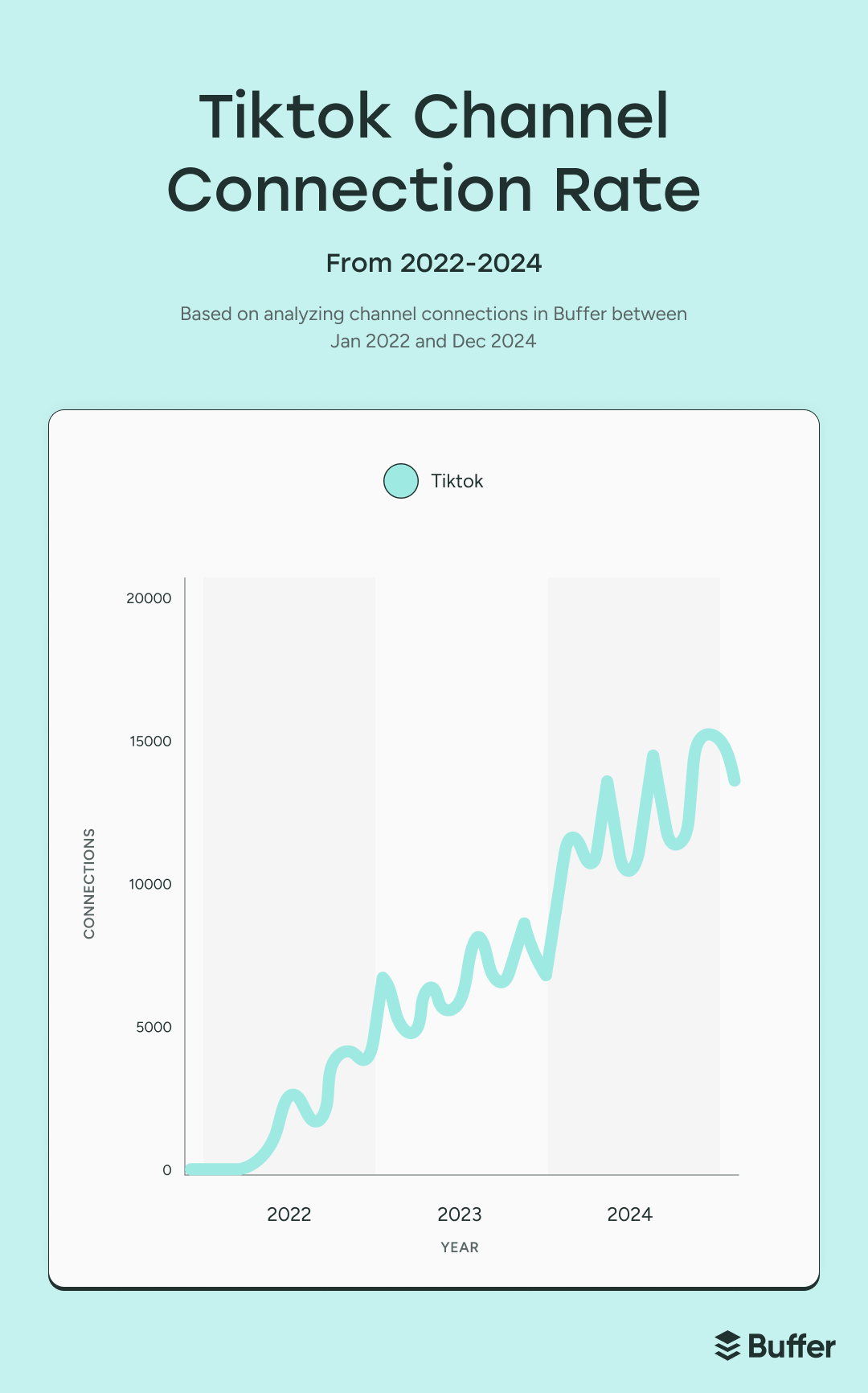
TikTok is the most rapidly adopted connection in Buffer
TikTok has grown since we added it to our list of platforms you can connect to in June 2022, from 779 connections in its first month to 276K connections by the end of 2024.
Of course, knowing who’s on TikTok is just one part of the picture. To really grow, it helps to understand how people use the app and what kinds of content they stick around for.
How users behave on TikTok
The way users behave on TikTok tells us everything we need to know about its influence: people spend hours on the app daily, and they’re not just watching videos — they’re sharing, shopping, and engaging.
Let’s break down what TikTok users are actually doing on the platform.
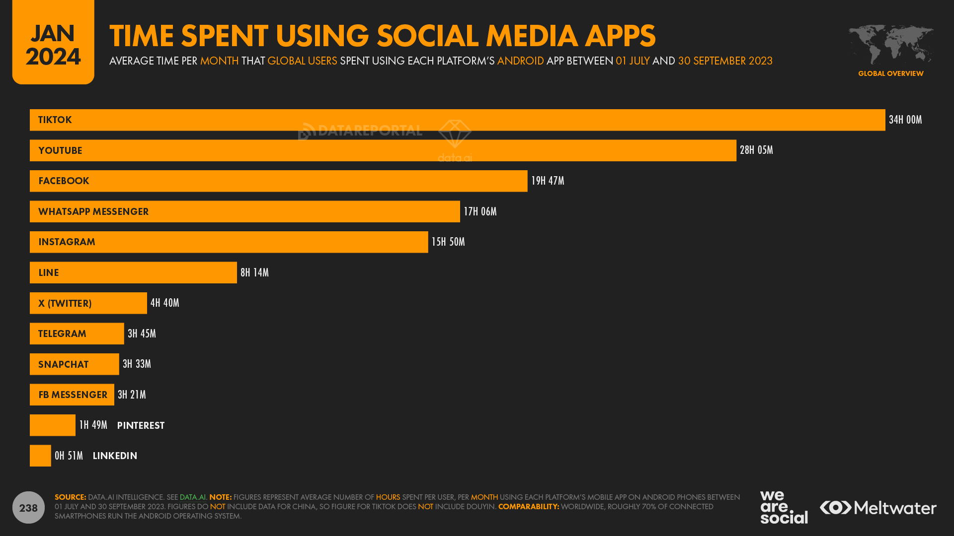
TikTok users spend an average of 95 minutes daily on the app
TikTok users love spending time on the app. Users average 34 hours per month and an average of 95 minutes daily on the platform, more than any other social network by a long shot.
The For You page, personalized discovery, and short-form storytelling make it highly addictive — and highly effective at holding attention.
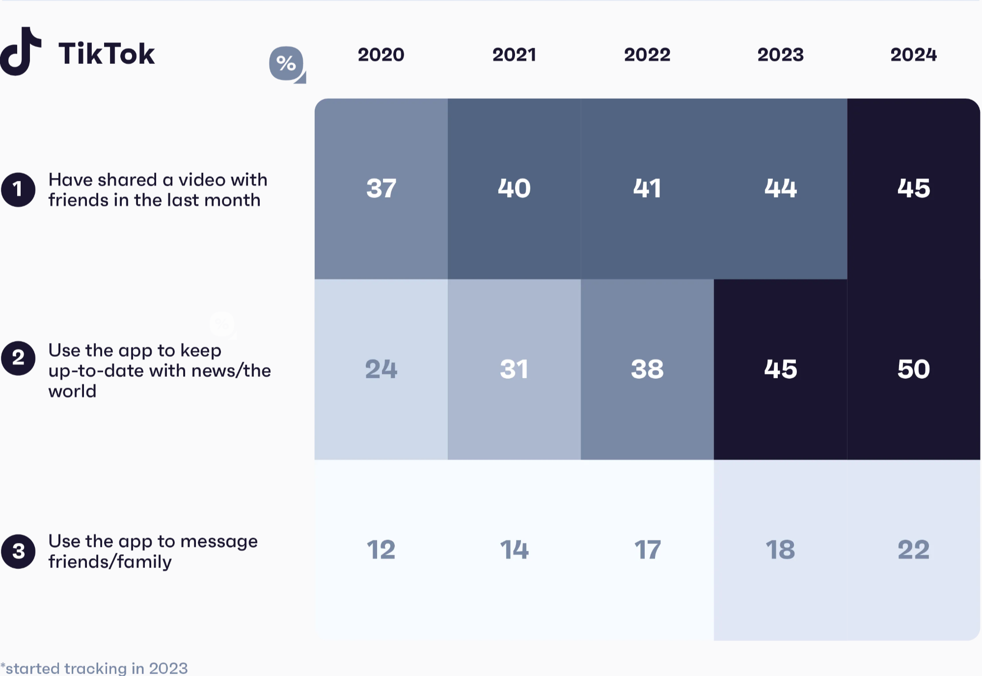
45% of Gen Z TikTok users have shared a video with friends in the last month
TikTok content doesn’t just live on TikTok. Nearly half of Gen Z users (45%) say they’ve shared a TikTok video with friends in the past month, up from 37% in 2020.
If you’re a creator or brand, this is your sign to create content that sparks a reaction. Think “send this to a friend”, not just “like and follow.”
Half of all TikTok users have made a purchase after watching a TikTok Live
According to TikTok, 50% of users have made a purchase after watching a TikTok Live.
It makes sense: Lives feel real and in-the-moment. You can set up real-time product demos, show honest reactions, and generate the kind of hype that makes people want to grab something right now.
If you’re launching a product, teaming up with a creator, or just trying to build buzz, going Live could be the extra push that gets your audience to take action.
TikTok is 150% better at convincing users to try a product or service
According to research from Material and TikTok, the platform is 150% more effective at getting users to try a product or service compared to other social networks.
That’s largely because TikTok doesn’t feel like traditional advertising or Google ads. It’s organic, often creator-led, and built on trust. Whether it’s a GRWM, a “TikTok made me buy it” moment, or a quick product demo in the comments, the content feels personal, and that makes it more persuasive.
Users are twice as likely to recommend a product discovered on TikTok
When people find something they love on TikTok, they talk about it — and not just in the comments. According to TikTok and Material, users are twice as likely to recommend a product they discovered on TikTok than one they found anywhere else.
That kind of genuine buzz gives every video the potential to go further than expected, in reach and real influence.
Tutorials are TikTok’s most-watched content — 62% of users prefer them
An Adobe Express study found that 62% of TikTok users say tutorials are their favorite videos, beating out product or service reviews (39%) and personal stories (38%).
Whether it’s a 30-second hack or a five-minute deep dive, “how-to” content taps into TikTok’s scroll-to-learn culture and routinely earns the highest completion and share rates.
For brands and creators, the takeaway is simple: teach first, sell second. Packaging your expertise into quick, actionable lessons is still the fastest route to the For You Page.
76% of TikTok users want a mix of images and video in their feed
TikTok may be video-first, but users don’t want only video. The platform’s 2025 What’s Next trend report shows that 76% of users say they enjoy both types of content.
For creators, that’s a green light to experiment. A photo-led day in the life post or image-based list of tips specific to your niche might be just as scroll-stopping as a video.
68% of TikTok users expect brands to mine the comments for insights
TikTok users don’t just read the comments — they treat them like part of the content. And they expect brands to do the same.
68% of users say that brands should pay more attention to what people are saying in the comments because they’re sharing feedback, asking questions, and generating ideas.
Content and content performance on TikTok
TikTok moves fast, and the content that performs well changes just as quickly. But some trends hold strong: video is still king, single image posts and carousels are on the rise, and smaller accounts are growing faster than ever.
Here’s what the data says about what to post, how often, and why it works.
16,000 TikTok videos are uploaded every minute
Let that sink in: users are uploading more than 23 million videos per day. That makes TikTok one of the busiest platforms out there — and means that standing out takes more than just showing up.
For creators and brands, this stat is a reminder that volume alone won’t cut it. Posting frequently matters, but quality, timing, and creativity are what separate the scroll-stoppers from the background noise.
81% of TikTok users say the app introduced them to something they didn’t know they liked
TikTok isn’t just for things you’re already looking for — it’s for things you didn’t even know you wanted. In fact, 81% of users say the app introduced them to a product, topic, or community they’d never searched for before.
That’s part of what makes TikTok so powerful: it creates new demand. Lean into the unexpected — niche hooks, surprising formats, or overlooked communities — and you might catch attention from people who didn’t even know you existed yesterday.
The optimal posting frequency on TikTok is 1–4 times per week
According to our research, the optimal posting frequency is between 1 to 4 times per week — and that pace is working well. In fact, posting just a few high-quality videos per week can outperform daily content if it’s strategic and relevant to your audience.
That said, TikTok’s algorithm rewards consistency. If you’re looking to grow faster, ramping up to 5 or more posts per week can increase your chances of hitting the For You Page — especially for newer or smaller accounts still building momentum.
But the most important thing is sustainability. If daily posting leads to burnout or causes you to start making filler content, it’s better to dial it back and focus on strong, resonant posts.
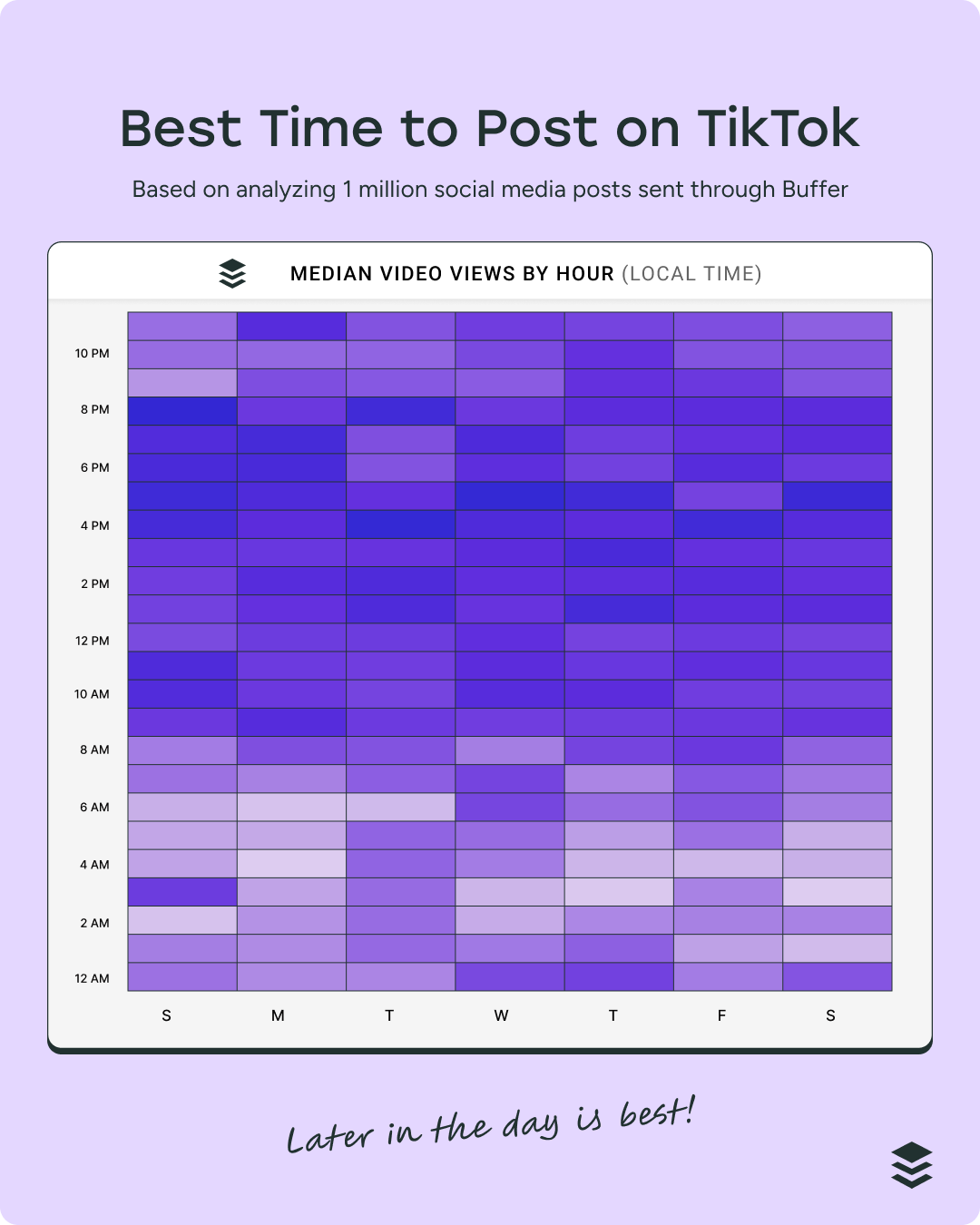
The best time to post on TikTok is between 3 and 6 p.m.
Our data shows that posting between 3 and 6 p.m. local time tends to generate the highest engagement on TikTok — especially mid-week. This timeframe likely aligns with when users are finishing up school or work and reaching for their phones to scroll, search, and shop.
But here’s the catch: the best time to post varies by audience. While this 3–6 p.m. window is a helpful baseline, your content might perform better at different hours depending on your niche, region, and followers’ behavior.
For the most accurate insight, check your TikTok analytics regularly and experiment with posting times to find your sweet spot.
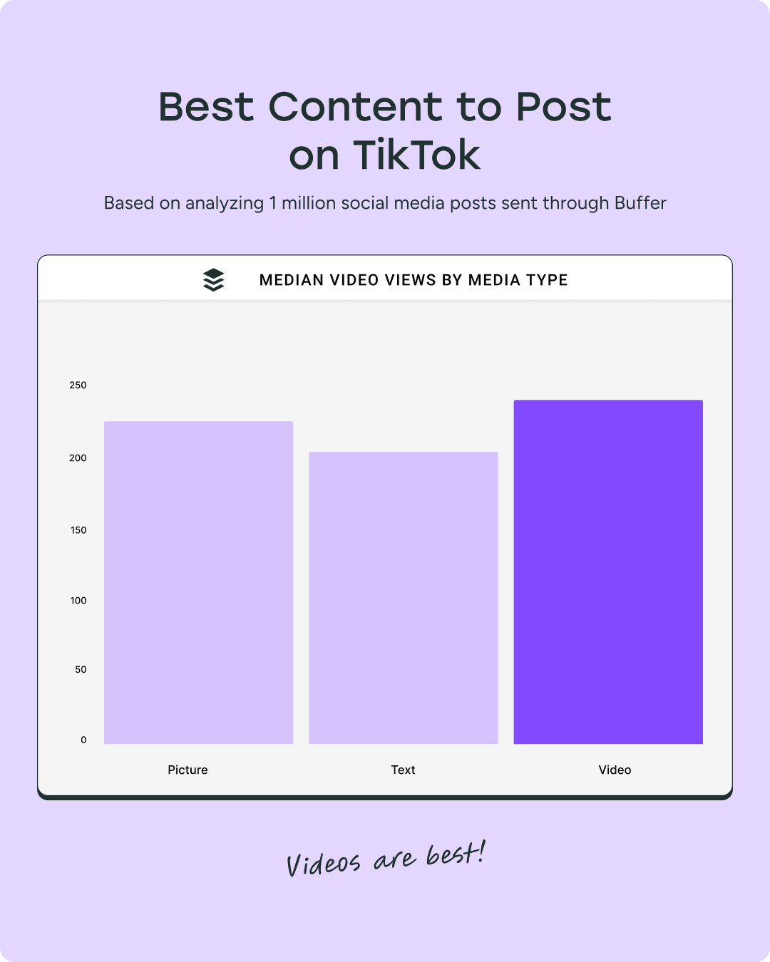
The best content to post on TikTok is short-form video
On TikTok, short-form video is still king — but what you post matters just as much as how you post it.
We found that content types like educational tips, tutorials, and quick how-tos consistently outperform other formats on the platform. Think snackable insights, visually-led demonstrations, or personal stories with a clear takeaway.
Text posts, images, and carousels are still emerging on TikTok and can work when used strategically, but video remains the default. If you’re going to post something static, treat it like a visual story — not a recycled Instagram post.
Bottom line: post video-first, value-led content that teaches, entertains, or resonates emotionally.
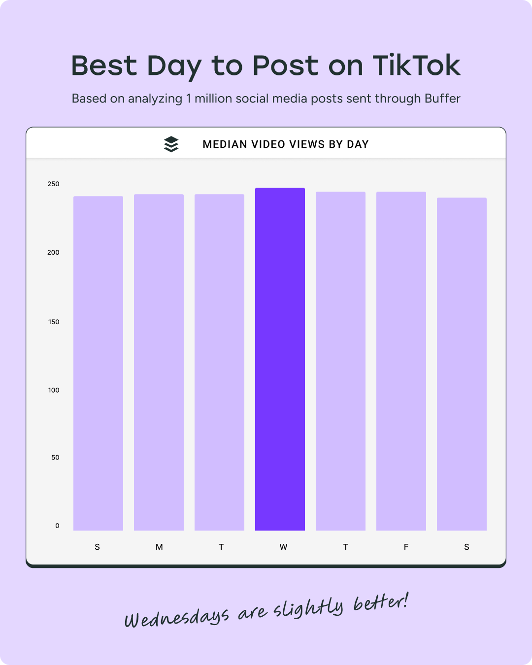
The best day to post on TikTok is Wednesday
Our data shows that Wednesday is the best-performing day for engagement on TikTok, with the other days not far behind.
Wednesday is likely best because it sits at the sweet spot between midweek fatigue and weekend anticipation — a time when users are more likely to be passively scrolling, discovering new content, and engaging with posts they might not see earlier in the week.
That said, your best day may differ. Always monitor your analytics to align with your specific audience’s habits.
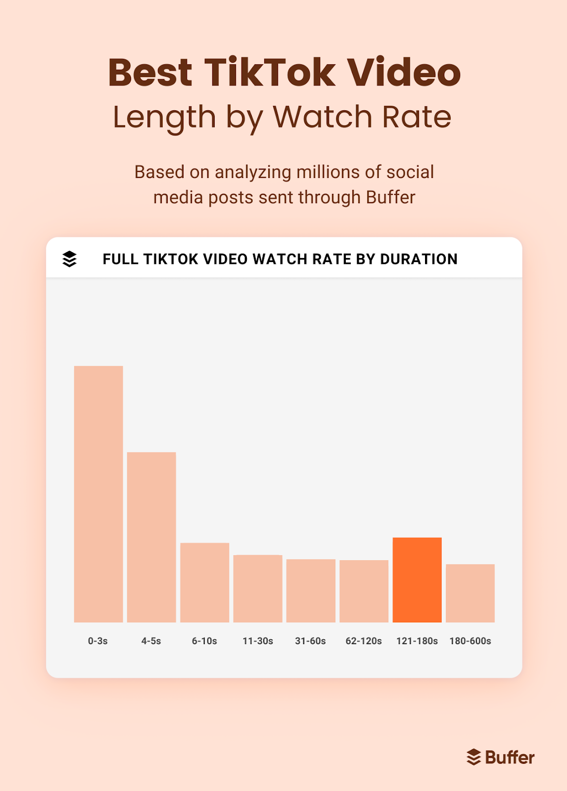
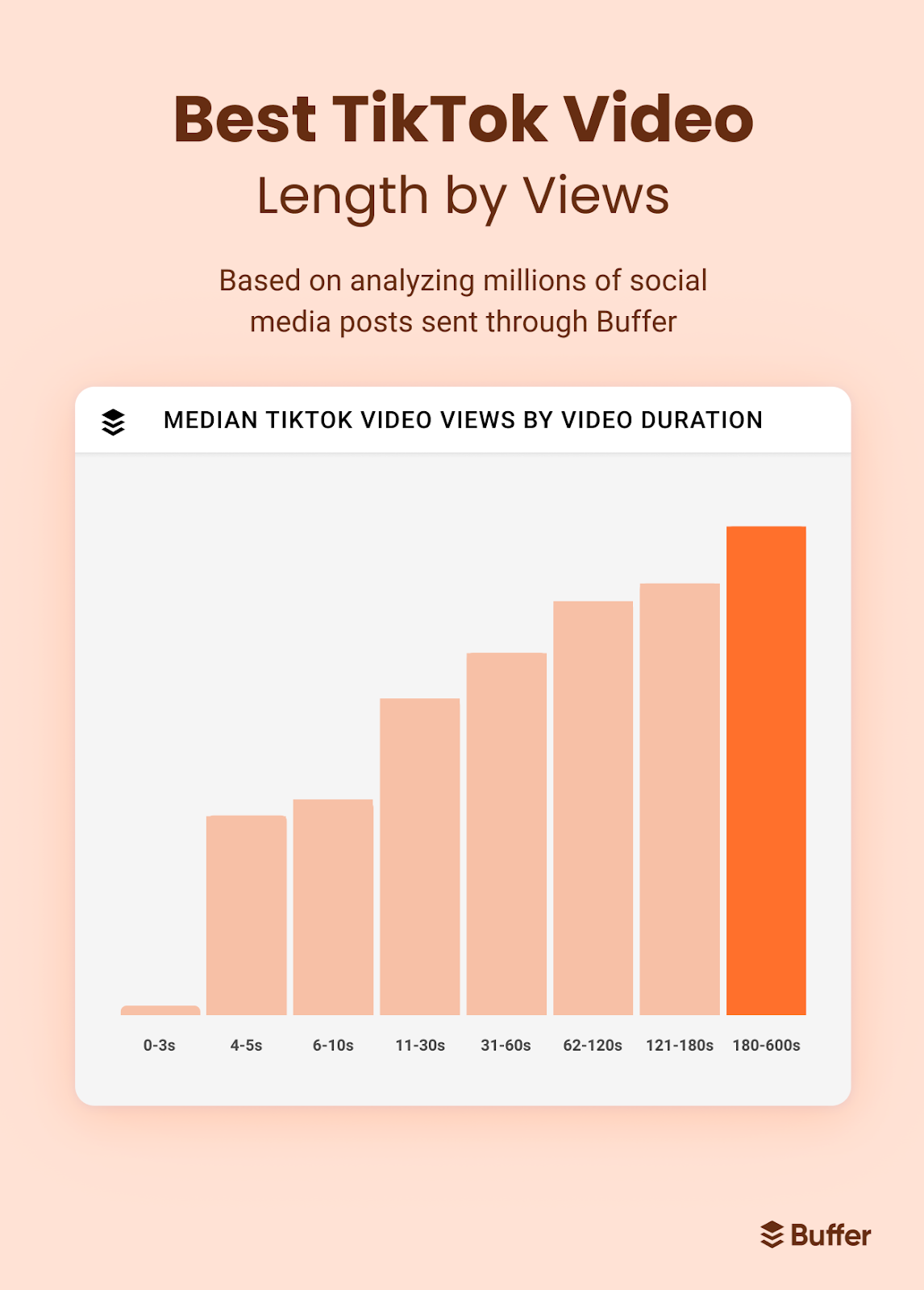
Longer videos perform better on TikTok — especially between 3 to 10 minutes
While TikTok started with short-form clips, the platform has evolved — and so has user behavior. We discovered that videos between 3 to 10 minutes long now perform better than ultra-short ones in terms of engagement and watch time.
That doesn’t mean every post needs to be long. But it does signal a shift: users are willing to stick around for content that provides deeper value, whether that’s an in-depth tutorial, a compelling story, or a multi-part narrative packed into a single post.
TikTok now supports uploads up to 30 minutes, but most high-performing long videos fall in that 3–10 minute sweet spot — long enough to engage, short enough to hold attention.
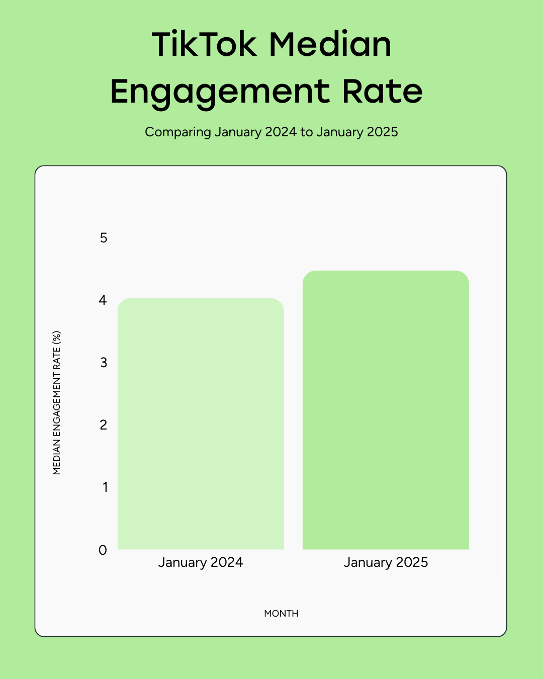
TikTok’s engagement rate sits at 4.86%
Our engagement study ranks TikTok third overall, with an average engagement rate of 4.86% (behind LinkedIn’s 6.50% and Facebook’s 5.07%). While that’s still ahead of YouTube Shorts, Threads, and Instagram, TikTok’s median engagement rate has edged down from 5.14% in January 2024 to 4.56% in January 2025.
We noted three shifts that might explain this:
Algorithm tweaks prioritize watch-time and replays over visible interactions such as likes or comments.
Heavier short-form video competition from reels, shorts, and even LinkedIn video.
More polished brand content, which can dilute the raw, community-driven feel that once super-charged engagement.
Focus on content that keeps viewers watching and sharing — not just tapping the like button.
Big accounts get more views — but that’s not the whole story
According to Socialinsider, large accounts consistently get more likes, comments, shares, and views per post. That’s expected — more followers mean more eyeballs.
Account size
Avg. likes / post
Avg. comments / post
Avg. shares / post
Avg. views / post
1K–5K
lowest
lowest
lowest
lowest
5K–10K
↑
↑
↑
↑
10K–50K
↑↑
↑↑
↑↑
↑↑
50K–100K
↑↑↑
↑↑↑
↑↑↑
↑↑↑
100K–1 M
highest
highest
highest
highest
But that doesn’t mean smaller accounts can’t win. While big profiles get the volume, small creators often win at rates as they get more engagement per view, faster growth, and deeper audience connection.
Smaller TikTok accounts grow faster than large ones
Here’s some encouraging news if you’re just starting out: accounts with 1K–5K followers are growing 8x faster than those with over 100K.
According to Socialinsider, accounts with 1K–5K followers saw an average growth rate of 269%, compared to just 33% for accounts with over 100K followers.
The smaller the account, the easier it is to pivot quickly, experiment often, and connect with an audience on a more personal level.
Smaller accounts publish more carousels on TikTok
Carousels are still a small slice of TikTok content overall — but interestingly, smaller accounts use them more often than larger ones. According to Socialinsider, here’s how carousel usage breaks down by account size:
1K–5K followers: 3.14% of posts
5K–10K: 2.17%
10K–50K: 2.35%
50K–100K: 1.71%
100K–1M: 1.49%
This suggests that smaller creators may be more willing to experiment with newer or underused formats, or they may be leaning into static content as a lower-effort way to stay consistent.
Either way, there’s an opportunity here. Since most TikTok content is still video, carousels offer a way to stand out, especially when paired with strong storytelling or visual hooks.
Brands and creators on TikTok
Creators are the engine behind TikTok, whether they’re filming quick takes from their bedrooms or partnering with global brands. And the good news? The platform rewards content at every level, from nano to mega.
Here’s what the latest data tells us about how creators and brands connect, as well as what it costs to collaborate effectively.
40% of TikTok users say a brand’s personality makes it more relevant
Highly polished content might look nice, but it doesn’t always land with TikTok users. The platform is built for content that feels human: off-the-cuff, a little scrappy, and full of personality.
In TikTok’s 2025 What’s Next trend report, 40% of users say a brand’s personality is what makes it feel relevant on the platform.
That means humor, behind-the-scenes moments, and creator-style storytelling go a lot further than a corporate voice or studio-quality promo. If you’re showing up on TikTok, make it human. Personality isn’t just a nice touch — it’s the thing that makes people care.
61% of marketers use TikTok for influencer marketing
TikTok has cemented itself as a core channel in the creator economy. Hubspot found that 61% of marketers now collaborate with influencers on TikTok, making it the third-most-used influencer platform after Instagram and YouTube.
TikTok nano-influencer posts have an 18% engagement rate on average
Posts from TikTok creators generate significant engagement across all types of creators, from nano to mega creators, solidly ahead of Instagram and YouTube Shorts, according to Grin. Here’s how it breaks down:
Mega or celebrity influencers (1M+ followers): 4% engagement rate
For brands, this means TikTok partnerships still deliver strong interaction, especially when paired with native, story‐driven content.
Content on TikTok can range in pricing from $50 to $10,000
Modash did the research and uncovered ballpark pricing for creators. Before we get into it, note that this data is specific to North America. And pricing will change from region to region and niche to niche. But these numbers can act as a starting point.
Here are the numbers for each tier:
Nano influencers (1-0K followers): $50 to $200
Micro influencers (10k-100K followers): $200 to $1000
Mid-tier influencers (100k-500K followers): $1000 to $5000
Macro influencers (500K -1 M followers): $5000 to $10,000
Mega or celebrity influencers (500K-1M followers): $10,000+
Factors like usage rights, deliverables, and exclusivity also play a role. The best partnerships happen when both sides are clear about what’s expected, and when creators are treated like creative collaborators, not just ad space.
What these TikTok statistics mean for your strategy in 2025
With more than 1.5 billion monthly users and a role in everything from entertainment to search, TikTok has grown into more than just a social app. It’s where people go to learn, laugh, connect, and buy — often all in the same scroll.
The data shows us that:
Story-driven content fuels discovery on TikTok and in search
Content can (and should) be playful and useful
Being small can be a strength for creators and the brands that partner with them
But behind those stats is an even more interesting shift: TikTok is a non-negotiable for creators and brands. It’s where audiences look for answers, follow for relatability, and stay for personality.
You don’t need to jump on every trend or reinvent yourself for the algorithm. Show up clearly, consistently, and in a way that feels unmistakably you.
Let the numbers guide you and trust your instincts, lean into your strengths to build something worth following.
Some YouTube videos gain millions of views, while others struggle to find an audience. The reason often comes down to the algorithm. YouTube’s algorithm isn’t guesswork—it’s a sophisticated system predicting what viewers will most likely watch and enjoy.
Whether you’re a marketer, content creator, or business owner, understanding how the YouTube algorithm works can help you grow your channel and reach more viewers. In this article, we’ll break down how the YouTube algorithm works in 2025 and share strategies to help you succeed.
Key Takeaways
The YouTube algorithm in focuses on understanding individual viewers through their behavior, preferences, and watch history.
YouTube serves videos in three main ways. The homepage shows videos based on viewer history, suggested videos appear alongside a video being watched, and search results combine relevance and viewer preferences.
Metrics like watch time, click-through rates (CTR), likes, comments, and shares are key factors in determining a video’s visibility.
Including YouTube Shorts, live streams, and playlists in your strategy can help you connect with wider audiences.
Regular uploads and active audience engagement signal to the algorithm that your channel offers value.
Features like polls, Q&A sessions, and multilingual subtitles increase engagement and appeal to diverse audiences.
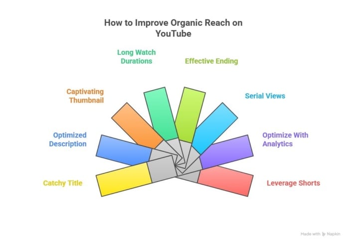
Algorithm optimization has seven components: create a click-worthy title, add detail to your description, design an attractive thumbnail, increase watch duration, encourage action after the video, maintain engagement with video series and playlists, and improve content using analytics over the long term.
What Is the YouTube Algorithm?
The YouTube algorithm is a recommendation system that serves videos to users based on their histories and (if they’re actively searching) search queries. The algorithm evaluates over 80 billion signals, according to the official YouTube blog.
The algorithm matters because YouTube is a powerful organic channel. Understanding how to increase the reach of your videos can increase revenue significantly.
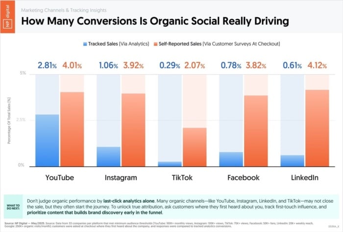
In fact, research conducted by my team at NP Digital found it’s the top organic social channel, outperforming sales from all other platforms by a large margin.
YouTube provides recommendations in four main areas:
Homepage: Features videos based on viewer history and content performance.
Suggested videos: Highlights related content next to the video being watched.
Search results: Combines relevance and viewer preferences to rank results.
Shorts: Shows short-form videos in the shorts feed based on user history.
Let’s look at each of these in detail.
Recommended Videos: A Whopping 70% of All Views
Recommended videos appear on the homepage and alongside videos on “watch pages,” on-screen at the end of videos, and in the suggested videos sidebar.
A mixture of personalization factors—based on the user’s history—and individual video performance signals are used to make recommendations.
Search Results: The Web’s Sixth Biggest Search Engine
Results page videos are served in response to YouTube search bar queries. The algorithm uses a mix of relevance (in relation to the search phrase) and personalization to rank videos.
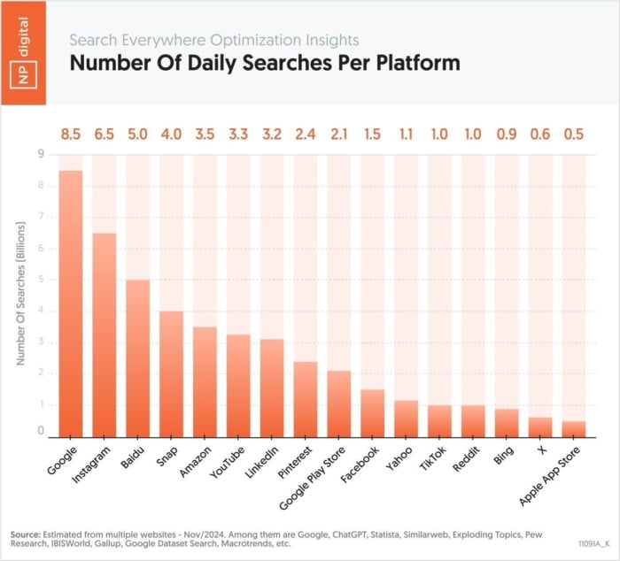
Despite accounting for only 30% of views, the number of searches on YouTube is still high enough to make it the sixth largest search engine on the web. My research found that YouTube has 3.3 billion searches every day.
Shorts: Casual Scrolling
The “shorts algorithm” serves videos based on user history, in a similar way to the homepage and watch page suggestions. However, videos are viewed in a scrolling format, typically on mobile.
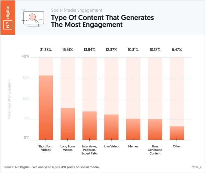
My team and I looked at the engagement levels of different types of content and found that shorts account for 31.3% of all social media content engagement, beating every other category. Shorts are excellent for building your audience, and I publish them regularly on my channel.
Trending: What’s Hot In Your Country
The “Trending” tab in YouTube displays videos that are going viral and generating high viewing figures. According to the YouTube Help Center, “Trending isn’t personalized and displays the same list of trending videos to all viewers in the same country.”
The YouTube Algorithm’s Evolution
The YouTube algorithm has evolved significantly over the years. Early versions rewarded videos based on view counts alone, encouraging clickbait tactics. In 2012, the focus shifted to watch time, prioritizing videos that kept viewers engaged for more extended periods.
In 2025, AI-driven personalization will play a central role. The algorithm analyzes viewer behavior to recommend videos that align with individual preferences. Metrics like watch time, click-through rates (CTR), and satisfaction surveys have a major impact on video ranking.
Short-form videos, like YouTube Shorts, are now a major factor in discoverability. They grab attention quickly, making them effective for engaging new viewers. Creators who include Shorts in their strategy often see significant growth in views and subscribers.
The evolution of the algorithm shows that success on YouTube depends on adaptability. Content that engages viewers across formats and metrics is more likely to gain visibility.
How the Algorithm Works: A Complete Overview
So, how does the algorithm work?
Let’s look at official and reputable third-party sources to piece together an understanding of what YouTube looks at to recommend and rank videos.
Official YouTube Documentation: Personalization and Performance
“…we start with the knowledge that everyone has unique viewing habits. Our system then compares your viewing habits with those that are similar to you and uses that information to suggest other content you may want to watch.”
“Our algorithm doesn’t pay attention to videos, it pays attention to viewers. So, rather than trying to make videos that’ll make an algorithm happy, focus on making videos that make your viewers happy.”
In addition, a paper published in 2016 titled Deep Neural Networks for YouTube Recommendations explained that the YouTube recommendation model works in two stages. Although it has evolved since the paper was published, there’s a strong likelihood that the underlying ideas have remained the same.
First, the algorithm goes through a “corpus” of millions of videos to retrieve a subset of videos that match the user’s preferences based on their history. Second, it evaluates multiple video and user factors to rank these candidates, returning what it determines to be the best-fit recommendations.
A Discussion Between YouTube Insiders: No One “Number”
In early 2025, YouTube Creator Liaison Rene Ritchie and Todd Beaupré, who leads the Growth and Discovery team, discussed the YouTube algorithm in depth.
Rene Ritchie asked, “We often hear from creators, ‘What’s the one number? Is it click-through rates? Is it watch time?” How do creators optimize for all of these factors?”
Beaupré answered by saying, “One thing to understand is there’s no single answer to that question, as much as creators would love to have one. But the reality is that we’ve enabled the system to learn that different factors have different importance in different contexts.”
He also added, “While we do look at how long people watch videos, it’s only one of the factors we consider…we introduced this concept of satisfaction…where we’re trying to understand not just viewers’ behavior but also how they feel.”
The key point is that YouTube considers a wide range of context-dependent factors. But the emphasis is on user “satisfaction.” Factors like relevance, watch time, and engagement all fit neatly into this category.
7 Key YouTube Algorithm Signals
A mix of official documentation and third-party testing highlights seven key areas that YouTube looks at in order to evaluate what Todd Beaupré calls “satisfaction.”
Here’s a working roundup of YouTube algorithm signals:
Content characteristics: The algorithm uses metadata, such as titles, descriptions, and transcripts, to determine a video’s relevance to a viewer’s query. Optimized metadata increases a video’s chances of being recommended.
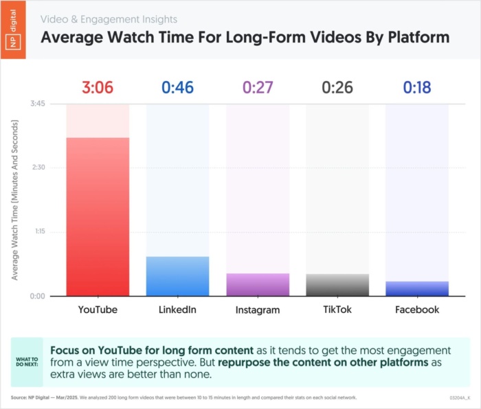
Watch time: Longer viewing sessions suggest valuable content. While there is significant variance across topics, my team and I found that 3.06 minutes is the average watch time on YouTube, and this is a good benchmark to keep in mind for longer videos.
Click-through rate (CTR): This is the percentage of impressions that turn into clicks. Attractive titles and thumbnails draw more clicks and indicate relevance.
Likes, comments, and shares: Viewer interactions show the content’s relevance and appeal. Videos with strong engagement are more likely to be promoted.
Viewer behavior: Content is prioritized based on individual viewing history, likes, and repeated interactions. It also considers patterns among viewers with similar interests to recommend content.
Relevance:Research by the Pew Research Center found that 32% of adults in the US use YouTube to stay up to date with current events, making it one of the web’s most popular news platforms. Because of this, the relevance of news-related content is likely a strong ranking factor.
Handling misinformation: Channels with authority and consistent, trustworthy content are favored. The algorithm also flags and limits the reach of misleading videos, so aligning with YouTube’s policies is critical. According to YouTube, consumption of “borderline content” recommended by the algorithm is lower than 1%. This is content that doesn’t violate YouTube’s terms of service but comes close.
How to Improve Your Organic Reach: 7-Step Framework
Improving organic reach on YouTube is about focusing on three factors: engagement, relevance, and viewer satisfaction.
Creating useful, attention-grabbing content should be your priority. However, there are also powerful tweaks that can give your rankings an extra lift.
1. Pick a Catchy Title
YouTube looks at your video’s title to understand what it’s about. A well-crafted title makes it more likely that you’ll be recommended to users and appear in search results for relevant queries.
Here’s how to nail your video titles:
Pick a primary high-volume keyword: Enter the core topic of your video into the YouTube search bar to generate specific keyword variations and pick one of these for your title. You can also run potential keywords through a tool like Ubersuggest, as there is significant overlap between Google and YouTube search term volumes.
Describe a clear benefit: A catchy title isn’t just for telling the algorithm what your video is about. It’s also for building interest and driving clicks. Articulate a clear, precise outcome or benefit, as I have done with “social media mastery” in my video below. “How to” titles also work very well on YouTube.
Don’t get too hung up on tags: There’s no harm in adding tags in the Show more section of the Details page of the upload window. However, don’t worry too much about these as their value is limited. Three or four keywords that describe your video will do the job.
2. Optimize Your Description
Descriptions do more than summarize your video—they help the algorithm understand and categorize your content.
Here’s how to create a killer description:
Focus on the first two lines: These appear in search results. Start with an engaging preview that highlights what viewers will learn.
Provide details: Outline key takeaways and include timestamps for longer videos. Use bullets in your description to make it easy for readers to skim.
Add calls to action (CTAs) where appropriate: Direct viewers to related videos or encourage them to subscribe when it’s appropriate to do so.
Here’s an example of a helpful description from one of my videos. It’s comprehensive—giving plenty of info to YouTube—and pulls readers in with a clear description of what they’ll learn.
3. Create a Captivating Thumbnail
Your thumbnail is an invaluable opportunity to stop scrollers, restate the benefits of watching your video, and encourage clicks. And if you’re not a natural designer, AI tools can fill the gap.
Here’s how to create thumbnails that get noticed:
Reiterate the benefit in a different way: Use the thumbnail as an opportunity to reiterate the main promise or learning of your video in a slightly different way to attract viewers that may not have found your title compelling.
Keep your design professional (without breaking the bank): Platforms like Canva and Adobe Express, which now have AI features, create professional-looking thumbnails that grab attention.
Split Testing: Test different thumbnails across your videos to see which combinations perform best.
You can see a selection of thumbnails for my videos below. In all cases I include my ugly mug—ahem, beautiful visage—and reiterate the main promise of the video in a slightly different way to the title.
4. Aim for Longer Watch Durations
The algorithm rewards content that keeps viewers watching from start to finish. Strong video storytelling holds those eyeballs and boosts watch time.
Here are my four top tips for improving average watch duration:
Start strong: Hook your audience in the first 10 seconds with a clear and engaging statement.
Match expectations: Align your video content with what the title and thumbnail promise.
Add chapters: Divide longer videos into sections with timestamps so viewers can skip to the parts they’re most interested in.
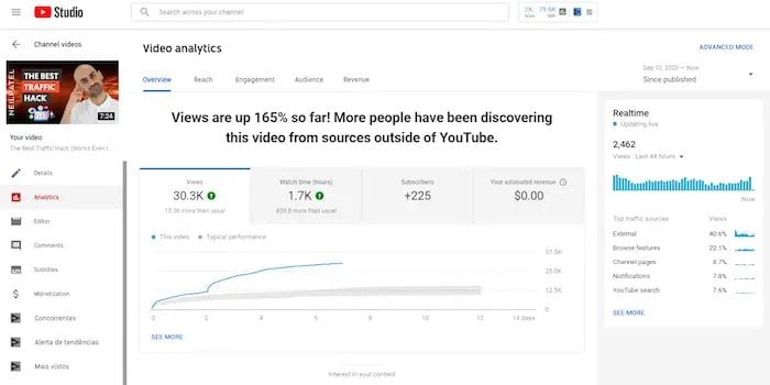
Modify your strategy based on feedback: Analyze audience retention graphs in YouTube Studio to see where viewers drop off and refine your content strategy accordingly, removing sections that might be seen as boring or not useful.
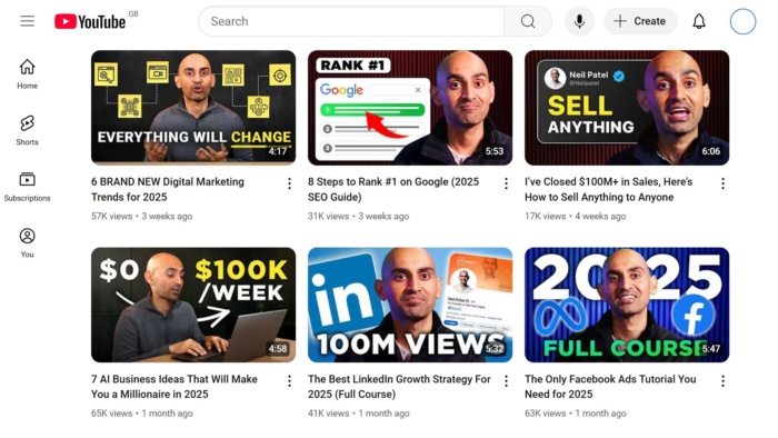
I hit all these criteria in my video “I’ve Closed $100M+ in Sales, Here’s How to Sell Anything to Anyone.” It opens strong, provides exactly what it promises (with practical examples), includes chapters, and cuts all nonessential fluff.
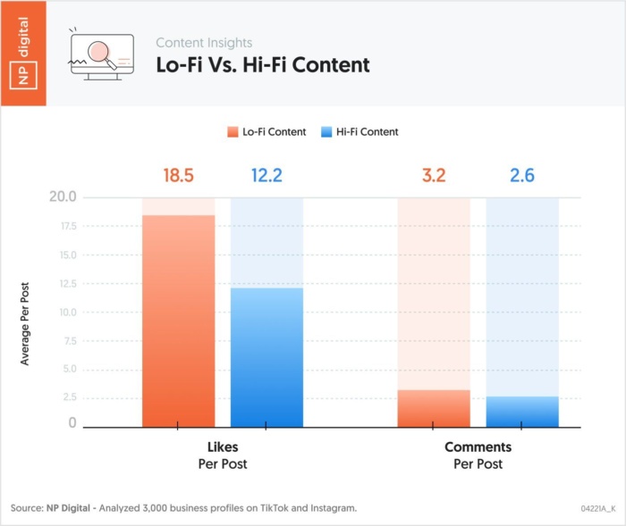
Oh, and don’t be afraid of creating lo-fi (or low-fidelity) videos if your audience is already engaging with content that’s more casual. This content isn’t overly polished and is designed to communicate authenticity. My research found that it tends to outperform high-fidelity content.
5. Don’t Skip the Conclusion
How you end your videos matters. A good conclusion keeps viewers engaged and encourages them to either subscribe, watch another video, or visit a landing page.
Add all of the following to your conclusions:
End screens: Add an end screen with a CTA and a link to your landing page or subscribe button.
Verbal calls to action (CTAs): Suggest specific videos or playlists that viewers can watch next.
Add cards: Reference related content from your channel and use clickable cards to drive traffic to it.
Here’s an example of a video from Russell Brunson with an end screen that includes a CTA, a card of a related video, and links to his channel page (the picture of his face) and his commercial website.
6. Create Series and Playlists
Serial content keeps viewers engaged for longer and increases session time as they watch the whole series, which the algorithm values. Creating binge-worthy videos also encourages viewers to subscribe to your channel.
There are two ways to offer serial content:
Playlists: Group related videos into playlists that autoplay. This keeps viewers watching without needing to search for the next video.
Episodic, well-labeled series: Structure your content in a way that builds anticipation, such as a step-by-step tutorial or a multi-part series that is clearly labeled—“Part One,” “Video One,” etc.
When signing off from videos in a series, don’t underestimate cliffhanger endings. A teaser for what’s coming next can make all the difference in keeping viewers watching.
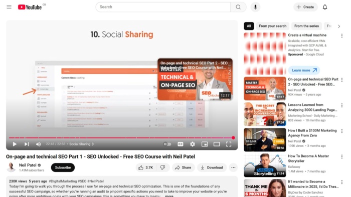
Here’s an example from my SEO Unlocked course on SEO fundamentals, with a link at the end of the video to part two.
7. Monitor Analytics to Find Opportunities
YouTube Studio offers tools to analyze your performance, refine your strategy, and align content with audience preferences.
Audience retention: Identify drop-off points and adjust your content to keep viewers engaged.
Click-through rate (CTR): Measure how well your titles and thumbnails attract clicks.
Engagement metrics: Look at likes, comments, and shares to understand what resonates.
Demographics and traffic sources: Learn about your audience and adjust to appeal to core groups.
Bonus Tip: Make the Most of YouTube Shorts
As we’ve mentioned before, YouTube Shorts are a powerful way to reach new audiences and promote your main content. Their quick, engaging format is perfect for grabbing attention. But they work slightly differently from long-form videos.
Follow these best practices for maximizing the reach of your shorts:
Focus on one idea: Keep it simple and clear. Shorts are most effective when they focus on a single concept.
Use captions: Many viewers watch without sound, so captions help convey your message.
Repurpose content: Highlight key moments from your long-form videos to attract new viewers.
Here’s an example from my YouTube channel. In under a minute, it delivers a quick lesson on social media engagement.
Adapting to Trends in 2025
Staying competitive on YouTube in 2025 requires keeping up with audience expectations and platform trends. Interactive content and a focus on sustainability and inclusivity shape how creators connect with viewers.
Interactive Content
Interactive features like polls, Q&A sessions, and community posts help you connect with your audience on a deeper level. These tools encourage participation, making viewers feel more connected to your content. This engagement also signals to the algorithm that your videos resonate with your audience.
This simple and easy addition makes the video more engaging and can even spark future conversations and video ideas.
Live streams are another way to build engagement. Use live chats to answer questions or collect feedback directly from viewers. These real-time interactions create a sense of community and keep your audience coming back for more.
Sustainability and Inclusivity
Audiences are increasingly drawn to creators who reflect their values. Content incorporating sustainable practices, like reducing waste during production, can appeal to eco-conscious viewers. Inclusivity is equally important. Multilingual subtitles, diverse representation, and accessible formats help you reach a broader audience while improving viewer satisfaction.
Focusing on these areas can strengthen your brand and improve your chances of gaining visibility on the platform.
Is AI Changing the Way the Algorithm Works?
I believe that the future looks bright for YouTube creators in the age of AI.
The algorithm has evolved significantly over the years. Early versions rewarded videos based on view counts alone, encouraging clickbait tactics. In 2012, the focus shifted to watch time, prioritizing videos that kept viewers engaged for more extended periods.
In 2025 and beyond, AI algorithms will continue to focus on relevance, watch time, click-through rates (CTR), and satisfaction. My view is that it will get better and better at measuring these signals, which means that high-quality content is the best path to success.
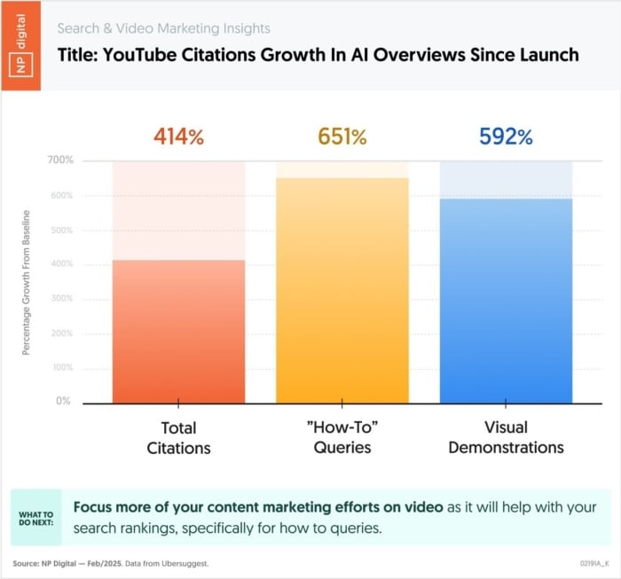
In addition, my team and I have found that AI engines often cite YouTube videos, with a 414% uptick in citations in AI overviews since launch. This points towards continued growth in the consumption of YouTube videos as AI search becomes more pervasive.
FAQs
How does the YouTube algorithm work?
The YouTube algorithm matches videos to viewers based on relevance, engagement, and personal preferences. It analyzes metadata, watch time, and viewer behavior to recommend content that keeps audiences engaged.
What is the YouTube algorithm?
The YouTube algorithm is powered by artificial intelligence (AI) and machine learning (ML) to determine which videos to recommend to users. It evaluates individual preferences, engagement metrics, and channel authority to prioritize content.
What 4 things does the algorithm prioritize on YouTube?
Watch Time: Videos with longer viewing durations and those contributing to session watch time perform better.
Engagement: Likes, comments, and shares improve visibility.
Relevance: Titles, tags, and descriptions matched to user queries.Viewer History: Recommendations based on past watch and search behavior.
Conclusion
Mastering the YouTube algorithm is about creating engaging content that connects with your audience. The algorithm prioritizes watch time, relevance, and engagement, so aligning your videos with these factors is critical.
Focus on building quality content that addresses viewer needs, optimizing it with strong YouTube SEO practices. Use features like interactive tools, live streams, and Shorts to connect with your audience and expand your reach. Embracing sustainable and inclusive practices can also strengthen your brand and attract diverse viewers. Whether you’re improving your video marketing strategy or experimenting with new formats, staying focused on your audience will keep your channel growing.
Would you rather have a beautiful website or a website your customers love?
From a business perspective, you shouldn’t choose either. You should want a high-converting website, instead. And this is where landing pages are so important.
A landing page is a key component in any marketing campaign. Whether you’re running a digital ad, sending an email letter, or posting on social media, you need a webpage that you can send interested visitors to that can help generate leads and conversions.
Many people get caught in the trap of creating designs they like without thinking about what their prospective buyers want and need. Unfortunately, this creates a leaky funnel that’s hard to fix.
But if you want to buck that trend and create landing pages that convert, I’m here to help. In this article, we’ve compiled a list of 20 landing page examples you can gather inspiration from.
We’ll go over each one’s strengths and weaknesses, so you’ll be able to walk away knowing what it takes to create a high-converting landing page for your business.
Key Takeaways
A landing page is a webpage created with a singular purpose—to generate a conversion, whether that’s a lead, sale, subscription, etc.
There are five main elements that every successful landing page should have—a bold headline, consistent copy, social proof, one singular offer, and a call to action.
Looking at landing page examples can be a great way to gather inspiration before you start building out your own landing pages.
What Is a Landing Page?
A landing page is a single webpage designed with a single goal in mind. That goal could be:
Selling a product
Signing customers up for a service
Promoting a product feature
Sharing an e-book, report, or white paper
Increasing newsletter subscribers
Potential leads or customers “land on” the webpage, giving it the name “landing page.” It’s a simple page that dives fully into a single offering with the intent of selling the visitor whatever it’s promoting.
5 Elements of an Effective Landing Page
As you scroll through the landing page examples we share below, you might notice that they all appear to follow a similar formula. That’s because you don’t fix what isn’t broken, and the key landing page elements are not broken.
Bold value proposition at the top of the page. The top of the landing page should clearly state what it’s promoting and why the webpage visitor needs it.
Messaging consistent from the ad or post that led to the landing page. Upon clicking to your landing page, viewers should see a consistency in messaging from the ad or social media post that initially led them there. That messaging should clearly communicate what the page is promoting, giving further information than the bold heading at the top.
Social proof, case studies, reviews, testimonials.Social proof is where people tend to lean towards choices that they’ve seen others make, which is why reviews and testimonials can make such a big impact. Include this type of social proof on your landing page to convince people to take action.
One single, hyper-focused offer. You should be focusing your landing page on one single topic or offer, whether you’re promoting a single software feature, a single service, or a single lead magnet.
A clear call to action. What do you want people who visit your landing page to do? Use that as your call to action. Make it clear, bold, bright, and easy to click.
20 Amazing Landing Page Examples
Need some inspiration for your next landing page? Check out these 20 examples that you can get inspiration from.
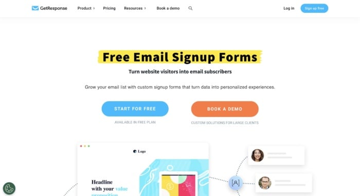
GetResponse is an email marketing platform. This landing page is highlighting a key feature—email signup forms meant to help businesses build their email lists. Powerful headline, check. Eye-catching image, check. List of current clients, check. List of features, check, You get the idea.
It’s quite long, but that just gives the Get Response team more to convince you to create a free account. And there are plenty of CTAs along the way in case you missed the one at the very top of the page.
Three takeaways from GetResponse’s landing page:
Highlight your copy to make it even more impactful. GetResponse highlights important words and phrases throughout the landing page, drawing your attention to them and making their copy pop.
Use social proof. The landing page includes a slideable widget filled with customer testimonials that mention this specific feature and how well it works.
Use multiple CTAs. Because GetResponse’s landing page is so long, they scatter it with CTAs at the end of every section.
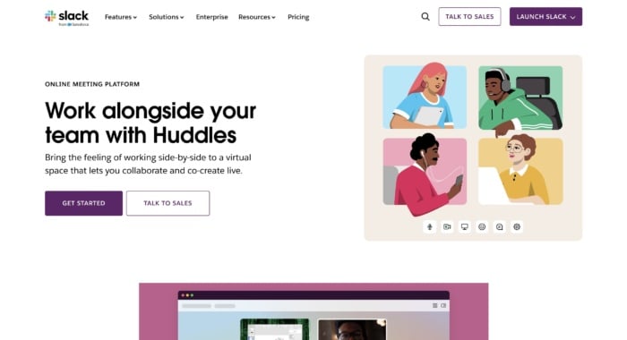
Slack is always on top of its game when it comes to creating some of the best landing pages. They are constantly optimizing for conversions, and that’s the best way to find your winning landing page. This landing page showcases one of its features—voice or video huddles that happen in real time, letting team members essentially call each other to hash something out quickly.
Three takeaways from Slack’s landing page:
Keep your navigation bar bare. Slack only includes the most important elements in the navigation bar on this landing page: letting current user login and prospective users talk to sales.
Show thedifference between free and premium. If you have a popular free version, use your landing page as a chance to show what users are missing out on by not upgrading.
Take advantage of multimedia. The page includes looping animated videos that showcase each of the main features, letting interested users see them in action before signing up.
This landing page for heatmapping software CrazyEgg showcases a specific feature that the software offers. In this case, it’s the ability to create website pop-ups to increase conversions.
The page leads with a demo link and breakdown of the feature, before you see more detailed information on how it works further down on the page.
Three takeaways from CrazyEgg’s landing page:
Provide basic instructions. The landing page includes a basic step-by-step for how users can set up pop-ups using the CrazyEgg tool, showing just how quick and easy it is and further selling them on the software.
Show versatility in applications. The use cases section shows how a variety of different industries can benefit from using this tool.
Use trust badges. CrazyEgg’s landing page is dotted with trust badges from the likes of G2 and Capterra, adding instant credibility to their offering.
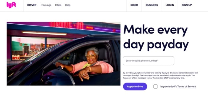
Lyft has been growing in the past years, and its website, landing page, and overall online funnel is a driving force, too. They focus on attracting new drivers that want to control their own life.
Once again, we see a giant, attention-grabbing headline that entices users. Now check out the button “Apply to drive.” It implies that it’s not 100 percent sure you’ll be able to get the position — which makes it even more enticing while also stopping candidates from getting carried away.
Three takeaways from Lyft’s landing page:
Make a point with your images. I’d bet Lyft wants to attract female drivers, which is exactly why they’ve chosen the feature image on the landing page.
Customize data requests. Most landing pages ask for an email. But because Lyft is an app, it asks for your phone number instead.
Link off to learn more. You don’t want to overwhelm users with information on a landing page, that’s why linking to other pages (as Lyft has done) can be a useful strategy.
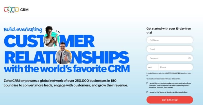
Zoho’s landing page is a great example of a more full-on, but still extremely powerful messaging. They use more text than the average landing page in the industry, but that’s not necessarily bad. It just means users have more information to make a decision. And in a crowded industry like the CRM space, that can be a highly effective thing.
Three takeaways from Zoho’s landing page:
Give your users a why. Don’t let users guess how your software stands out. Show them exactly why they should use your software.
Show how you compare. Comparison tables are a highly effective way to stand out in a crowded marketplace.
Talk price. If price is a USP for your brand, then mention it. Zoho shows how much users can save by using them instead of a competitor like Salesforce.
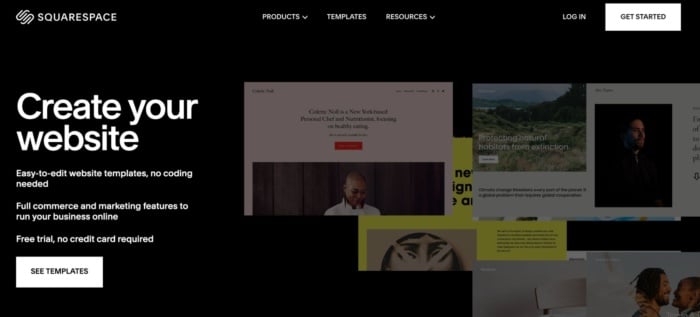
Squarespace is a contender for the shortest landing page ever. Seriously, there’s not much more to it than the screenshot I’ve taken above. But that doesn’t mean it isn’t effective.
Rather than trying to get you to create an account, all Squarespace wants you to do here is look at the templates. I reckon they know that once you see how good the templates are and how easy the platform is to use, you’ll be hooked.
Three takeaways from Squarespace’s landing page:
Short can be sweet. You don’t have to have a massive landing page to convince users to take action. A couple of enticing benefits may be all you need.
You don’t need much color. Everyone knows color can be used to convey emotion to users. But it’s not essential. And because it’s not on-brand for Squarespace, it’s not used.
The rule of three. Three is a magic number in marketing and Squarespace uses it to get across their core USPs.
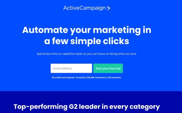
If there’s one thing you can’t fault ActiveCampaign’s landing page for, it’s brevity. They get straight to the point with the key benefit of their platform and encourage you to start a trial by entering your email address. Scroll down further and the rest of the page is similarly pared back, only including key information users need to know.
Three takeaways from ActiveCampaign’s landing page:
You don’t need fancy graphics. There are no eye-catching images above the fold and only two in total.
Lean on an authority. Are you highly rated by a trusted authority like G2? If so you can do what Active Campaign has done by showcasing all of your badges.
Show how your platform works. Images are great, but showing how to use your platform can make a huge difference in your conversion rate.
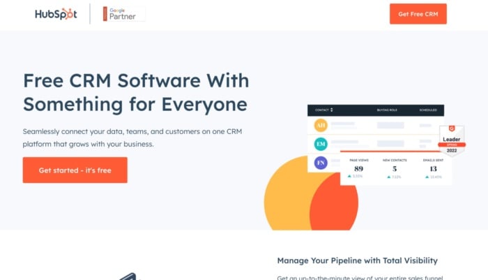
Cost is a big hurdle for any small business looking to purchase a CRM. That’s why HubSpot makes such a big deal of its free offering in this landing page. But just because you get the software for free doesn’t mean it’s limited. That might be your first thought, but HubSpot assuages those fears by showing all of the features you get below.
Three takeaways from HubSpot’s landing page:
Get your point across fast. The first three words users read on this landing page will be exactly what they are looking for: free CRM software. They don’t need to know much more to get started.
Reiterate your USP in your CTA. You can use your CTA to back up your headline by tacking on a short message or reason to take action as HubSpot has done here.
Use white space. HubSpot’s landing page isn’t too busy or crowded. There’s loads of white space, which makes it super easy to read.
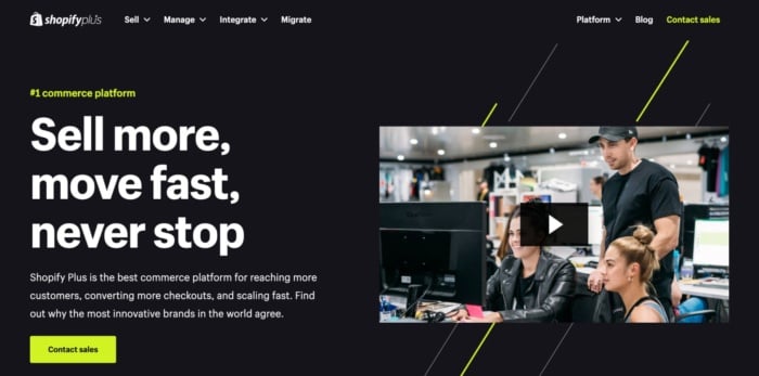
Shopify Plus isn’t designed for bootstrapped e-commerce stores or side hustlers. It’s an enterprise product and that shows in this landing page. It talks directly to big businesses, addresses their specific concerns, and shows them the kind of results they can achieve. Best of all, it’s topped off with a piece of ultra-professional video marketing that’s also designed to appeal to the brand’s target audience.
Three takeaways from Shopify Plus’s landing page:
Tailor your CTA. Enterprise customers aren’t going to make a purchase straight away. That’s why Shpoify encourages them to contact their sales team rather than book a demo.
Use statistics. The landing page gives hard data about how much better stores can perform by using Shopify Plus. This is much more powerful than a throwaway comment.
Speak to your customer’s values. Shopify devotes a large chunk to talking about the performance of their platform — something enterprise companies care about deeply.
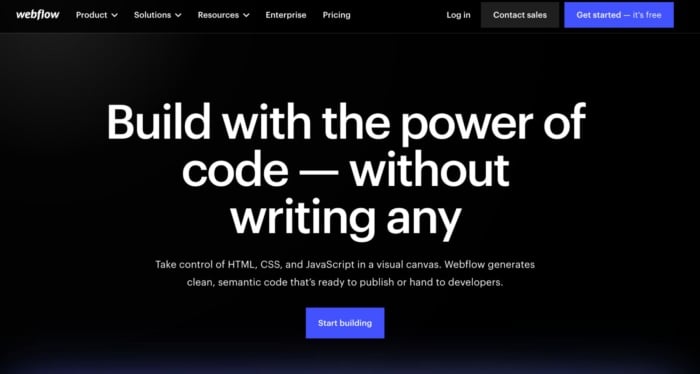
There’s a reason designers aren’t web developers — most don’t know how to code. That doesn’t stop them from designing great-looking websites, but it does mean they need help. Not if they use Webflow, however. Webflow lets designers design and code powerful websites without having to write any themselves. And because the company knows its target audience, everything on the landing page is designed to appeal to designers — from the images to the testimonials to the copy.
Three takeaways from Webflow’s landing page:
Tailor your landing page to your target audience. This landing page won’t appeal to anyone who can’t design. But that’s the point. Those people won’t use Webflow, designers will.
Double down on social proof. Webflow understands the power of social proof, which is why they highlight their existing customers multiple times on the page.
Show, don’t tell. Webflow ends the landing page by showing designers exactly the kind of sites they can create with the platform.
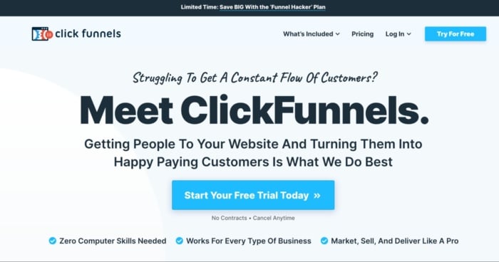
The goal of the ClickFunnels landing page is to get you to start using its software. They know that once they’ve got you on their platform, you are way more likely to start paying. With that in mind, everything on the page is geared at showing how easy it is to get started and what you can accomplish with the software. There are dozens of testimonials of high-profile salespeople who have made serious bank with the software and copy that challenges any preconceived ideas you have. It’s a masterclass in persuasive landing page design.
Three takeaways from ClickFunnels’s landing page:
Let your customers sell for you. Testimonials are so powerful. If you have them from the right people (the kind your prospective customers want to emulate) then they’ll do most of the hard work for you.
Attack objections early. ClickFunnels does a great job of overcoming common objections (like you need to have good computer skills or your business isn’t a good fit) above the fold.
Use CTAs liberally. There is a CTA banner after every section on this page, giving users every opportunity to convert.
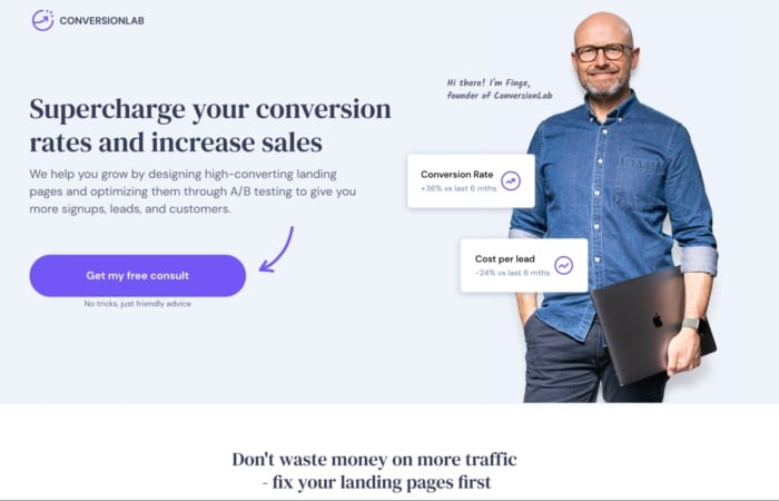
Conversionlab has been using this landing page design for years now. I’ve noticed they split test different button CTAs, like book a call, get a free consult, and many more. Keeping their Founder on the main page of the website builds a long-term relationship many businesses nowadays miss out on. They clearly state their services through their persuasive headline and, even if you’re not ready to book a consultation, a pop-up will appear collecting your email.
Three takeaways from Conversionlab’s landing page:
Put your team front and center. You can build instant relatability with users by putting your team members on your landing page.
Don’t be afraid to give it all away. Conversion Lab’s landing page explains in detail what it’s like to work with them, so every prospect knows exactly what to expect.
Try twice to convert. Following up with an email (collected via pop-up) is a great way to ensure that a high percentage of prospects that land on your website will end up booking a call with you.
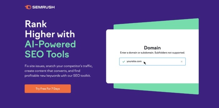
Semrush is an SEO platform. Here’s a landing page example for their tool that showed up as an ad in organic search. The button is bright (and on-brand) and makes it clear what your next step would be. The main headline focuses on the benefit — grow your online visibility — and the third line focuses on another key benefit — you only need one platform. That’s appealing to marketers who are juggling a ton of tools.
Three takeaways from Semrush’s landing page:
Know your audience. The landing page’s CTA focuses on a known pain point of digital marketers: that they have to juggle dozens of different tools.
Roll out the big guns for testimonials. Semrush lists some of their biggest customers prominently on the homepage. If these massive companies use the platform, surely you should, too?
Use variety with your CTA buttons. Each of the CTA buttons lead to the signup form, but the copy is different in each one, ensuring they hit the pain point that will get someone to click, no matter where they’re at on the page.
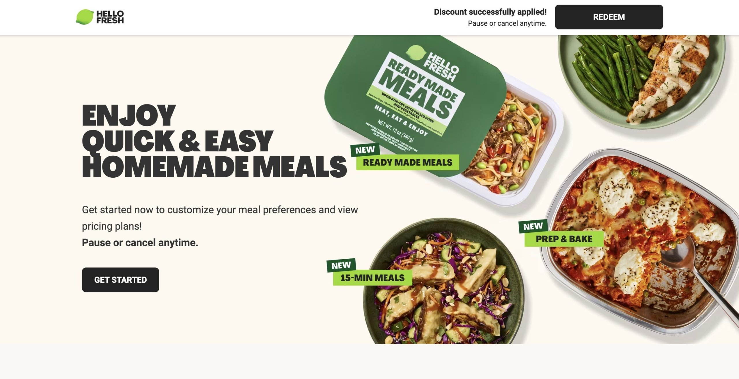
HelloFresh is a meal-kit delivery service, and this landing page is another ad-based page that’s focused entirely on its offering, with no additional navigation.
Like other landing pages, the content is limited. They use a heading, CTA, and images to show how the platform works and some of the user options. However, I suspect that’s on purpose — after all, the premise is relatively simple, it’s more about showing how the service fits into people’s lifestyles.
Three takeaways from HelloFresh’ landing page:
Strategic discounts make a difference. The page is offering a discount, but it’s automatically applied the second someone clicks on the page, creating an enticing offering that requires no additional effort on the customer’s side—they just have to click “Redeem” or “Get Started.”
Use high-quality visuals. HelloFresh prides itself on high-quality, fresh ingredients, and the images here present these front-and-center.
Strategic link placement. The carousel at the bottom is neatly aligned with different dietary needs and preferences, helping move users down the sales funnel.
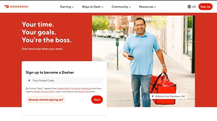
Doordash probably doesn’t have to worry as much about getting customers as it does about recruiting new drivers to meet demand. That’s the goal of this landing page that shows users what they stand to gain from becoming a Dasher. It’s on-brand, carefully lays out the benefits of becoming your own boss, and shows you how much you could earn. The only thing it’s missing is social proof.
Three takeaways from Doordash’s landing page:
Put the user front and center. Everything on this landing page, from the copy to the images revolves around the user. It’s about what they can achieve and speak directly to them.
Pre-qualify users on your landing page. Doordash clearly lists the requirements drivers have to meet, meaning they’ll need to spend less time vetting candidates in the future.
Don’t rule out the impact of social proof. The lack of testimonials from current Dashers really lets this page down. The experience of current drivers is probably high on a prospective driver’s checklist.
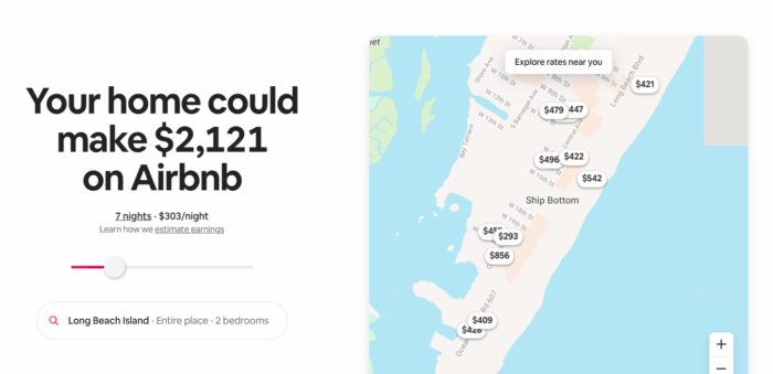
Want to know how much you could rent your property for on Airbnb? That’s exactly what the company’s landing page helps you to understand. This fun and interactive landing page gives users a taste of what they can earn by renting out their property on Airbnb and then shows them how easy the process is.
Three takeaways from Airbnb’s landing page:
Dynamic pages can work a dream. As soon as you land on Airbnb’s landing page it automatically changes the content depending on your location. That creates a highly personalized and interactive experience that’s more likely to convert users.
CTAs don’t have to take center stage. The CTA to create an Airbnb account is tucked away in the right-hand corner of the page. But that doesn’t make it any less prominent or visible.
Make it interactive. Users can play with the slider bar to see how much they could earn by renting out their property for longer. The more you slide, the bigger the number gets, and the more tempting it is to create an account.
Every homeowner wants to know how much their property is worth. It’s that simple desire that Zillow capitalizes on with this landing page, which aims to generate leads for the company’s mortgage business. It’s short, simple and incredibly alluring for both curious homeowners and buyers looking to understand the potential value of a new home.
Three takeaways from Zillow’s landing page:
Eye-catching imagery can play a big role. The biggest element on Zillow’s landing page isn’t the CTA, but the image behind it. It’s doing a lot of legwork creating an aspirational feel to the page.
Clearly contrast copy and images. There’s a danger that the overlay copy on the background image could get lost. But Zillow does a great job of ensuring the contrast is clear and the copy is readable.
Give users more information, but only if they want it. There’s a tendency for the best landing pages to overwhelm users with information. Zillow avoids this by providing FAQs that only appear if users click on them.
Visme is a graphic design tool that offers a number of templates for different types of business-centric designs, like presentations, infographics, e-books, and the like. This landing page is all about the fact that you can create e-books with the tool, highlighting only e-book templates and other features related to e-book creation.
What I like:
Three takeaways from NP Digital’s landing page:
Brand consistency matters. All of the copy and images are related to this singular type of design. This page is perfect for ebook-related ads but also a great SEO play as well.
Showcasing different product. The examples section does a great job showing off the variety of different e-books that this product can make.
CTAs after key features. The page design here places the CTA button after all the different breakdowns of major features, meaning that the user can buy as soon as they see the feature that matters most to them..
Wix is a website builder, and this landing page goes all in on its website design capabilities. It showcases all features related to getting a new website up and off the ground.
Three takeaways from Wix’s landing page:
Don’t neglect the visual factor. As you scroll, you’re met with colorful blocks that each highlight its own feature, making this a visually appealing landing page that keeps users engaged the entire time. Show your work. The examples section here does a great job of showing the full breadth of sites that Wix can help build.
Use FAQs (when it makes sense). FAQs can be very useful for helping go into greater detail about a product without clogging up the page experience. They are great for SEO, too!
Let’s end with one of the best landing page examples from my digital marketing agency, NP Digital. Unlike some of the other examples in this list, the goal of this landing page isn’t to get people to buy a product or sign up to a service. I want users to download a market research report my team and I created.
As you can see, it’s quite a bit shorter than a normal landing page. That’s because it doesn’t need elements like social proof or loads of images. All I want to get across is a snapshot of what you can read in the report and how you can download it.
Three takeaways from NP Digital’s landing page:
Don’t let users enter fake information. I email the document to the address you provide in the form. That means you have to enter your correct email address to get the document and I don’t have to waste time scrubbing fake emails from my database.
Sometimes you can ask for more information. Your opt-in form doesn’t have to be tiny in order to convert. Because I’m giving away a lot of information for free, I can ask for more information in return.
Long landing pages don’t necessarily make the best landing pages. If you don’t want users to waste time scrolling, don’t make them. Only give them the information they need to convert.
7 Tips for Creating Killer Landing Pages
You’ve seen the best of the best. Now you’re ready to create a landing page that drives business growth. These seven tips will help you create the high-converting landing pages you’ve been dreaming of:
Include clear calls to action. Your call to action should be specifically tied to your goal and should be supported by everything else on your page, from the headline and body copy to the images and overall layout. Avoid bland CTAs like “Submit” that don’t explain the next steps.
Keep your landing page forms simple. Only require users to provide the minimum amount of information they need, usually just their name and email. Asking for too much information early on decreases the chances a user will complete the action you want them to take.
Ensure your copy is clear and concise. The best landing page copy should be clear, easy to read, and make a specific point. Use bullet points, headings, and bold font to make content easier to read. Every single sentence and word on your landing page should serve a purpose, and that purpose should be to support your call to action. If it doesn’t do that, cut it.
Include vital information above the fold. That includes a benefit-focused headline and a CTA. Hopefully, at least a small percentage of your visitors will be ready to buy as soon as they arrive on your landing page.
Ensure your landing pages look the same as your campaign ads. If your page is tied to an email or PPC campaign, make sure the landing page echoes the look and feel of the ad or email. The easiest way to do this is to carry over fonts, images, and colors from your campaign to your landing page. This is especially important for paid ads, as it can increase your quality score.
A/B test your landing page. A/B testing means running two different landing pages and changing just one element to see which performs best. For example, you might use two different images and see which one drives the most conversions.
Use fewer images and a large font. Visual clutter detracts from the message and CTAs. Larger font sizes are also a good idea to keep visitors’ eyes focused on what matters and reduce eye strain. Just don’t go overboard and put everything in a headline-size font — no one wants to be yelled at.
In general, a great landing page includes:
A strong heading that includes your main keyword
A subheading that clarifies the heading
Copy that explains the offer
An image, video, or illustration that supports the offer
A form or CTA button where the user can convert
You might also include social proof or trust symbols, such as reviews, testimonials, and logos of previous customers.
Building Out Your Next Landing Page
While there are some consistent elements between all strong landing pages, the exact design will depend on your goals, your business, and your industry.
Let me ask you a couple of questions that will guide you in the right direction.
What do you want to accomplish with your landing page?
The most common landing page goals are:
Getting people to opt-in in exchange for free value on a subject.
Selling a low-ticket product like a book or a mini-course.
Promoting a free trial offer for a monthly service or software.
You’ve got to know exactly what offer you want to present on your landing page before creating it.
Are you committed to this project or are you just trying out an offer?
You might find yourself optimizing a non-profitable landing page for months before it starts generating real returns. If you’re not ready for that, then I recommend you quit before you even start.
Yes, you can get lucky and hit a home run on your first try, but don’t count on it.
Be ready for the long game so you catch the long-term gains that are so much sweeter than a short-term spike in traffic.
What’s your budget?
Before you begin designing your landing page, you need to prepare a solid budget.
You can’t expect everything to go smoothly throughout the process. Problems are going to occur and most times the easiest and fastest way to solve them is to pay someone who is an expert in the field.
That can be a developer, a funnel designer/builder, an ad specialist, or a CRO consultant. Either way, you should be ready to pay someone to do it right so you don’t face the same problems over and over.
In marketing and life, one of the best ways to test the quality of your work is to put it in front of an audience. For landing pages, you can do that by running ads to see if the traffic converts.
If it does, you raise your ad budget and try to scale. If it doesn’t convert at first, then you should let a professional take a look at it.
Even if you already hired someone to build it for you, don’t expect them to help you here. Yes, they could optimize your page, but you’ve got to keep in mind that people have an emotional attachment to their work.
That’s why you need a third party to help you out.
When it comes to optimizing a landing page for conversions, think about hiring an agency.
Big marketing agencies nowadays have had hundreds if not thousands of clients who have been in your exact situation. That’s why hiring a marketing agency to help you increase your conversion is the best bet.
Talking about CRO (conversion rate optimization) there’s no better choice than NP Digital.
I might be biased, but I think it’s the best marketing agency for both SEO and CRO.
If you’re at the stage where you want to optimize your existing landing page but you don’t know exactly how to do it, then book a quick call with a member of my team who can unravel the secret conversion optimization methods your business needs.
Frequently Asked Questions
What is a landing page?
A landing page is a specially designed page intended to encourage users to complete a specific task (i.e., convert.) They work by highlighting key points, using social proof or case studies to build trust, and providing a CTA to encourage conversion.
Who needs a landing page?
Any business with a website should have a landing page of some sort to encourage users to take an action like booking a demo, calling for a quote, or signing up for an email list, etc.
What makes a good landing page?
There are several elements that make a landing page effective. First, a clear and compelling headline that instantly communicates the value proposition is essential. Second, concise and persuasive copy that highlights the benefits of your product or service. Third, it needs a visually appealing design that is easy to navigate and optimized for mobile devices. Fourth, a strong call-to-action that is prominent and directs users to take action. Finally, I recommend trust-building elements such as testimonials or social proof to instill confidence.
Conclusion
I hope these best landing page examples can serve as an inspiration to create a high-converting landing page. To get the most out of your landing page, be sure to:
Find what your best customers struggle the most with and then solve this problem with a short and punchy headline.
Use credibility and videos if possible.
Know your goals — Is it to get their email or phone number? Have them call? Start a free/paid trial or something else?
If you’re not using AI in marketing, you’re already falling behind. Artificial intelligence (AI) tools are becoming more and more prominent, and many have functions specifically designed to help marketers better promote their products and services.
Throughout this article, we’re going to dive deeper into what AI in marketing looks like, sharing the benefits of taking advantage of AI, how AI can be used in marketing, plus some AI marketing tools to get you started.
Key Takeaways
AI can provide a number of benefits for your marketing team, like speeding up tedious tasks, providing you with better insights, and boosting your overall results.
You can use AI as part of your content planning and creation process, to gather competitive insights, to improve your customer service, and more.
There are a number of AI tools that can help you automate processes and streamline your strategy.
Benefits of Using AI in Marketing
Why should you incorporate AI into your marketing strategy? There are so many benefits that these tools can bring to your team—if you use them right.
Speed Up Processes
AI can help marketers speed up processes and spend less time conducting certain tasks manually. According to HubSpot’s State of AI Report, 79% of marketers agree that AI helps them to spend less time on manual tasks, showing just how valuable these new tools can be.
Improve Personalization
AI can analyze customer data at scale, helping you to gather more insights and understand how to better personalize your content and segment your audience. Better personalization can provide your business with better results from your marketing campaigns.
Better Insights
Because AI can analyze data more effectively than humans can, you can get better insights. For example, AI analysis can help you identify trends earlier, forecast sales and customer behavior more efficiently, and help your marketing team make better decisions.
Cost Savings
Incorporating AI tools into your team’s daily processes can save time and resources, resulting in cost savings within your marketing budget. While AI shouldn’t replace core human workers, there are certain tasks that it can take off their plates, letting them focus on things that actually impact your business’s bottom line.
Higher ROI
Because AI tools can help your marketing team better understand customers, personalize campaigns, and ship better content, you’ll see a higher return on investment (ROI) as a result. Start using AI within your day-to-day marketing tasks to see how it can help improve your performance.
How AI Works With Marketing: 9 Use Cases
Because AI is a newer technology, you might not be sure how it works with marketing quite yet. However, there are a number of key use cases that AI can help with.
Content planning: AI chatbots can be a huge help in brainstorming content ideas. Tell the chatbot about your business and your overall content goals and ask for topics that you may not have covered yet. You can then run the ideas through an SEO tool to find top keywords to center your content around.
Content creation: While AI shouldn’t be handling the entire content creation process, it can still provide some assistance. Get help creating a comprehensive outline, get ideas for your introduction, or get AI to start with a summary that you can expand on.
Marketing automation: Incorporate AI tools into your marketing automation workflows to further your team’s productivity. AI tools can be used as a step within your workflows or they can help you set up new workflows, improving efficiency.
Customer service: AI can be a huge help within customer service. Use an AI-powered chatbot on your website to help answer basic customer questions while also escalating issues to a human service representative for larger issues. This can make sure your customer service team is only having to deal with major issues, with AI responding to all smaller queries.
Audience segmentation: AI tools can analyze large amounts of customer data, helping you to segment out your audience in a much more effective way than if your team were analyzing the information themselves. Segmentation can help you create more personalized campaigns and marketing efforts.
Social listening: Incorporate AI into your social listening strategy to more quickly analyze the data, understand overall sentiment, and generate a summary of overall customer conversations. This type of AI assistance can make your social listening strategy much more effective.
Competitive intelligence: Again, because AI is such a powerful tool when it comes to analyzing data, it can be a huge help when looking at competitive insights. Discover how your competitors are faring in comparison to your own performance, plus analyze market trends to see what you can expect in the future.
Predictive analytics: Similarly, AI can also be used to predict customer behavior, taking a look at past campaigns and forecasting future results based on historical data. This can be a huge help when creating new campaigns so that you can make them better than ever.
Administrative tasks: AI is also hugely helpful with basic administrative tasks like data entry, scheduling, pulling reports, and more. Use AI for the boring manual tasks to free up your team’s time for more important work.
3 Examples of AI in Marketing
Let’s look at some real life examples of businesses using AI in ways that market their products or make working with their business feel more appealing.
Spotify
Spotify is a music streaming service that recently launched its own AI product to help its users have a better listening experience. This AI product is called “DJ,” and it analyzes your top songs and plays music based on your past listening habits.
The DJ will play five songs that all come with a similar vibe, then come back onto the “mic” to share your next five songs. If there’s a set of songs that listeners aren’t interested in, they can tap the “DJ” icon to move onto the next set.
It’s a unique experience that really helps to set Spotify apart from other streaming platforms.
Curlsmith
Curlsmith is a beauty brand focused on curl care. It has a chatbot widget on its website to help customers find what they’re looking for.
As you can see, the chatbot responses are all “Automated with AI.” Customers can use this chatbot to:
Find the right products for their curl type
Check in on a recent order
Ask questions about shopping with Curlsmith
Ask about discounts
Change an order
There are programmed responses, but if a user says that they need additional help, there’s a conversational AI chatbot implemented as well that will analyze a user’s response in order to provide them with the best customer service.
Heinz
Heinz put together a creative ad campaign a couple of years ago and used AI to help them build it. The ad told the story of how the Heinz team typed “ketchup” into an AI image generator, and the output was a ketchup bottle with a logo that looked eerily similar to the Heinz logo.
The campaign essentially said, “even AI knows ketchup is Heinz,” and showcased several other prompts the team ran through the AI image generator, all including the word “ketchup,” and the output they received.
This was a creative way to incorporate AI tools in a marketing campaign that also provided an extremely effective result.
AI Marketing Tools to Use
If you want to get started incorporating artificial intelligence into your marketing strategy, you need to find the right tools to use. Below, we introduce you to six different AI marketing tools, each with its own use case.
ChatGPT – AI Chatbot
ChatGPT is an AI-powered chatbot that can provide answers to anything you type into the text box. It can help with things like:
Brainstorming
Outlining
Conducting research
Optimizing content
Analyzing your market
But ChatGPT can honestly help with nearly any request you might have for it. You can also upload Excel files and have it analyze historical data, helping you generate predictive analytics, forecast customer behavior, and gather competitive insights, even without tools that are more catered to those capabilities.
If you don’t use any other AI tool, you should at least have a ChatGPT account under your belt.
Pricing: Completely free for limited (but still extensive) use. To get access to more models and more capabilities, premium plans start at $20/month.
Jasper – Content Generation
If you’re looking for help with your content generation, Jasper is the perfect tool for you. The tool provides an intuitive workspace that makes it easy to generate content at scale, optimize content so it hits every mark, conduct research to fully flesh out your content, and more.
While Jasper is the ultimate content generation tool for marketers, it also offers AI agent capabilities. AI agents are tools that can operate autonomously, helping marketers get more done in less time.
Pricing: Plans start at $39/month/seat.
Midjourney – Image Generation
Midjourney is an AI-powered image generation platform. It was originally built through a Discord server (which still remains active), but now can be accessed through an easy-to-use web app. Users can input any text-based description, upload images for reference, and incorporate some of Midjourney’s built-in parameters to create images for any marketing needs.
Generate realistic images, animated images, surreal art, and more. Midjourney is also starting to delve into video generation, which can be a game changer for creating marketing video ads and commercials.
Pricing: Paid plans start at $8/month.
Hootsuite – Social Copy Generation
Hootsuite is a social media management platform, but it also offers a number of free AI-powered tools that can help marketers get ideas for their social copy and captions. Some of the available tools include:
Caption generator
Tweet generator
Video title generator
Video description generator
Hashtag generator
Username generator
Social media bio generator
Content ideas generator
Blog ideas generator
Take advantage of these completely free tools to help you brainstorm more ideas and captions for your social media content. These free tools are also their own example of AI in marketing, as they help promote Hootsuite alongside providing free value.
Pricing: The AI-powered generators are completely free to access. Hootsuite’s suite of social media management tools start at $99/user/month.
Zapier – Marketing Automation
Zapier is an AI-powered marketing automation platform that makes it easy for marketers to set up automated workflows. Zapier works via “zaps” that connect tools together to create an automation that wouldn’t otherwise be possible.
For example, automatically add leads to your CRM, automatically add your new blog posts to your social media content calendar, or automatically add new customers to a spreadsheet for tracking.
These are some basic zaps, though. Zapier also offers a number of extensive workflows that incorporate their AI capabilities, helping marketers to automate more complex tasks as well.
Pricing: Free for up to 100 tasks/month. For more usage, paid plans start at $19.99/month.
Tidio – Chatbot
Tidio is a chatbot software that enables businesses to create their own AI-powered chatbots for their customers to interact with. Users can get customer support from your AI bot, chat with your bot about product suggestions, and make appointments all through your Tidio chatbot.
Train the Lyro AI assistant with your business information so they can help customers out, while also escalating more serious concerns or more unique questions directly to a human customer service representative.
Pricing: Plans are flexible based on the number of conversations you expect to have per month. Get access to the tool for free for 50 conversations or less. Plans start at $24.17/month for 100 conversations and go up from there.
FAQs
What are some examples of AI in marketing today?
Chat bots, a form of artificial intelligence, are a common occurrence on business websites. Other examples within marketing include ad targeting, dynamic pricing, and ChatGPT.
How is AI changing the marketing industry?
The greatest impact that AI has had on the marketing industry is in the automation of repetitive tasks. This frees up times for digital marketers to focus on larger-scale projects and higher level strategy.
How to use AI in digital marketing?
Use AI where it actually helps. Automate tedious tasks like reporting, scheduling, and customer service. Use it to speed up content planning and pull insights from your data faster. Let AI handle repetitive tasks so your team can focus on strategy and creative work.
Should you trust AI tools?
AI tools, in and of themselves, are nothing to be feared. There is nothing inherently bad about AI or AI tools. However, you do want to review any work that comes out of them to avoid concerns like plagiarism or inaccuracy.
AI Is the Future of Marketing
Artificial intelligence (AI) is a key part of marketing these days. You can use the tools to help generate content for your marketing campaigns, analyze results, predict upcoming trends, and so much more. To get even more ideas for how to use AI in your marketing efforts, check out our arsenal of AI tools.
Think a website redesign is just about fixing your homepage or refreshing the layout? Think again.
Too often, these projects focus on changing the look or chasing the latest trends. But if your redesign doesn’t fix what’s actually broken, your site won’t perform any better or win you more business.
In this guide, I’ll show you what a website redesign really involves and walk you through my agency’s 11-step process — including mistakes to avoid.
Key Takeaways:
A true website redesign is more than just cosmetic, involving rebuilding your website to create a strong foundation for visual design, UX, SEO, and technical infrastructure.
Mobile devices have generated over 50% of all website traffic since 2017, so use a mobile-first approach during your redesign process to appeal to the largest percentage of users.
If you take a “set it and forget it” approach to website redesign, you’ll end up back where you started. Make a plan to monitor and optimize your site post-launch to keep hitting your goals.
What Is a Website Redesign?
A website redesign is a process that involves changing a site’s appearance, content, and functionality.
The goal? Developing a website that better meets both user needs and business goals.
A website refresh involves making small-scale changes (like making a few tweaks to the homepage layout). But a full redesign basically rebuilds your existing website from scratch.
A site redesign checklist typically includes these elements:
Visual Design: How the site looks, including the layout, color schemes, typography, and branding
User Experience (UX): How the site functions for users, including the navigation and interactive elements
Search Engine Optimization (SEO): How the site appears in search, including keywords and metadata
Site Architecture: How the site is organized, including page hierarchies, URL structures, and internal links
Technical Infrastructure: How the site functions on the backend, including site speed and security
Accessibility: How well all users can understand and interact with your website
When to Consider a Website Redesign Project
Not sure if a web design is really necessary? Here are a few signals that it’s time for an overhaul.
Outdated Design
Does your site look like it was designed in 2010? Potential customers might question if your business is still operating — or if it can meet their current needs.
New Branding or Positioning
Has your company refreshed its branding or updated its competitive positioning? Your site is one of the first places you’ll want to roll out these changes.
Subpar User Experience
Do site visitors frequently tell you they can’t find anything on your site?
Bad Mobile Experience
Is your site the opposite of mobile-friendly? Since 2017, mobile devices have generated over half of website traffic. Which means mobile responsiveness is essential for every site.
Content Management System Limitations
Does your content management system (CMS) limit your site’s functionality or the plugins you can add? Switching from WordPress, Webflow, or any other CMS is a great reason to rebuild your site from the ground up.
Poor Site Performance
Does your site take ages to load — even though you’ve tried everything to speed it up? A complete redesign gives you an opportunity to address technical issues.
How to Redesign Your Website in 11 Steps
Now that you know when it’s time for a redesign, here’s how to do it step by step. I’ll break down my process into phases, from discovery and planning to launch and performance monitoring.
Discovery and Planning
Start by doing research and getting clear on your strategy.
Step 1: Audit Your Current Website
The first step is understanding what’s happening on your website and benchmarking its current performance.
Use Google Analytics to check website visitor data like total traffic, bounce rates, and conversion paths.
Analyze SEO tool data and identify top-ranking pages — and those that don’t rank for many keywords.
The idea is to assess what’s working on your website and what isn’t. This way, you can preserve the elements that serve your site well (like top-ranking content) and update those that don’t (like a design that loads slowly on mobile devices).
Step 2: Conduct User and Competitive Research
Validate your research by talking with your actual prospects and customers. Add surveys to your site so you can automatically poll site visitors. Or reach out to customers manually.
Ask them what they like about your site, from the design to the functionality. Learn what they dislike about your site. Prompt them to highlight points of friction that prevent them from finding information or accomplishing tasks.
Then, make a list of competitors and analyze their websites. Identify areas where your competitors’ sites outperform yours and opportunities where your new site can do a superior job.
Step 3: Define Goals and Align Stakeholders
After auditing your website and understanding your current situation, you’re ready to set redesign goals. What does success look like for your new site?
Get crystal clear on what you want to achieve. For example, you might want to:
Create a better UX so website visitors can easily find the information they need. Which should make your site easy to navigate, decrease bounce rates, and build trust.
Implement a new CMS that integrates with the marketing automation tools your team uses. And that allows your team to publish new content more consistently.
Improve conversion rates by reducing friction for website users and guiding customers to next steps like signing up for a list, booking a call, or making a purchase.
Create a timeline and establish clear deadlines for each phase of the process.
Then, assemble a website design team with all essential stakeholders. For example, you’ll need someone to sign off on branding and design, website copy, SEO, and legal compliance.
Site Structure and Content Strategy
Map out the site architecture and content before developing mockups.
Step 4: Confirm the Navigation and the Content Strategy
Put your research to work. Design navigation that prioritizes user goals so your target audience can easily use the site. Add user-friendly navigation menus to simplify how they access important content.
Don’t forget about SEO best practices. Use a logical hierarchy that organizes content into categories. Make sure most content is no more than three clicks from the homepage.
While you’re at it, clarify your content strategy. Audit your existing content and determine if and how it fits into the new site structure.
Make a plan to combine redundant pages, unpublish outdated content, and identify content gaps that you’ll need to fill with new landing pages.
Step 5: Draft Website Copy
Now you’re ready to create or update the content for the most important pages on your website. Start with your homepage and then systematically work through product or service pages, use case pages, and industry pages. Include existing offer pages and conversion pages in this part of your website redesign plan.
Write for your audience, speaking to their goals and pain points
Incorporate your brand voice, including your style and tone of voice
Make website copy easy to skim with clear page structure and subheadings
Add calls to action (CTAs) that prompt prospects to take the next step
Design and Prototyping
This is where the redesign process gets visual — and when stakeholders weigh in.
Step 6: Create Wireframes and a Design System
Design wireframes that show the website navigation, user flow, and content placement. Then, create a design system that shows the color palette, typography, and visual style.
By now, you should start to get a sense of how the new site will look and feel.
I recommend incorporating accessibility into this stage of your website redesign strategy. Choose accessible colors with sufficient contrast and fonts that are easy for site visitors to read.
Step 7: Build Mockups or Prototypes
Next, turn your wireframes and visual guidelines into website mockups or prototypes. Again, start with the most important pages on your website — like your homepage and product or service pages.
Apply the design to actual content drafts so stakeholders can see how the web copy will fit on the site, complete with the text hierarchy, white space, navigation, and design elements.
Develop prototypes for various screen sizes. While mobile devices will likely make up a large percentage of your site traffic, they won’t account for all of it. Make sure your site is just as easy for desktop users to navigate.
Step 8: Get Stakeholder Sign Off
The key to a successful redesign is getting everyone on board with your decisions. So once you’ve confirmed major design and copy decisions, present the prototypes to your stakeholders.
Walk them through how users will navigate the site based on typical journeys. Explain why you’ve made certain design decisions or built specific pages.
Gather feedback and make necessary revisions. Document every comment and change throughout the process. Then, get your team to sign off on the design, UX, and copy.
Development and Technical Setup
Set up your new website for success with a strong technical foundation.
Step 9: Develop the Website
Now you’re ready to hand off the design to your development team. Work with the website developers to choose a CMS that supports your design, marketing automation, and compliance needs.
Use clean, descriptive URLs with relevant keywords and a logical hierarchy. If necessary, create 301 redirects to update the location of content from your old website.
Largest Contentful Paint, which reflects content loading performance
Interaction to Next Paint, which reflects the responsiveness of your site
Cumulative Layout Shift, which reflects the visual stability of your site
Build SEO foundations into your site so you can easily optimize your content for search engine rankings. Incorporate schema markup and metadata into the backend to help each page rank for relevant keywords.
Step 10: Test and Optimize the Site
Before launching your new site, take time to test it thoroughly. Recruit team members and beta users to check how your site performs on various devices, browsers, and screen sizes. Check for consistent appearance and functionality.
Work with your dev team to create a testing checklist. This way, nothing will fall through the cracks. Here are a few elements to add to your list:
Broken links
Missing images
Formatting issues
Faulty integrations
Slow loading speeds
Form submission issues
Launch and Performance Monitoring
Go live with the new design and monitor performance closely.
Step 11: Launch and Monitor the Site
Now you’re ready to launch the redesigned website. With your dev team, go through a complete checklist to set the stage for a successful website launch.
Update DNS settings
Set up SSL certificates
Confirm any 301 redirects
Check analytics tracking
Monitor the site closely for the first day or two. Make sure your dev team is available to quickly address any bugs.
Then, regularly review technical aspects like page load speeds, performance aspects like conversion rates, and SEO aspects like keyword rankings. Use your insights to create a plan to continue optimizing your site.
Common Mistakes to Avoid in a Website Redesign
Don’t make the same missteps many web designers do. Watch for these mistakes to make the website redesign process as smooth as possible.
Mistake
Phase
How to Fix It
Missing Performance Benchmarks
Planning
Document baseline metrics like website traffic, conversion rates, and page load times before the redesign. Set specific goals for each.
Misaligned Goals
Planning
Set clear goals at the beginning of your redesign process. Communicate them to stakeholders and provide regular updates.
Navigation Issues
Strategy
Test the proposed navigation with a group of real users. Monitor how they use the site and where they get stuck.
Poor Mobile UX
Design
Use a mobile-first design, then scale up to a desktop design. Test for usability issues before launching the website.
Inconsistent Branding
Design
Create a style guide with branding guidelines, including hex codes, typography, font size, and spacing rules.
Ignoring SEO Essentials
Development
Establish your new URL structure and create 301 redirects as necessary. Implement structured markup and metadata.
No QA Process
Development
Assign a QA lead and recruit real users. Follow a clear checklist to test the site and make it easy for users to report bugs.
Post-Launch Neglect
Post-Launch
Use analytics and SEO tools to monitor site performance. Schedule 30-, 60-, and 90-day reviews and plan for continuous optimization.
FAQs
What is a website redesign?
It’s a full rebuild of your site, going beyond just a visual update. You’re reworking the design, structure, content, and functionality so your site works better for your users and supports your business goals.
How do you redesign a website?
Start by figuring out what’s working and what’s not. Talk to users. Check your analytics. Map out a new site structure and write better copy. Then design, develop, test, and launch. Keep it focused on solving real problems instead of chasing trends.
How often should you redesign your website?
Whenever your site stops pulling its weight. That might be every few years or sooner if your tech, brand, or audience changes. If it’s slow, confusing, or outdated, it’s time.
Why redesign a website?
Because the old one isn’t doing its job. Maybe it’s hard to use. Maybe it’s off-brand. Maybe it just doesn’t convert. A redesign lets you fix what’s broken and build a better experience for the people you want to reach.
Final Thoughts on Website Redesign
Many businesses make design decisions on a whim — no plan, no discussion, and no website redesign goals. This can lead to underwhelming results. Or worse, ongoing updates that leave customers confused.
But with a clear workflow to follow, your website redesign doesn’t have to be overwhelming. Use my 11-step approach to set clear goals, get everyone on board, and design a new website that gets the results you want.
LinkedIn is the best platform for building professional connections, finding B2B leads, and job hunting. But in order to make the most of the platform, you need a LinkedIn headline that’s going to stand out.
Below, we discuss what a LinkedIn headline is, how you can write a good one, plus showcase 20 amazing examples you can use for inspiration.
Key Takeaways
A LinkedIn headline is like a quick elevator pitch showcasing what you do professionally.
To write a good LinkedIn headline, you want to start by perusing different examples to get an understanding of what your headline should include.
Make sure to incorporate things like your current role, your biggest skills, industry keywords, and other important information in your own headline.
What Is a LinkedIn Headline?
A LinkedIn headline is a short description of who you are/what you do that sits at the top of your LinkedIn profile. As you can see below, my LinkedIn headline is “Co-Founder at Neil Patel Digital.” Short, sweet, and to the point.
There are a number of ways to write your LinkedIn headline. You can keep it simple like mine, share a bit more about what you do, or infuse some personality into it. Just make sure it matches your overall personal brand—more on that later.
How to Write a Good LinkedIn Headline
To craft a LinkedIn headline that grabs attention and really showcases who you are, there are a few key elements you want to include. Follow along with these steps to write a good headline that properly details who you are and what you do.
Look at Examples Before You Start
Before you even put a single word in your headline, look around the platform to see how others describe themselves. You can also scroll down just a bit to see 20 amazing LinkedIn headlines we’ve hand-picked to share with you.
Looking around at how other users have written their headlines can be a great way to get the creative juices flowing in your brain. Plus, you can figure out styles that don’t suit you, giving you some parameters to start with.
Include Your Current Role
Now let’s get down to business. It’s time to start writing your LinkedIn headline. And the first thing you want to do is write down your current role.
Keep it simple. Something like “VP of Marketing at Company” or “Dev Lead.” And if you’re currently unemployed and job hunting, you can share that, as well, by writing out something like “Searching for a role in the HR tech space.”
Add Your Skills and Expertise
Next, include any relevant skills and expertise you have that will help you stand out. This can be really simple and in list form, like “Content Strategy, Product-Led SEO.” Or you can be a bit wordier and write something like “I build landing pages that convert.”
Including your best skills and experience can help you stand out, especially if you’re job hunting, looking for new clients, or aiming to expand your professional network.
Incorporate Industry Keywords
One major component of LinkedIn is its search functionality. And to make sure you appear in search results when people are looking for someone with the type of experience you have is to incorporate the right keywords into your headline.
You don’t want to create a keyword-stuffed, jargon-filled LinkedIn headline. But you do want to incorporate enough keywords that they sound natural while still helping you boost your profile’s ranking in search results.
Promote Yourself
Don’t be afraid to show off a bit with your headline. You’re good at what you do. Let it be known. For example, you could include something like “Built a channel with 1M+ YouTube subscribers” or “Building a bootstrapped SaaS product.”
Or, you can talk about what you do for clients. Like, “I write high-converting website copy,” or “I create social media ad campaigns that get results.”
LinkedIn is a professional social networking platform. The goal is to increase your online network, whether that’s finding new clients, making new colleagues, or meeting new industry professionals. And one great way to do that is to really sell what you can do.
Let Your Personality Shine
Just because LinkedIn is a professional platform doesn’t mean you can’t still let your personality come through in your headline and in your content. Include a line that provides a bit more context into who you are as a person—and not just as a professional.
We’ve included a few examples below of how some users have chosen to showcase their personality, even while remaining professional.
Make It Short and Sweet
You only have 220 characters to sum up exactly what you do and who you are in your LinkedIn headline. It’s like the shortest elevator pitch ever. So you need to find the right words to introduce yourself to other LinkedIn users in a really short, concise way.
Another pro tip: Keep the most important part of your headline at the beginning. In both search results and the LinkedIn feed, people will only see the first several words of your headline. They have to click to your profile to see the entire thing.
Make your headline short and sweet, but also, make them want to click to see more about what you have to offer.
20 LinkedIn Headline Examples to Steal
If you want to create your own impactful LinkedIn headline, you first need to look around and see how others in your industry are composing there. Here are 20 different ideas you can steal for your headline to get you started.
Similar to my headline, you can choose to just be straightforward, sharing nothing but your existing role. Don’t worry about any added fluff—just include what you do and where you work so your new connections know exactly what to expect from you.
Or, you can choose to have some fun with your LinkedIn headline. Infuse your personality into it, creating a headline that’s still relevant to what you do but also lets you showcase a bit of who you are.
This example, “I live on LinkedIn for a living,” works because Kate is a LinkedIn content creator. So she’s able to put a bit of who she is into her headline while still remaining true to her professional work.
In this example, we see the freelancer has included companies she’s worked with in the past right inside of her LinkedIn headline. This is a great way for potential clients to see if she’ll be a good fit right off the bat.
Consider incorporating some of your past or current clients within your own headline, especially if you only work with companies within a specific industry. It can help narrow down your incoming work requests to more relevant brands.
With this example, Olly has let his followers and connections know exactly what to expect from him and his content. He’s building in public, sharing his experience, and providing content that others in the same boat might be interested in.
Use your LinkedIn headline as a sort of elevator pitch, promoting yourself and your product or services. In this example, Esha has written that she will write content for your brand that will keep people from scrolling past.
For your own headline, come up with a quick one-liner that perfectly encapsulates what you do so you can use your LinkedIn profile as a way to bring in new work.
Another simple way to use your LinkedIn headline is by simply making a list. List out different roles you have, share a few things about yourself like we see in this example, or list out some of your different skills.
This is a great example because you can use it in any way. Use characters like the “|” or “-” to separate your list items in a visually appealing way that’s easy to follow.
Let new connections know what kind of content to expect from your LinkedIn posts. By sharing the topics you talk about, you can find like-minded connections and colleagues that are going to be much more likely to engage with you on the platform.
Explain exactly what you do so that LinkedIn users understand if they want to connect with you or not. This is also a great way to find new work, by creating a one-two line overview of what you have to offer potential clients.
If you’ve been working on building up your personal brand, make sure your LinkedIn headline matches that voice or branding. In the above example, we can see this creator incorporates all lowercase letters into their overall voice and branding. So of course it makes sense for her to continue that right within her headline.
If you’ve won awards or other accolades that are relevant to your work, why not tout them within your LinkedIn headline? Include major accomplishments right inside your headline to further promote your expertise within your profession.
Again, your LinkedIn headline can be treated like a short and sweet elevator pitch. With that in mind, one great way to use it is by creating a tagline of sorts that shows off what you do within a catchy one-liner that can stick in potential clients’ minds.
This example is great because not only does it share the user’s exact role, but she also added some additional product promotion. So instead of just seeing that Kirsty works at Chameleon, we now know exactly what type of company it is, and she’s included an adjective that helps sell it even further.
What do you have to offer potential clients, customers, or employers? Write out your value proposition and include it as part of your LinkedIn headline. This is another great way to try to promote your product or services and generate new work through the platform.
Take a page out of Liz Willits’ book and just throw some humor into your headline. Just because LinkedIn is a professional platform doesn’t mean everyone’s headlines need to be formal and stuffy. This review from her mom showcases that Liz enjoys infusing humor into her work.
Incorporating buzzwords can be a great way to grab attention. It’s the perfect example in this instance as Scott is a copywriter, so throwing in these big, eye-catching buzzwords not only intrigues potential connections but also showcases a bit of what he can do.
If you have multiple roles you want to promote, include all of them within your headline. We see Lee doing this in the last line of her headline, listing out, “Business owner, author, teacher, and traveler.”
You can include a link within your LinkedIn profile, but why not make it even easier for people to discover where they can learn more about you or your business by sharing a link right inside of your LinkedIn headline? It won’t be clickable, but viewers can easily copy and paste it into their browser bar.
Proud of your professional achievements? Show them off. We see Ben doing just this by sharing that he boosted monday.com’s monthly visitors from nothing up to 231k. Including tangible accomplishments like this can be a great way to showcase what you can do for potential clients and employers.
Showcase your professional mission right inside your LinkedIn headline. In this example, we see Tori sharing that she wants to build five million women’s net-worth and self worth. Sharing this is important as it’s a main part of her overall business goals. It also helps her to stand out to her potential audience.
You don’t need to keep your professional and personal self separated. Feel free to include personal details in your LinkedIn headline—especially if they’re relevant to your professional role. In this instance, we see Maggie share that she’s a mom right inside her headline. This makes sense for her as she’s building a platform focused on transforming parental leave.
FAQs
What is a LinkedIn headline?
It’s the short line of text right under your name on your LinkedIn profile. Think of it like a quick intro. it tells people what you do and why they should care. It shows up in search results, connection requests, and posts, so it’s one of the first things people see.
What should you put in your LinkedIn headline?
Start with your role or title. Then add what you’re good at or what makes you different, including things like skills, results, industry keywords, or a short value proposition. Keep it tight, use natural language, and make sure it actually sounds like you. Bonus points if it sparks curiosity or shows some personality.
Create Your Own LinkedIn Headline
Write your own LinkedIn headline by taking advantage of the tips and examples we’ve included throughout this article. Your headline should showcase what you do professionally, the kinds of content you share, and what your skills are so your new connections know what to expect.To make the most out of your Linkedin presence, check out my guide on LinkedIn marketing next.